
EyeCaptain
Visual Hierarchy for CTAs: How to Make the Main Button Win

Visual Hierarchy for CTAs: How to Make the Main Button Win

Visual hierarchy CTA guide: use size, contrast, isolation and position to make your primary button win attention, plus a step-by-step audit method.

Dimitris Andreadakis

8 min read
63 views
visual hierarchy CTAcall to action button placementprimary vs secondary CTAcompeting calls to actionsquint test web design

To make your primary CTA win attention, it has to be the most visually distinct interactive element in its area. Give it more size and contrast than anything nearby, surround it with empty space, place it where the eye lands after reading the value proposition, and demote or remove competing buttons, links, badges and banners that pull focus away.

Most pages do not fail because the CTA is the wrong color. They fail because five other things on the screen are shouting just as loudly. This guide breaks visual hierarchy into five levers and an audit you can run on any page today.

What is visual hierarchy, and why does it decide CTA clicks?

Visual hierarchy is the ranking of elements on a page by how strongly they draw the eye. People do not read pages top to bottom. They scan, stop at whatever stands out, and decide in seconds whether to act. If the strongest element on screen is a promo banner, a chat bubble or a hero photo, that is what gets the attention your CTA needed.

A clear hierarchy has one obvious first thing, one obvious next step and everything else clearly quieter. The primary CTA does not need to be the first thing seen. It needs to be the obvious thing to do once the visitor understands the offer.

Which levers make a CTA stand out?

Five levers control how much attention a button gets. Color is only one part of the contrast lever, which is why changing button color alone so often does nothing.

LeverWhat it meansCommon mistakeFix
SizeLarger elements draw the eye first and are easier to hitPrimary and secondary buttons the same sizeMake the primary visibly larger or full width on mobile
ContrastDifference from surroundings in color, lightness and fillBrand color button on a background of the same huePick a fill that no other element on the page uses
IsolationEmpty space around an element makes it distinctCTA crammed between badges, links and iconsAdd generous spacing on all sides
PositionWhere it sits in the reading pathCTA placed before the visitor knows what it doesPlace it directly after the value statement
CompetitionHow many other elements claim attentionTwo or three buttons styled as equalsOne filled primary, others as outline or text links
EyeCaptain
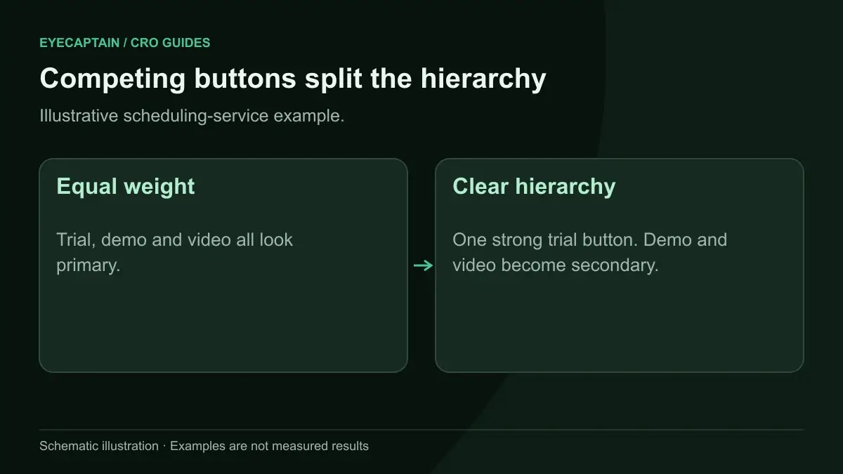
Competing buttons split the hierarchy. Illustrative scheduling-service example.

How big should the primary CTA be compared to other buttons?

The primary CTA should be noticeably larger than any secondary action in the same section, so the difference reads at a glance rather than on inspection. Fitts's law, a well-established principle in interaction design, says larger and closer targets are faster to reach, so size helps both attention and effort.

On mobile, a full-width primary button is a reliable pattern for product pages and forms. On desktop, increase height and padding before increasing font size, because oversized text on a button can look like a heading. Keep headline type larger than button type so the reading order stays headline, then button.

What does contrast mean beyond button color?

Contrast is how different an element looks from everything around it. That includes lightness, saturation, fill versus outline, and whether the color is used anywhere else. A bright orange button loses impact if orange also appears in the sale badge, the announcement bar and the icons.

Reserve one accent color for primary actions sitewide and keep it off decorative elements. Make secondary actions outline or text style. Also check readability: the button label needs enough contrast to read, which WCAG 2.2 sets at 4.5:1 for normal text. Our color psychology post covers hue choices; this lever is about distinctness, not meaning.

Why does white space around a CTA matter?

Empty space around a button separates it from its neighbors so the eye treats it as its own object. Psychologists call the related effect the isolation effect, or Von Restorff effect: an item that differs from those around it is more likely to be noticed and remembered.

Crowding is the most common hierarchy failure on ecommerce product pages. A typical "Add to cart" sits among a quantity stepper, a wishlist heart, payment icons, a "Buy now, pay later" message, a shipping estimate and a size guide link. Each is useful. Together they turn the button into one item in a cluster. Group supporting details below the button, push secondary links further away, and leave clear space above and beside the CTA.
EyeCaptain
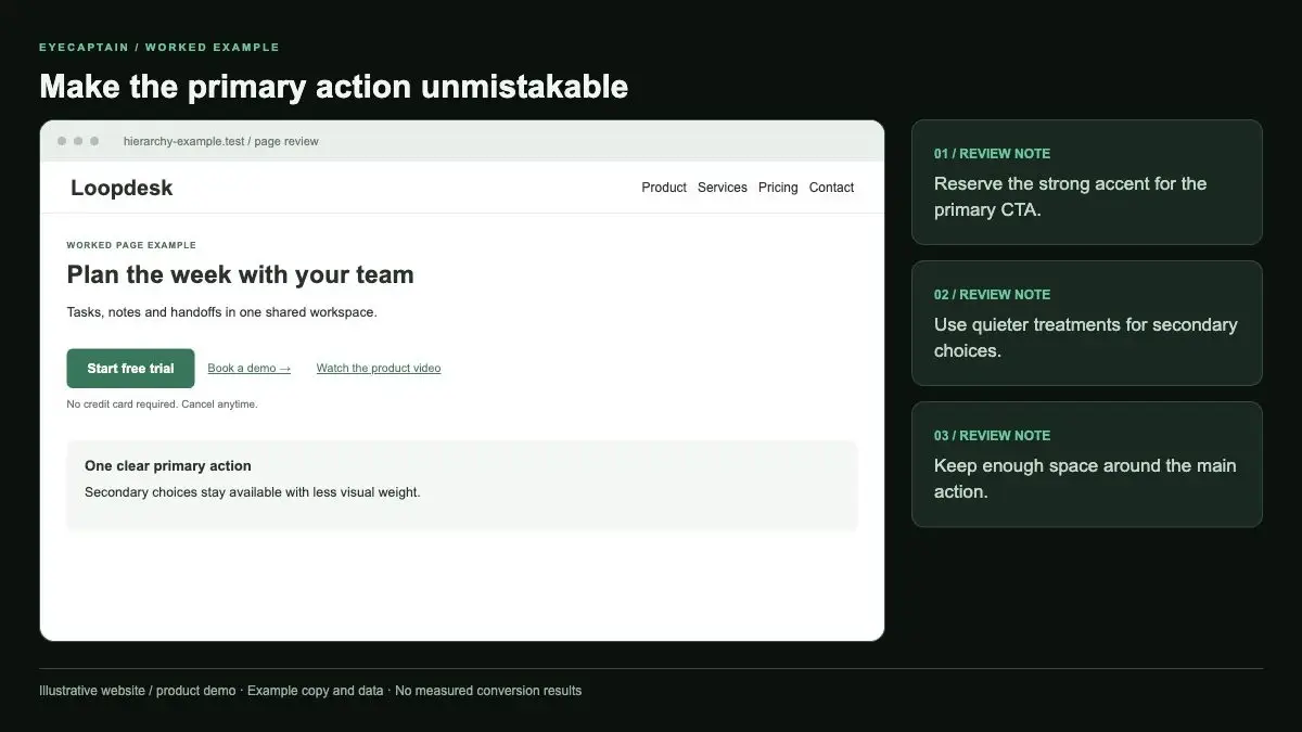
Make the primary action unmistakable. Reserve the strong accent for the primary CTA. Use quieter treatments for secondary…

Where should the primary CTA be placed on the page?

Place the primary CTA right after the content that makes someone want to click it, usually the headline and a short value statement. A button that appears before the visitor understands the offer gets seen but not clicked.

On landing pages, that means headline, one line of benefit, then CTA, ideally visible without scrolling on common screen sizes. On long pages, repeat the same CTA after each major proof section rather than introducing new ones. On mobile, a sticky bottom bar can keep the action reachable, but test that it does not cover content or other controls. Our guide to scroll map analysis shows how to find where attention drops before you move a CTA.

Which elements compete with the CTA most often?

The worst competitors are elements that look clickable or move. Typical offenders:

  • A second filled button with equal weight, such as "Learn more" next to "Start free trial".
  • Auto-rotating hero sliders, where motion pulls the eye every few seconds.
  • Chat widgets and popups that open over the CTA area.
  • Announcement bars in a saturated color.
  • Badges, trust seals and award icons placed tight against the button.
  • Large lifestyle images with faces looking away from the CTA.

You do not have to delete all of these. Decide which one action matters per section and lower the visual weight of the rest.

EyeCaptainEyeCaptain
Conversions Booster

UX bugs are silently killing your revenue

88% of users never come back after a bad experience. Our AI detects CTA hierarchy issues, mobile gaps, and cognitive overload patterns.

CTA hierarchy broken

How do you audit visual hierarchy on a page?

Run this audit on one page at a time, on both desktop and mobile:

  1. Name the one action. Write down the single conversion you want from this page. If you cannot pick one, that is the first problem.
  2. Screenshot the first screen. Capture what loads without scrolling on a common laptop size and a common phone size.
  3. Do the blur test. Blur the screenshot heavily or squint at it. Note the three blobs that stand out most, in order.
  4. Check where the CTA ranks. If the primary CTA is not in the top three, or ranks below a secondary action, note what beats it.
  5. Count competing interactive elements. List every button and link near the CTA and mark each as essential, supporting or removable.
  6. Check the five levers. For each: size, contrast, isolation, position, competition. Note the weakest one.
  7. Change the weakest lever first. Make one change, such as demoting the secondary button to a text link.
  8. Repeat the blur test. Confirm the CTA now ranks higher, then measure clicks and conversions before and after.

Predicted attention maps can speed up steps 3 and 4. Our post on AI attention heatmaps explains how they estimate where eyes land before you have traffic data.

EyeCaptain
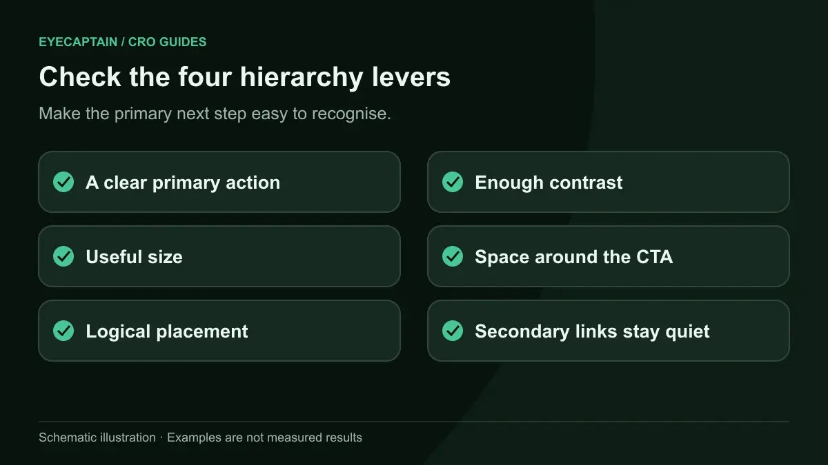
Check the four hierarchy levers. Make the primary next step easy to recognise.

What does this look like on a real page?

Take a hypothetical SaaS homepage for a scheduling tool. The hero has a large product screenshot, a headline, and two equal blue buttons: "Start free trial" and "Book a demo". The navigation bar has eight links plus a blue "Sign up" button. A purple announcement bar promotes a webinar. A chat bubble pulses in the corner.

In the blur test, the purple bar and the screenshot rank first and second. The two hero buttons tie for third. The fixes: keep "Start free trial" as the only filled button and make it larger; turn "Book a demo" into an outline button; change the nav "Sign up" to a plain text link; tone the announcement bar down to a neutral color; delay the chat bubble. After the changes, the trial button ranks second, right after the headline, which is the order you want.

Key takeaways

  • A CTA wins attention through size, contrast, isolation, position and low competition, not color alone.
  • Use one filled primary button per section and demote everything else to outline or text.
  • Reserve your accent color for primary actions so it stays distinctive.
  • Place the CTA right after the value statement, then repeat the same CTA after proof sections.
  • Audit with a blur test on desktop and mobile, and fix the weakest lever first.

A free CRO audit on EyeCaptain measures the visual weight of your CTAs and competing elements for one page, with a predicted attention heatmap on desktop and mobile.

EyeCaptain
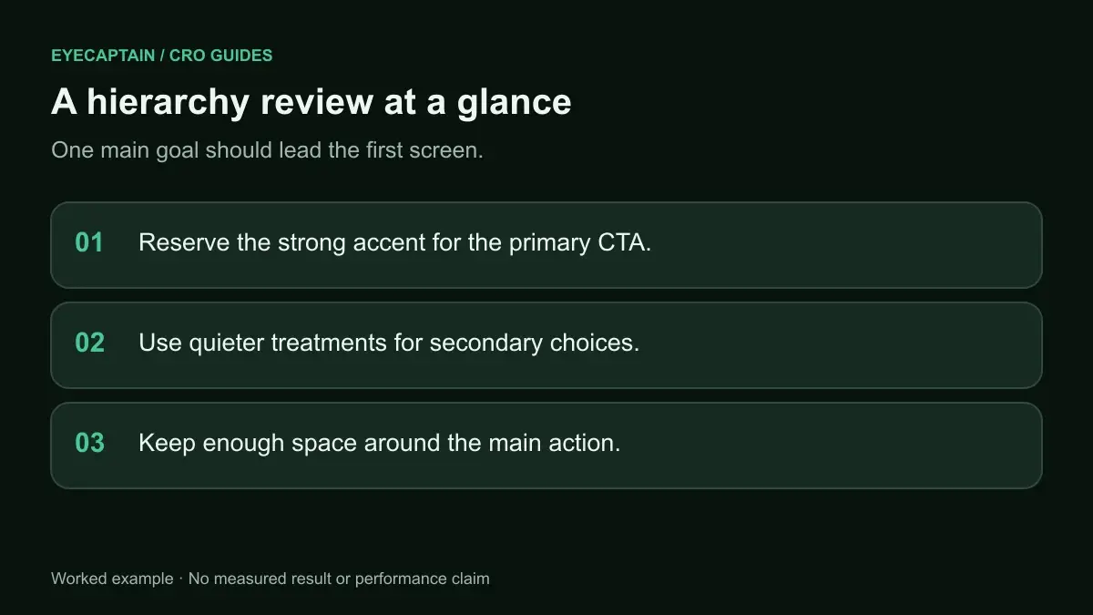
A hierarchy review at a glance. One main goal should lead the first screen.

Frequently asked questions

Should I have more than one CTA on a landing page?

You can repeat the same CTA several times on a long page, which helps people who are ready at different points. What hurts is offering several different actions with equal visual weight. If you need a secondary action, such as booking a demo, style it clearly quieter than the primary one and place it after or beside it.

What is the squint test in web design?

The squint test means blurring your view of a page, by squinting or applying a blur filter to a screenshot, so details disappear and only shapes, colors and contrast remain. Whatever stands out in the blurred view is what dominates attention. If your primary CTA is not among the first few elements you notice, its visual weight is too low.

Do ghost buttons work as primary CTAs?

Ghost buttons, which use only an outline and no fill, carry less visual weight than filled buttons. That makes them a good choice for secondary actions and a weak choice for the primary action. If your design system uses ghost buttons everywhere, give the main CTA a solid fill so it clearly outranks the rest.

Is the F-pattern still relevant for CTA placement?

Nielsen Norman Group documented the F-shaped scanning pattern on text-heavy pages, and it remains useful for articles and search results. Landing and product pages with strong visual design guide the eye differently. Rather than following a fixed pattern, place the CTA right after the content that explains the offer, then check placement with a blur test or attention data.

How do I measure if a hierarchy change worked?

Compare the CTA click-through rate and the page conversion rate before and after the change, over comparable periods. For a reliable answer, run an A/B test with enough traffic to reach statistical significance. Click maps also show whether attention moved from competing elements to the CTA, which helps explain why the numbers changed.

Enjoyed this article?

One short email a week with practical CRO and UX tips

No spam. Unsubscribe anytime.

Find what stops your visitors from converting

EyeCaptain is an AI-powered CRO & UX audit tool that automatically scans your pages, identifies UX issues, and gives you actionable optimization suggestions to increase conversions. Try it for free, no card, no commitment.

Free CRO Audit
Share this article
LinkedIn X

About the author

Founder of EyeCaptain. Writes about conversion rate optimization, UX analysis and the neuromarketing behind pages that actually sell.

More articles by Dimitris Andreadakis