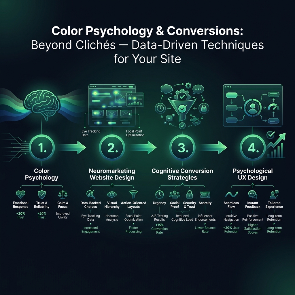

Unlock the principles of color psychology and neuromarketing website design to increase your conversion rates. While many search for a single "magic" color, the reality is more sophisticated. Effective design depends on powerful cognitive conversion strategies that guide the user's attention and simplify their choices. The focus should be on contrast, context, and reducing mental effort - not on outdated color charts.
Beyond the Color Wheel: Applying Psychological UX Design for Conversions
Move past the simplistic idea that "red means urgency" or "blue builds trust." In psychological UX design, the true power of color is its ability to create visual weight, telling users exactly where to look and what to do next. This principle is far more effective than relying on the supposed emotional meaning of a specific hue.
Contrast and Visual Hierarchy: The 50-Millisecond Decision
When a visitor arrives on your website, their brain makes an initial judgment in just 50 milliseconds. In that fraction of a second, the only elements that register are those that stand out. Your "Add to Cart" button isn't clicked because it's a specific color like orange; it's clicked because it is a bright, high-contrast element in an otherwise visually simple space. This is a core concept in effective neuromarketing website design.
A study by the Nielsen Norman Group, which tracked user eye movements, confirmed this. The most successful formula was consistently a single, high-contrast button surrounded by neutral tones. The specific color was irrelevant as long as it created a strong visual break from the background.
Cognitive Load: Why Multiple CTAs Can Hurt Performance
It might seem logical that offering more choices would increase engagement, but the opposite is often true. Adding a second call-to-action (CTA) with a different color can decrease conversions. This happens because you have increased the cognitive load for your visitor. Instead of a clear, single path, they now must stop and evaluate two different signals. This split-second hesitation is often enough to cause them to abandon the task.

The Visual Journey: Guiding Users to the Final Click
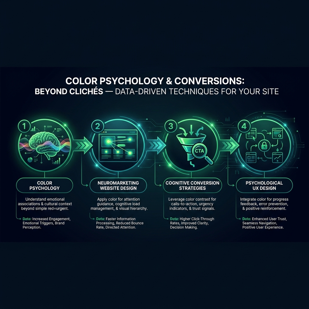
Effective cognitive conversion strategies recognize that color works as part of a sequence. A site that uses cool blues and grays and then suddenly introduces a clashing, bright red "Buy Now" button can create subconscious friction. A smoother approach guides the user by building a consistent visual journey. This involves using subtle accent colors on product pages, a slightly more intense version in the cart, and the boldest version on the final checkout button. One A/B test showed a 23% conversion lift simply by creating this smooth color progression.
Why Your Brand Colors Might Be Harming Conversions
Many businesses make a common mistake: their brand guidelines dictate a primary color, and designers apply it everywhere for consistency. The result is a uniform appearance where no single element stands out, causing buttons, links, and headers to blend together. This is not just a branding issue; it is a visual hierarchy problem that directly harms your conversion rate.
The Hierarchy Problem: When Nothing Stands Out
When every element on the page competes for attention, a visitor's eye has no clear path forward. They can become disoriented, and crucial action items get overlooked. This is a critical failure in psychological UX design.
According to research from the Baymard Institute, 18% of users who abandon their shopping carts do so because they could not easily find the "Continue" or "Checkout" button. They did not change their minds; the button was simply hidden by the surrounding design.
The Solution: A Dedicated Conversion Color and Pattern Interrupts
The solution is not to abandon your brand colors but to assign them specific roles. Use your primary brand color to build recognition in static elements like your header and footer. Your call-to-action color, however, should be treated as a specialized tool for conversion. Its only job is to break the visual pattern just enough to command attention. Stripe demonstrates this perfectly; their brand is a sophisticated purple, but their primary CTAs are a vibrant, electric blue-green, creating a powerful "pattern interrupt" that draws the user's focus.
Consistency Over Emotion: A Key Cognitive Conversion Strategy
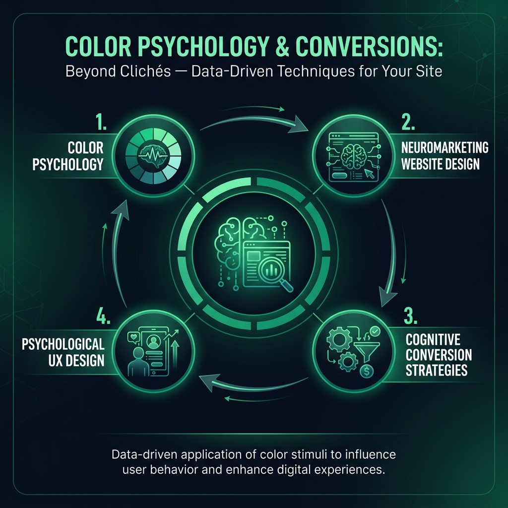
The emotional meaning of a color is far less important than its consistent application. A study in the Journal of Consumer Psychology found that when contrast and placement were equal, the difference in conversions between "aggressive" red buttons and "calm" blue ones was statistically insignificant. What truly mattered was consistency. Websites that used the exact same high-contrast color for their primary CTA throughout the entire user journey saw 17% fewer abandoned purchases. The brain learns to associate that specific color with the primary action, making the click an easy, almost automatic decision.