Infographic για digital marketing - οπτικοποίηση εννοιών UX design, conversion rate optimization, user experience
    eyecaptain.io

    UX vs CRO 2026: Improve Experience, Sales and ROI

    Learn how UX and CRO work together in 2026. Improve usability, remove conversion blockers, and turn a smoother experience into measurable ROI.

    EyeCaptain

    Dimitris

    20 February 2026

    8 min read
    275 views
    UX designconversion rate optimizationuser experienceROIdigital marketing

    In the world of digital marketing, treating user experience (UX) design and conversion rate optimization (CRO) as separate disciplines is a critical mistake. A truly effective strategy understands that these two elements are deeply intertwined. While many businesses focus on minor A/B tests, they often overlook the significant UX issues that prevent users from converting, ultimately hindering growth and impacting the overall return on investment (ROI).

    The High Cost of a Disconnected Strategy

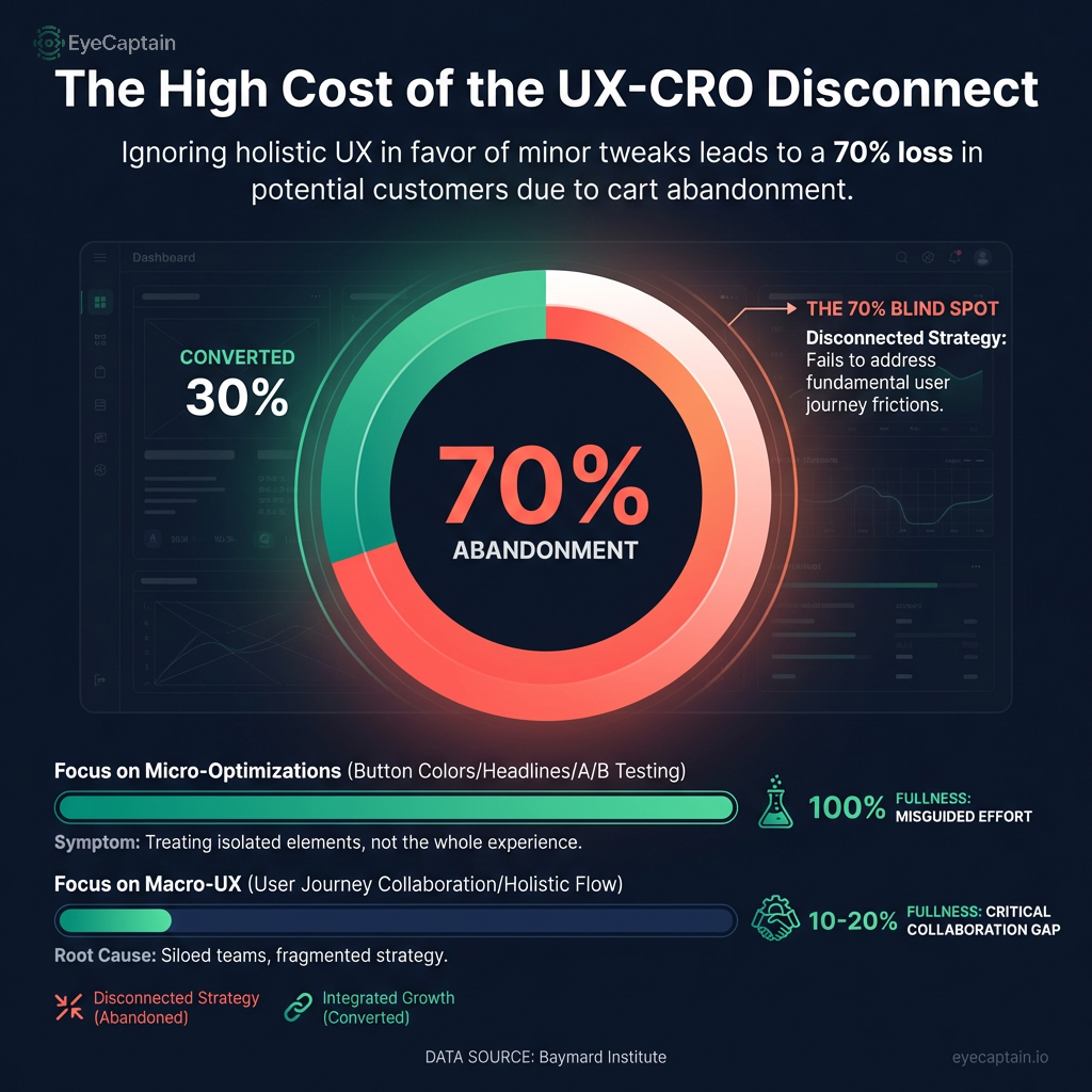
    Too many companies get lost in optimizing minor details - like button colors or headline variations - while ignoring the broader user experience that determines whether a customer stays or leaves. This disconnect between the user's overall journey and the push for a single conversion is a massive blind spot in many digital marketing efforts.

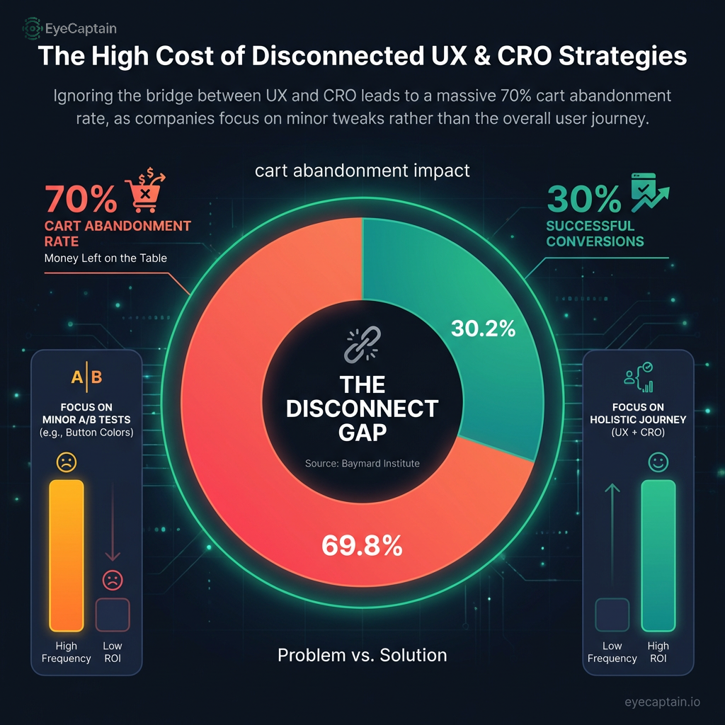
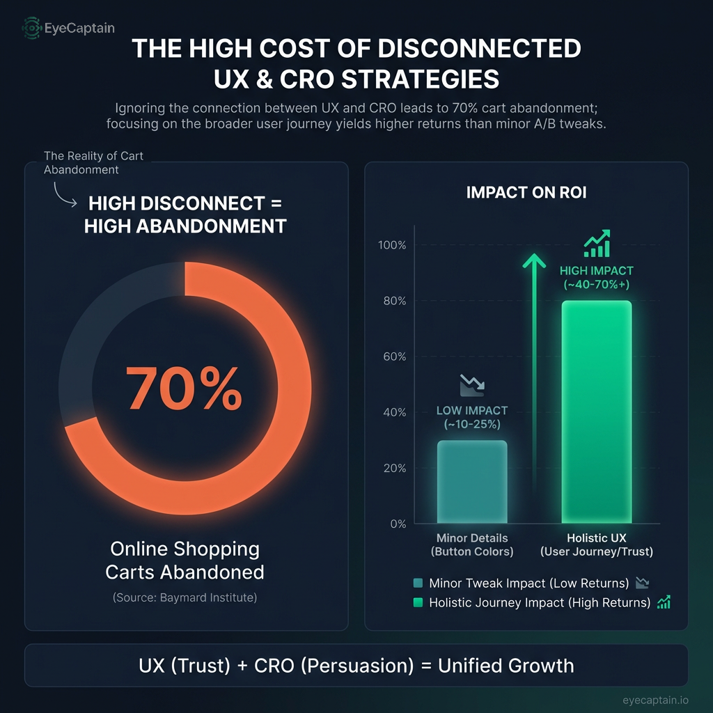
    Data from the Baymard Institute reveals a stark reality: nearly 70% of online shopping carts are abandoned. Yet, a surprisingly small number of companies foster collaboration between their UX and CRO teams, treating two critical functions as if they exist in different universes.

    This separation is the heart of the problem. Effective CRO aims to persuade users to take a specific action. However, great UX design is what shapes the entire journey, making users want to take that action in the first place by building trust and reducing friction.

    Bridging the Gap: How User Experience Drives Conversions

    For years, a false dichotomy has pitted UX design against conversion rate optimization. UX teams advocate for clean, simple interfaces, while CRO specialists often push for more aggressive calls-to-action and persuasive elements. The truth is, both are aiming for the same goal: a successful user outcome that benefits the business.

    Consider a SaaS company that spent eight months A/B testing its pricing page with no success, stuck at a 2.1% conversion rate. The real issue was not the pricing page itself, but a major UX flaw earlier in the journey: requiring credit card information for a product demo. This created distrust long before users considered pricing. By simply moving the credit card request to after the free trial, their pricing page conversion rate increased dramatically to 4.7% without a single change to the page itself.

    Στατιστικό γράφημα που απεικονίζει τη σχέση μεταξύ UX και CRO. Αριστερά, ένα κυκλικό διάγραμμα δείχνει ότι το 70% των καλαθιών αγορών εγκαταλείπονται (δεδομένα Baymard Institute). Δεξιά, ένα ραβδόγραμμα συγκρίνει τον χαμηλό αντίκτυπο των μικρών αλλαγών σχεδιασμού (όπως χρώματα κουμπιών) με τον υψηλό αντίκτυπο της βελτίωσης της συνολικής εμπειρίας χρήστη (UX) και της μείωσης της τριβής.
    EyeCaptain
    eyecaptain.io

    This illustrates a core principle: CRO tactics cannot fix a fundamentally poor user experience. Conversely, a beautiful user experience that ignores clear conversion goals can fail to generate revenue.

    Cognitive Load and Conversion Psychology

    Every element on a page contributes to a user's cognitive load - the mental effort required to process information. While traditional CRO sometimes adds to this load with more pop-ups or text, a UX-focused approach aims to reduce it. Research from the Nielsen Norman Group highlights that users can only process about seven pieces of information at once, yet many websites overwhelm them with far more.

    Best Buy's checkout redesign is a masterclass in this principle. Instead of just reducing form fields, they applied UX thinking to their CRO goals. They grouped related information, hid optional details, and created a clear, step-by-step path. While they actually increased the number of fields, the improved organization lowered cognitive load, leading to a 15% increase in checkout completions.

    Integrating UX and CRO Data for Smarter Decisions

    In most organizations, UX data (like heat maps and user interviews) and conversion data (like A/B test results) live in separate silos. This creates blind spots. A heat map might show users ignoring a call-to-action, but only qualitative UX research can explain why.

    E-commerce leader ASOS solved this by creating cross-functional data reviews. Every A/B test hypothesis must now be supported by UX research, and every insight from user studies is evaluated for its potential impact on conversions. For instance, when heat maps showed users clicking non-interactive product images, they did not just address the "dead clicks." Usability tests revealed users expected a "quick view" feature. After implementing it, engagement rose by 31% and conversions by 12% because the user experience was aligned with user expectations.

    The Attribution Problem in Digital Marketing

    Traditional attribution models often fail to credit UX improvements for their role in a conversion. If a user visits five times before buying, the credit usually goes to the last ad clicked, ignoring the UX enhancements that may have streamlined the decision-making process. Good UX boosts conversions indirectly by lowering bounce rates, building trust, and encouraging site exploration - factors that standard CRO dashboards often miss.

    Στατιστικό infographic που απεικονίζει τη σχέση μεταξύ UX και CRO. Το κύριο γράφημα δείχνει δεδομένα από το Baymard Institute με ποσοστό εγκατάλειψης καλαθιού κοντά στο 70%, το οποίο χαρακτηρίζεται ως 'τυφλό σημείο' στη στρατηγική. Παράπλευρα διαγράμματα συγκρίνουν την υπερβολική εστίαση σε μικρο-αλλαγές (όπως χρώματα κουμπιών) με την ελλιπή συνεργασία των ομάδων σχεδιασμού, εξηγώντας πώς η κακή εμπειρία χρήστη μειώνει το ROI και τις πωλήσεις.
    EyeCaptain
    eyecaptain.io

    Booking.com overcomes this with cohort analysis, tracking user groups over time to measure the long-term ROI of UX changes. When a simpler search interface initially caused a 3% dip in immediate conversions, a typical CRO analysis would have deemed it a failure. However, their cohort data showed these users spent 18% more over the next month. The superior user experience led to more confident, higher-value customers.

    EyeCaptainEyeCaptain
    97%
    Conversions Booster

    Your visitors leave without converting

    Most websites lose 97% of their traffic without a single conversion. Our AI scans 200+ CRO elements to find exactly where visitors drop off.

    Hero CTA missing

    Optimizing for Mobile: A Unified UX and CRO Approach

    With mobile commerce dominating online sales, a desktop-first CRO strategy is no longer viable. User behavior on mobile is fundamentally different - more impulsive, yet far less tolerant of friction. What works on a desktop can be a deal-breaker on a small screen.

    Zara's mobile site demonstrates this perfectly. Their desktop pages are rich with images and details. The mobile version, however, prioritizes focus, showing five key images and tucking extra information into expandable sections. By applying the UX principle of reducing clutter for mobile, they improved their mobile conversion rate optimization by 34%.

    Cross-Device Experience Continuity

    The modern user journey is fragmented across multiple devices. A customer might research on their phone and purchase on their laptop. A CRO strategy focused on a single touchpoint will miss the bigger picture, whereas a holistic UX approach embraces this seamless journey.

    Adobe discovered that users who engaged with interactive mobile demos were three times more likely to purchase on a desktop later. Instead of forcing a sale on mobile, they enhanced the mobile demo experience. This UX-led decision boosted mobile engagement by 89% and increased overall cross-device sales by 41% by aligning their digital marketing strategy with natural user behavior.

    Personalization at Scale: The Ultimate UX and CRO Synergy

    Effective personalization goes beyond using a customer's name. It involves a deep integration of UX design and conversion goals to tailor the entire experience to a user's intent. Amazon, for example, personalizes not just recommendations but the entire site structure, changing layouts and navigation based on whether a user is new or a returning customer.

    Στατιστικό γράφημα τύπου 'donut chart' που απεικονίζει δεδομένα του Baymard Institute, δείχνοντας ότι το 70% των καλαθιών ηλεκτρονικού εμπορίου εγκαταλείπονται. Η εικόνα συγκρίνει τις στρατηγικές UX και CRO, τονίζοντας πώς η αποσπασματική βελτιστοποίηση επηρεάζει αρνητικά το ROI και τις πωλήσεις.
    EyeCaptain
    eyecaptain.io

    This is the pinnacle of integrated optimization, where the interface adapts to what each user is trying to achieve. It is the ultimate fusion of providing a great user experience and driving business goals.

    A Better Framework for Testing

    To achieve this synergy, your testing infrastructure must measure both quantitative metrics (conversions) and qualitative feedback (user sentiment). Standard A/B testing platforms can track revenue but cannot tell you if a change frustrated users.

    Spotify runs parallel tests, evaluating changes with both conversion metrics and user satisfaction surveys. This dual approach prevents them from rolling out changes that boost short-term metrics but harm the long-term user experience and customer retention. A better experience often creates more long-term value, a crucial insight for measuring true ROI.

    Measuring the True ROI of Integrated UX and CRO

    Calculating the return on investment for a unified strategy requires looking beyond direct attribution. UX improvements deliver value by reducing support costs, increasing customer lifetime value, and enhancing brand reputation - benefits that simple conversion tracking overlooks.

    Airbnb measures success with a blended scorecard, tracking booking rates alongside host satisfaction and support ticket volume. When they simplified the property listing process, the UX change led to higher-quality listings and fewer guest complaints, creating a healthier, more profitable ecosystem in the long run.

    Ultimately, the biggest challenge is not technical but organizational. The companies that excel are those that foster collaboration, sharing data, goals, and a unified definition of success between their UX and CRO teams. If your organization continues to measure these functions in silos, you are leaving significant value on the table while your competitors optimize the entire customer journey.

    Enjoyed this article?

    Join 1,500+ professionals getting weekly CRO & UX tips

    🎁 Bonus: Weekly CRO insights + exclusive resources

    No spam. Unsubscribe anytime.

    🚀 Boost Your Conversion Rate with EyeCaptain

    EyeCaptain is an AI-powered CRO & UX analysis tool that automatically scans your pages, identifies UX issues, and gives you actionable optimization suggestions to increase conversions. Try it for free, no card, no commitment.

    Free CRO Audit

    Did you find this helpful?

    Share it with someone who might find it useful.

    Be the first to learn CRO secrets

    Actionable tips, case studies & early access to new AI tools. Weekly in your inbox.

    1,200+ marketers trust us

    Cookie Settings

    We use cookies to improve your experience.