Infographic EyeCaptain για digital marketing - οπτικοποίηση εννοιών User Psychology, Website
    eyecaptain.io

    The Dark Psychology Behind Why Users Abandon Your Website

    Your website triggers subconscious user behaviors you don't even know about. Discover the hidden psychology patterns that drive 67% of visitors away.

    EyeCaptain

    Dimitris

    19 February 2026

    4 min read
    282 views
    User PsychologyWebsite

    Ever wonder why visitors quickly abandon your website or application? Often, the root cause lies deep within user psychology. Studies, such as those from the Baymard Institute, consistently reveal that a significant portion of online transactions are abandoned due to invisible psychological barriers. This underscores a crucial point: effective digital optimization extends beyond aesthetics. It involves understanding fundamental human brain patterns that influence online behavior, regardless of geographical location - from Tokyo to Berlin or São Paulo. Every click, scroll, and pause offers insight into neurological responses refined over millennia, profoundly shaping the user experience on your digital platform.

    Taming the Information Beast on Your Digital Platform

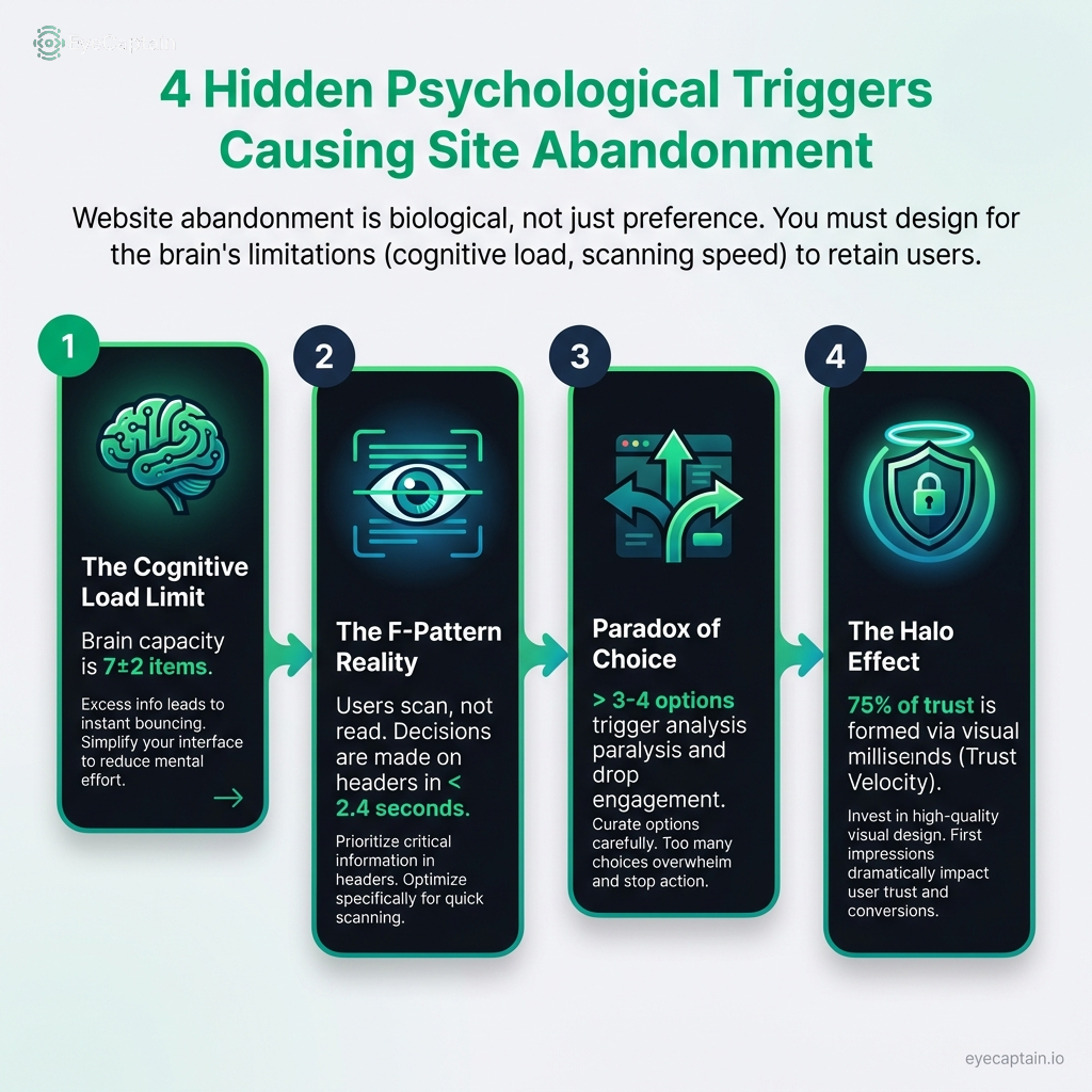
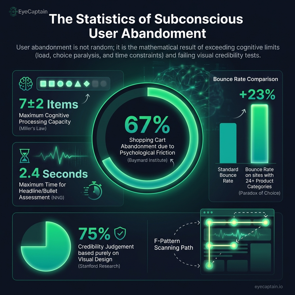
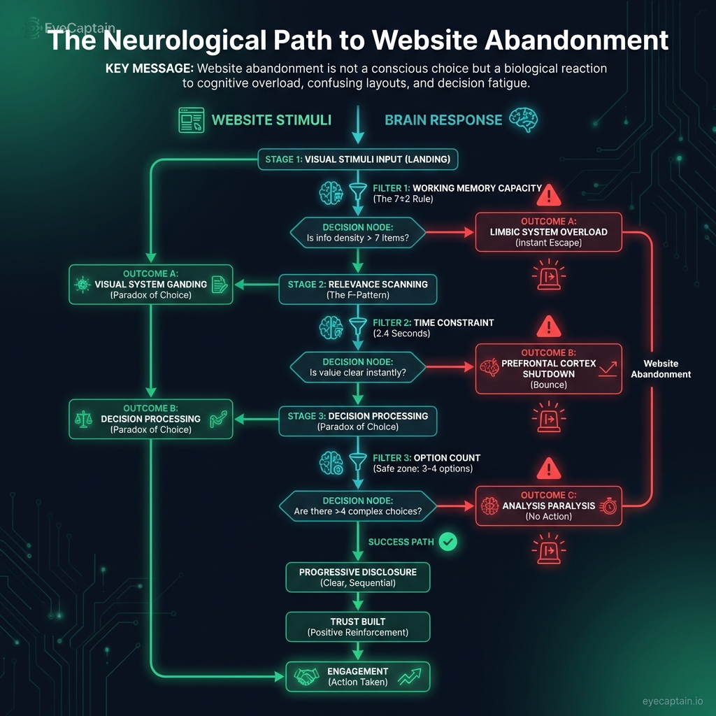
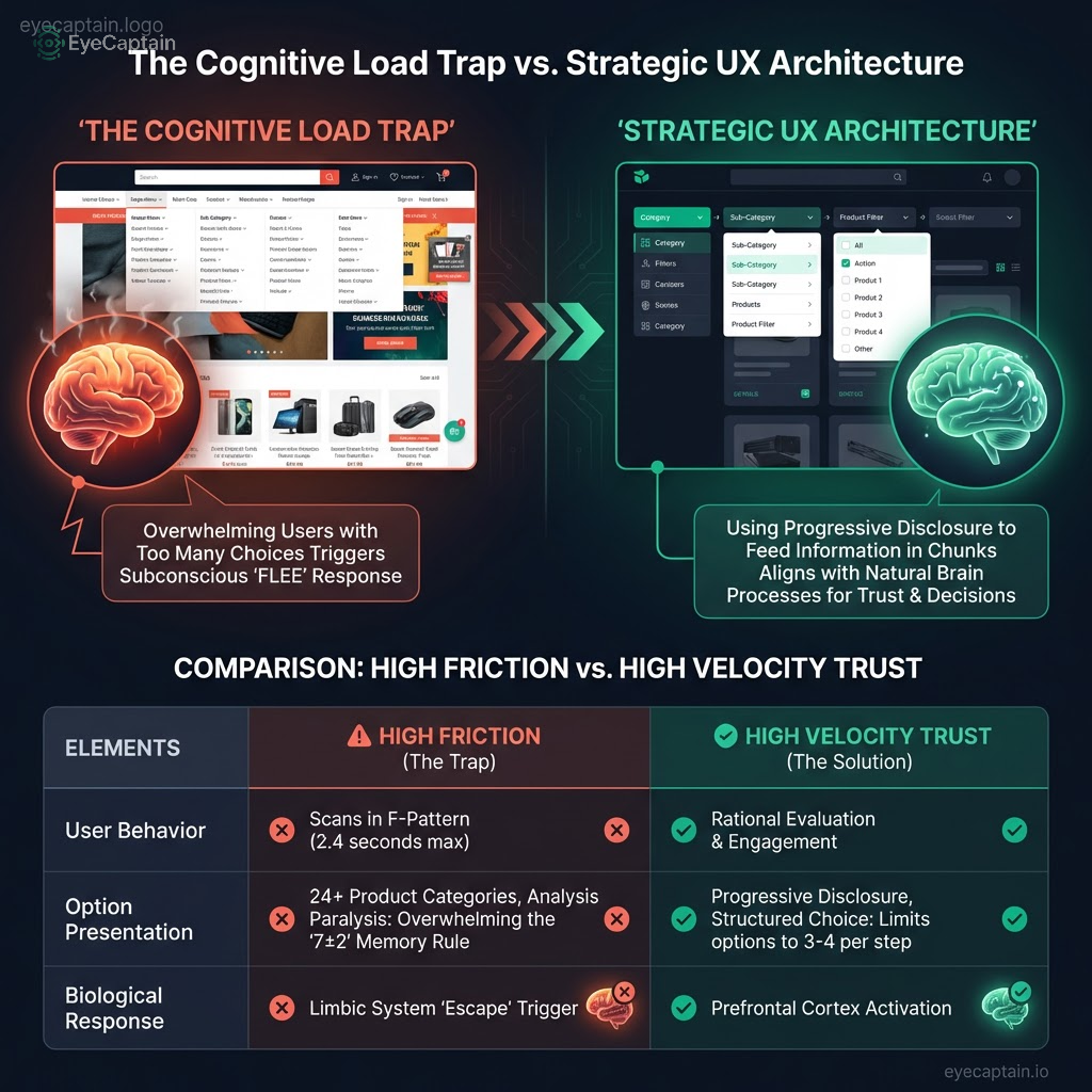
    Our brains have inherent limitations, typically managing around seven pieces of information simultaneously. When a digital platform presents an overwhelming amount of data, the primitive limbic system often triggers a "flight" response. This information overload is a primary contributor to high bounce rates globally, impacting diverse cultures and age groups, and significantly hindering website engagement. It's akin to attempting to drink from a firehose: too much, too fast, preventing effective information absorption.

    Eye-tracking studies, particularly from the Nielsen Norman Group, consistently demonstrate that users rarely read web pages word-for-word. Instead, they skim content, often in an "F" pattern, focusing briefly on headlines and bullet points. If these initial snippets fail to capture attention, the brain disengages, leading to lost digital engagement. Consider it like browsing a bustling marketplace; if the first items aren't appealing, you move on to the next stall.

    Στατιστικό infographic που παρουσιάζει 5 βασικά δεδομένα για την ψυχολογία των χρηστών ιστοσελίδων. Τα γραφήματα δείχνουν ότι το 67% της εγκατάλειψης καλαθιού οφείλεται σε ψυχολογική τριβή, ο εγκέφαλος επεξεργάζεται μόνο 7±2 πληροφορίες ταυτόχρονα, οι χρήστες κρίνουν το περιεχόμενο σε μόλις 2.4 δευτερόλεπτα, η υπερβολή στις επιλογές αυξάνει το bounce rate κατά 23% και το 75% της αξιοπιστίας βασίζεται στον εικαστικό σχεδιασμό.
    EyeCaptain
    eyecaptain.io

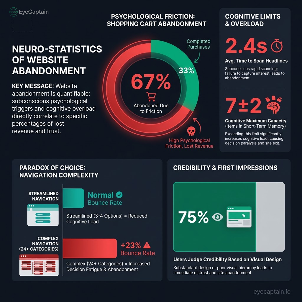
    Beyond sheer volume, decision paralysis can severely impair the user experience. Research on the "paradox of choice" suggests that an abundance of options can prevent users from making any decision at all. E-commerce sites with overly complex navigation or endless product categories frequently experience higher bounce rates compared to those that prioritize simplicity. This highlights the critical importance of intelligent information architecture, not merely a minimalist design. Major players like Amazon exemplify this by presenting choices in manageable, bite-sized segments through layered filtering systems - a cornerstone of truly user-friendly digital design. They understand that overwhelming users with too many options can feel like searching for a single grain of sand on a vast beach: overwhelming and unproductive.

    Building Trust: The Halo Effect in Digital Design

    In the online realm, trust is often formed not through gradual accumulation, but via rapid judgments based on subtle cues. This swift assessment is heavily influenced by the halo effect. Studies across various markets indicate that users frequently evaluate a platform's credibility based on its visual appeal and professional presentation, sometimes even before delving into content or expertise. This initial impression is absolutely vital for establishing website credibility. Whether in a bustling marketplace or on a digital screen, first impressions are paramount.

    Επεξηγηματικό διάγραμμα ροής (infographic) που αναλύει τη ψυχολογία του χρήστη και τους λόγους εγκατάλειψης μιας ιστοσελίδας. Το γράφημα δείχνει τη διαδικασία λήψης αποφάσεων του εγκεφάλου σε τρία στάδια: 1) Έλεγχος γνωστικού φορτίου (κανόνας 7±2), 2) Σάρωση περιεχομένου (μοτίβο F) και 3) Παράδοξο της επιλογής. Βέλη δείχνουν πώς η υπερφόρτωση πληροφοριών οδηγεί σε ασυνείδητη αντίδραση διαφυγής (bounce rate), ενώ η σωστή αρχιτεκτονική οδηγεί σε εμπιστοσύνη και αλληλεπίδραση.
    EyeCaptain
    eyecaptain.io

    Social proof plays a significant role, as humans are inherently inclined to follow the crowd. Elements like testimonials, review counts, and usage statistics activate "mirror neurons" in our brains, fostering a sense of reliability. However, generic feedback such as "Great product!" can raise suspicion. Specific, verifiable testimonials, like "This boosted my conversion rate by 34% in two weeks" or "I found the perfect local artisan through this site," are far more effective. Their authenticity significantly enhances your digital credibility. Furthermore, showcasing reviews from diverse regions - perhaps a glowing testimonial from Mumbai alongside one from Manchester - helps build global trust and demonstrates the platform's resonance across various cultures.

    Moreover, authority bias can accelerate the trust-building process. Displaying logos from reputable local media, internationally recognized industry certifications (e.g., ISO standards), or endorsements from respected figures in a specific market bypasses rational thought. It serves as a shortcut for users to instantly perceive, "Okay, this site is legitimate." For instance, featuring a local government endorsement in a particular region or an approval stamp from a prominent tech influencer can immediately increase user trust. This psychological shortcut is crucial for establishing instant trust on your digital platform.

    Συγκριτικό infographic που αντιπαραβάλλει τον σχεδιασμό υψηλού γνωστικού φορτίου με τη στρατηγική UX. Η αριστερή πλευρά δείχνει πώς τα χαοτικά μενού και οι πολλές επιλογές προκαλούν παράλυση απόφασης και εγκατάλειψη ιστοσελίδας. Η δεξιά πλευρά παρουσιάζει τη λύση της σταδιακής αποκάλυψης πληροφοριών (progressive disclosure) που διευκολύνει τον εγκέφαλο του χρήστη και αυξάνει τις μετατροπές.
    EyeCaptain
    eyecaptain.io

    Navigating the User Journey Maze: Understanding Friction Psychology

    Every form field, page load delay, or confusing navigation choice on a digital platform contributes to psychological friction. This friction doesn't just add up; it multiplies, significantly disrupting the user journey, whether a user is in bustling Mumbai or a quiet European village. Imagine trying to walk through mud - each step is unnecessarily difficult, eventually leading to abandonment.

    EyeCaptainEyeCaptain
    88%
    Conversions Booster

    UX bugs are silently killing your revenue

    88% of users never come back after a bad experience. Our AI detects CTA hierarchy issues, mobile gaps, and cognitive overload patterns.

    CTA hierarchy broken

    Consider the endowment effect in multi-step checkout processes. Once users invest effort, the perceived loss of that invested time often outweighs any potential gain. Therefore, progress bars are more than visual aids; they are psychological anchors. They help prevent cart abandonment by acknowledging the work already completed. In regions with slower internet, such as parts of Southeast Asia or Africa, ensuring fast site loading and clear progress indicators becomes even more critical for a smooth website experience, as user patience can quickly diminish.

    Loss aversion profoundly impacts how users perceive pricing. Phrases like "Save €50" are often more effective than "Was €200, Now €150." The former emphasizes gain, while the latter focuses on a reduced loss. The decoy effect is another clever tactic to guide choices. When presented with three pricing options, users often gravitate towards the middle one, even if it's not the most logical choice. This illustrates how these mental anchors influence decisions on a digital platform, whether for a bargain hunter in a developing market or a premium buyer in a developed one.

    Πληροφοριακό γράφημα λίστας που απεικονίζει 4 κύριους ψυχολογικούς λόγους εγκατάλειψης μιας ιστοσελίδας. Η εικόνα παρουσιάζει: 1) Τον περιορισμό του γνωστικού φόρτου (κανόνας 7±2), 2) Το μοτίβο σάρωσης F-pattern (2.4 δευτερόλεπτα), 3) Το παράδοξο της επιλογής (decision paralysis) και 4) Το φαινόμενο Halo effect όπου το 75% της εμπιστοσύνης κρίνεται από το visual design.
    EyeCaptain
    eyecaptain.io

    Anticipation anxiety can derail a sale before it even begins. Unexpected shipping costs (especially for international purchases), unclear return policies, or hidden processing fees trigger a fight-or-flight response. Our brains often fail to differentiate between a surprise checkout fee and a genuine threat, leading to instant disengagement. Therefore, complete transparency regarding all costs, including local taxes and duties (like VAT in Europe or GST in India), is absolutely vital for global audiences and for ensuring a highly usable website. No one appreciates an unpleasant surprise at checkout, regardless of their location.

    Context also plays a crucial role. A user browsing during peak work hours in a busy city might have significantly less patience than someone leisurely scrolling in their free time. Mobile users in emerging markets, for example, are often more price-sensitive and cautious about data usage than desktop users in developed nations. Tailoring your digital experiences to these local nuances - perhaps offering a "lite" version of your site for areas with slower internet, or highlighting popular local payment methods (like M-Pesa in Kenya or WeChat Pay in China) - is key to successful website optimization.

    Ultimately, the intricate layers of user psychology in digital design are frequently overlooked. Our conscious minds often rationalize decisions already made by our subconscious, driven by ancient programming. However, by truly understanding and applying these hidden behavioral insights, and adapting them for diverse global contexts, you can significantly enhance your digital platform's performance and elevate the user experience. This necessitates moving beyond assumptions and embracing data-driven website optimization, ensuring your digital presence genuinely connects with everyone, everywhere.

    Στατιστικό infographic που αναλύει τους ψυχολογικούς λόγους εγκατάλειψης μιας ιστοσελίδας. Το κεντρικό διάγραμμα δείχνει 67% εγκατάλειψη καλαθιού λόγω ψυχολογικής τριβής. Περιφερειακά γραφήματα παρουσιάζουν: το όριο γνωστικής επεξεργασίας (7±2 στοιχεία), τον χρόνο απόφασης των χρηστών (2,4 δευτερόλεπτα), αύξηση 23% στο bounce rate λόγω υπερβολικών επιλογών και το γεγονός ότι το 75% της αξιοπιστίας κρίνεται από το visual design.
    EyeCaptain
    eyecaptain.io

    Enjoyed this article?

    Join 1,500+ professionals getting weekly CRO & UX tips

    🎁 Bonus: Weekly CRO insights + exclusive resources

    No spam. Unsubscribe anytime.

    🚀 Boost Your Conversion Rate with EyeCaptain

    EyeCaptain is an AI-powered CRO & UX analysis tool that automatically scans your pages, identifies UX issues, and gives you actionable optimization suggestions to increase conversions. Try it for free, no card, no commitment.

    Free CRO Audit

    Did you find this helpful?

    Share it with someone who might find it useful.

    Be the first to learn CRO secrets

    Actionable tips, case studies & early access to new AI tools. Weekly in your inbox.

    1,200+ marketers trust us

    Cookie Settings

    We use cookies to improve your experience.