
So, your website is getting plenty of clicks, but the sales just aren't happening. Sound familiar? If you're staring at your analytics wondering why all those potential customers are hitting the back button, you're not alone. This isn't just a simple conversion problem. It's a sign that your marketing strategy has a leak, leading to a high bounce rate and a sales funnel that's losing you both money and future fans.
Every person who clicks away isn't just a lost sale. They're a lost opportunity. They won't recommend you, and they probably won't even remember your brand's name tomorrow. If you're tired of bleeding cash and customers, it's time to figure out what's going wrong and fix these common website mistakes for good.
Common CRO Mistakes: #1. Your Site Feels Untrustworthy
You know, trust is one of those things you don't really notice until it's gone. A checkout page can look clean, load in a flash, and work perfectly on a phone, but still fail completely. Why? Because it feels sketchy.
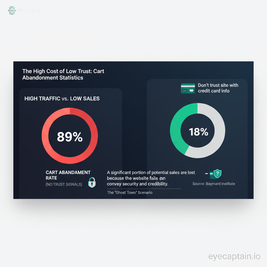
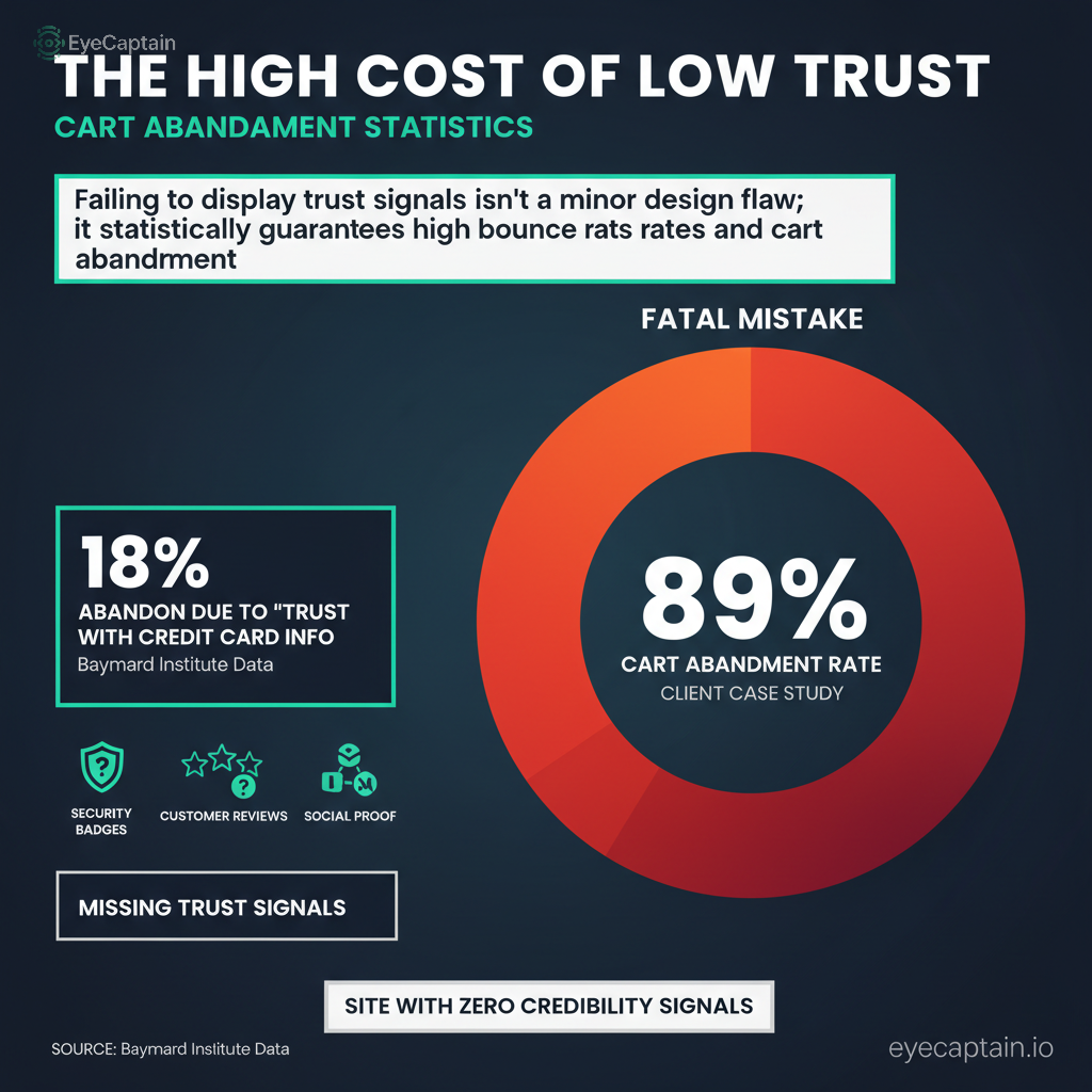
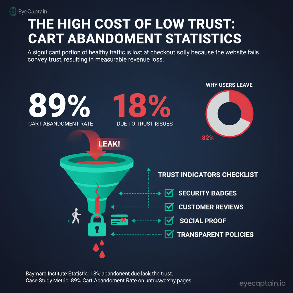
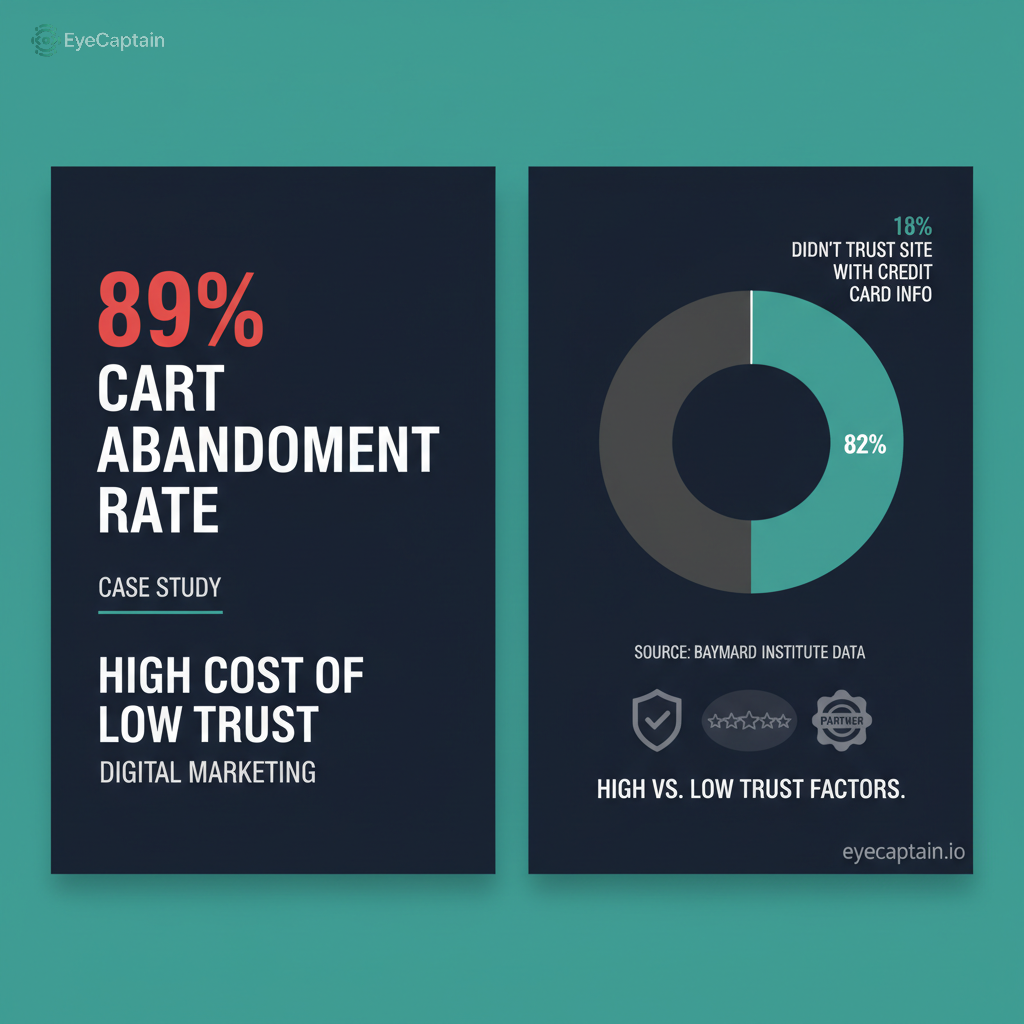
We recently looked at a client's page that was a ghost town of credibility. No security badges. No customer reviews. Zero social proof. Is it any surprise their cart abandonment rate was a whopping 89%?
According to the Baymard Institute, about 18% of people ditch their shopping cart simply because they don't trust the site with their credit card info.
But here's the part everyone gets wrong: trust isn't something you can just slap on at the end. Your funnel optimization has to start the instant someone lands on your homepage.
How to Build Credibility from the Start
So how do you build that credibility? It's not just about plastering badges everywhere. Think strategically. If you've worked with well-known companies, put their logos right on your homepage where people can't miss them. You should also leverage reviews, and don't stress about a few four-star ratings. Honestly, a huge number of reviews often means more to a customer than a perfect score. And please, use real photos. Ditch the generic stock images of smiling people in boardrooms. We can all spot those a mile away. Use pictures of your actual team and your real customers.
Placement is everything. Security seals belong right next to the fields where people enter their payment details. Customer testimonials should pop up right where doubt starts to creep in, like on a product page or right before the final checkout button. We saw a SaaS company move their testimonials from the footer to just below their pricing plans, and guess what? Their conversion rate jumped 34% in less than a month.
Critical Website Mistakes: #2. Nobody Understands What You Do
You know your business inside and out. But do your visitors? One of the biggest website mistakes is talking about features instead of benefits. "Advanced AI-powered analytics dashboard" means nothing to most people. It's just jargon. But "Cut your reporting time from 4 hours to 15 minutes"? Now you're talking my language.
The old five-second rule is still absolute gold. A new visitor has to understand what you do, why it's for them, and what to do next, all within about five seconds. The stuff they see without scrolling, your headline and opening sentence, is the most valuable real estate on your entire site. Eye-tracking studies have shown time and again that people spend most of their time looking right there.
Try this little experiment. Grab someone who knows nothing about your business, show them your homepage for just five seconds, then close the laptop. If they can't tell you what you sell, your message is broken.
A Simple Way to Get Clear
The best value propositions aren't complicated. They just tell a simple story. They start with the customer's pain, introduce your solution, and then paint a picture of the great outcome. Something like: "Tired of spending your weekends counting inventory? Our system syncs all your stock automatically. Get your Fridays back and focus on growing your business, not getting buried in a stockroom."
See how that works? It connects with a real frustration, offers a clear fix, and ends with a result they actually want. Just remember to drop the corporate buzzwords. Nobody cares about "omnichannel integration." They just want their problems solved so they can run their business without the headaches.
Funnel Optimization Killers: #3. You're Making Things Too Difficult
You've probably tweaked your site a hundred times. But odds are, you're looking at it from your perspective, not your customer's. All those little things that seem fine to you can be major roadblocks in your funnel optimization.
Let's talk about forms. Every single field you add is another reason for someone to give up and leave. Each extra box can literally slash your completion rates. Do you really need their phone number? Unless you're planning to call them immediately, just get the essentials. A name and an email are usually all you need to get started.