
The Ultimate Conversion Rate Audit: A Checklist for Real Results
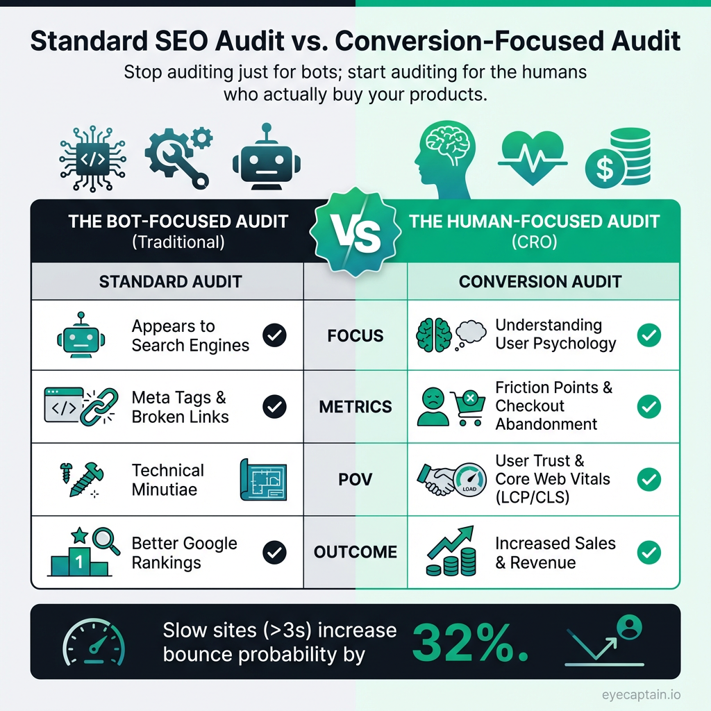
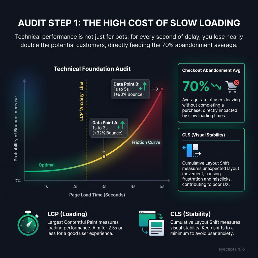
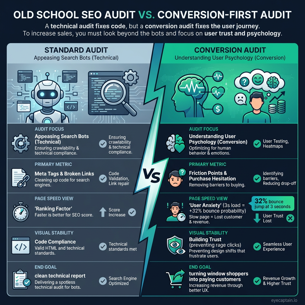
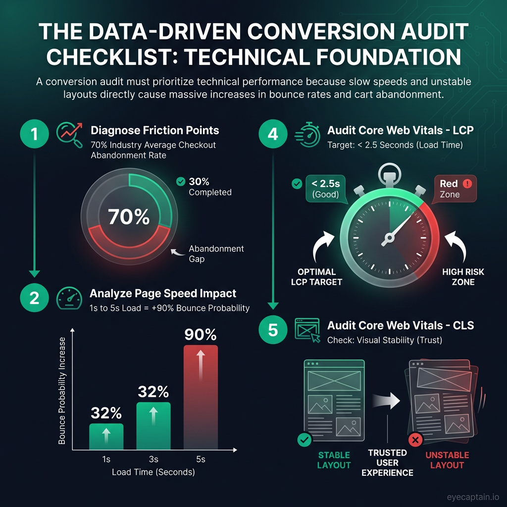
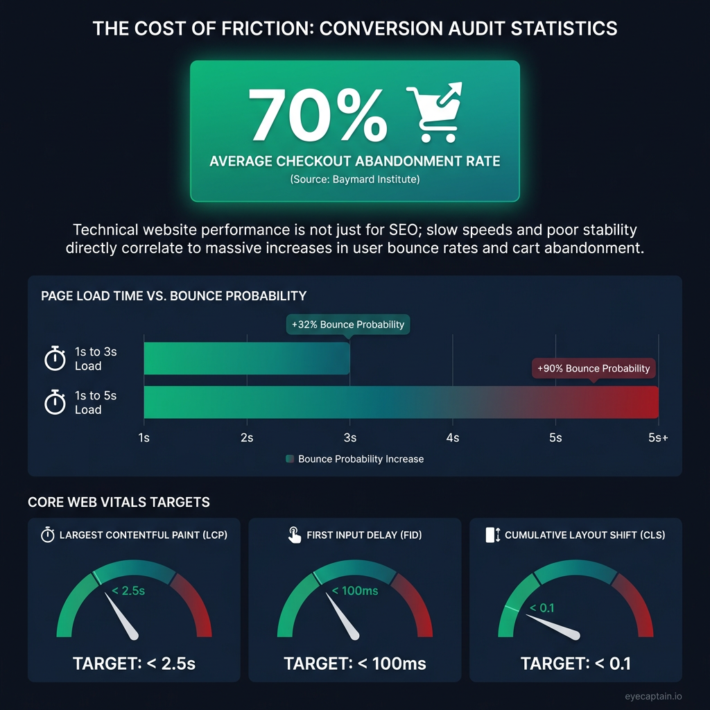
Tired of website audits that serve up a plate of technical jargon but no real results? A true conversion rate audit goes beyond meta tags and broken links to pinpoint the real reason visitors aren't buying. While many reports focus on technical minutiae, your checkout abandonment rate might be stuck at a staggering 70% - a figure the Baymard Institute confirms is the industry average. A meaningful audit should diagnose the root cause of this drop-off.
This is about getting inside your customers' heads. It's less about appeasing search engine bots and more about understanding user psychology. What's causing friction on their journey? Where do they hesitate? This checklist focuses on the elements that actually move the needle, turning window shoppers into loyal, paying customers.
Technical SEO Audit for Higher Conversion Rates
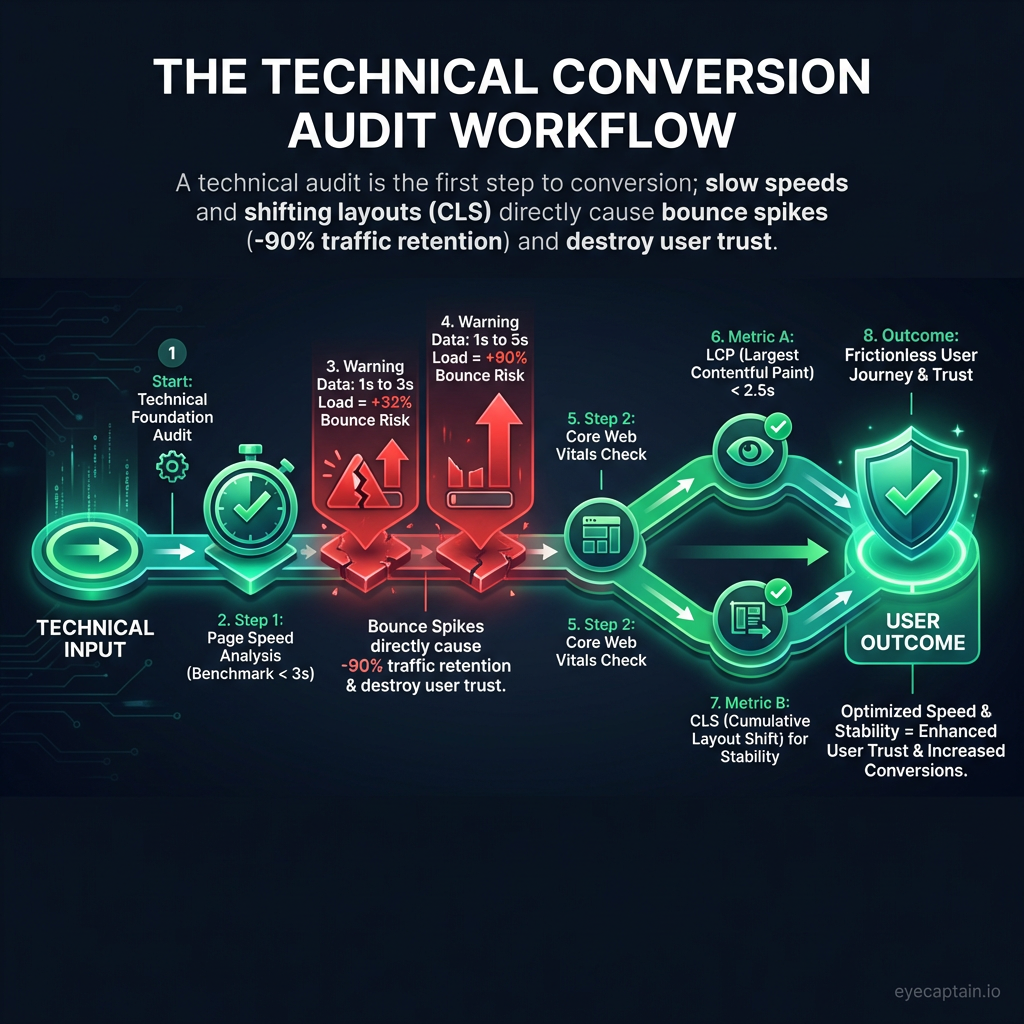
The technical foundation of your site isn't just for Google rankings; it directly impacts user trust and your ability to convert. A thorough technical audit for conversions looks at these critical areas.
Page Speed and Core Web Vitals
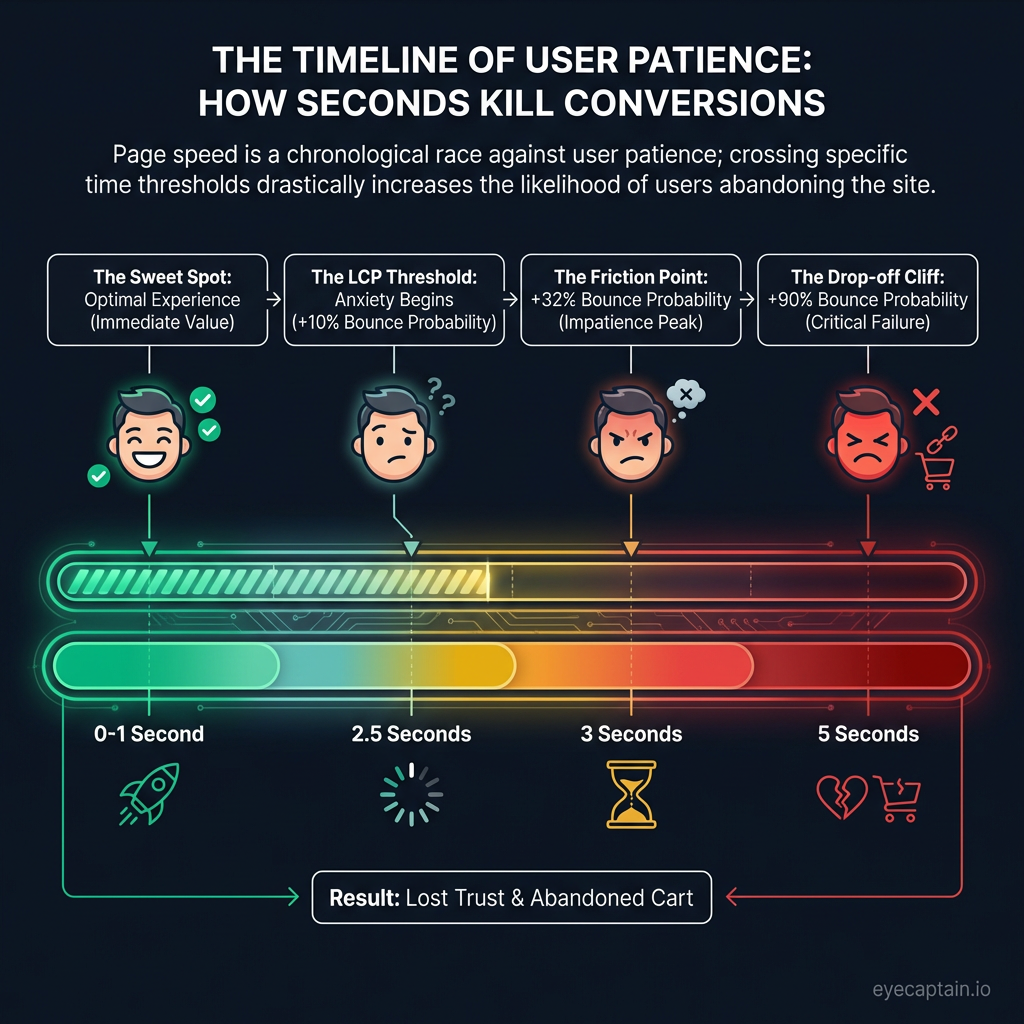
A slow site is the digital equivalent of a long line at the checkout - and it's a notorious conversion killer. Google's data reveals that as page load time goes from 1 to 3 seconds, the probability of a bounce skyrockets by 32%. At 5 seconds, that jump is 90%. Core Web Vitals are now a crucial part of the user experience:
- Largest Contentful Paint (LCP): If your main hero image or content block takes longer than 2.5 seconds to load, you're creating user anxiety.
- Cumulative Layout Shift (CLS): When buttons and links move as the page loads, you break user trust. People hate trying to click something that suddenly shifts away.
These metrics are a core part of any modern conversion rate audit. [Opportunity for internal link to a detailed guide on Core Web Vitals]
Mobile Usability and the 'Thumb Zone'
In 2026, 'mobile-friendly' is table stakes. True mobile usability means it's easy to use with one hand. During your audit, check that touch targets are at least 44px for easy thumb tapping and that forms trigger the correct keyboard (e.g., numbers for a phone field). Crucially, place primary call-to-action buttons within the 'thumb zone' - the area of the screen a user can comfortably reach.
Crawl Health and Security Signals
Crawl errors are missed revenue opportunities. A 404 error on a popular product page is like a locked door on Black Friday. Slow redirect chains frustrate impatient customers, and orphaned pages might contain high-converting content that no one can find. Furthermore, security is paramount. While an SSL certificate is standard, visual trust signals are what users see. A CXL (formerly ConversionXL) study found that moving security badges above the fold increased conversions by 42%. Any browser security warning is an instant deal-breaker, so ensure your certificates are always valid and you have no mixed content issues.
Content & Messaging Audit: Is Your Copy Converting?
You have less than 8 seconds to communicate your value. The Nielsen Norman Group found users form a first impression in just 50 milliseconds. If they can't instantly understand what you offer and why it matters, they're gone.
Value Proposition and Headline Clarity
In your content audit, prioritize clarity over cleverness. "Revolutionary Synergistic Platform" means nothing. "Reduce Customer Support Tickets by 40%" speaks directly to a pain point and demonstrates immediate value. Think about Slack's classic "Be less busy" or Dropbox's "Everything you need for work, all in one place." That’s clarity. Specifics build trust and make your case instantly.
Persuasive Product Descriptions & Strategic Social Proof
Great product descriptions anticipate and answer questions before they're asked, reducing purchase anxiety. Look at how a powerhouse like Amazon handles this by providing every conceivable detail. The placement of your social proof is also critical. A testimonial placed right next to the 'Add to Cart' button is far more effective than one buried on a separate page. A case study is perfect for users comparing options, but it's overkill for a first-time visitor. [Opportunity for internal link to a case studies page]
Readability and Scannability
No one reads a wall of text. To ensure your message lands, make your content highly scannable. Use clear headings, short paragraphs, bullet points, and bold text to guide the reader's eye to the most important information.