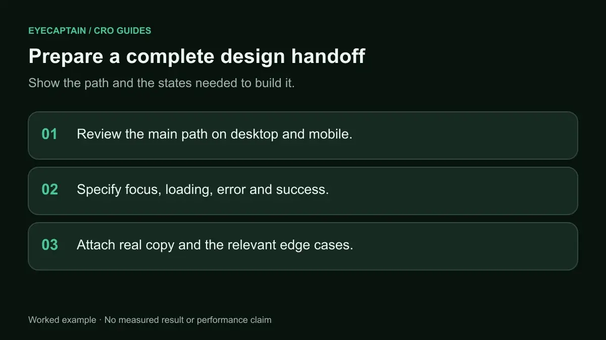

A design review checklist for conversion checks a Figma file for the problems that cost sales after launch: unclear hierarchy, a weak primary call to action, missing trust signals, undesigned states, a neglected mobile frame, and placeholder copy. Run it before developer handoff, when fixes take minutes in Figma instead of days in code.
Why review Figma designs for conversion before handoff?
Review before handoff because every conversion problem found in Figma is cheap, and the same problem found after launch is expensive. Once a page is built, changing a layout means tickets, development time, QA, and often a release cycle. In Figma, it means moving a frame.
Most design reviews focus on brand consistency and pixel accuracy. Those matter, but they do not ask whether a visitor will understand the offer and act on it. A conversion review asks different questions: what does a visitor see first, what are they asked to do, and what would stop them?
The checklist below is organized into six areas. Each one lists what to check and the specific thing to look for in the file.
What should a conversion design review checklist include?
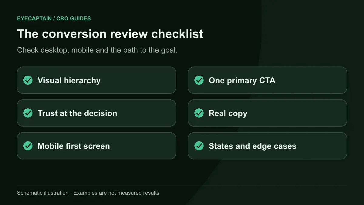
It should cover six areas: visual hierarchy, the primary CTA, trust and reassurance, component states, the mobile frame, and real copy. Use the table as a quick pass, then read the detail for each area.
| Area | Check | Pass looks like |
|---|---|---|
| Hierarchy | Squint test on the first screen | Headline and primary CTA are the two strongest elements |
| Hierarchy | One idea per section | Each section has a clear heading and a single point |
| CTA | One primary action per screen | Secondary actions are visibly weaker |
| CTA | Button label | Says what happens next, such as "Book a free consultation" |
| CTA | Contrast | Button text meets 4.5:1; button shape meets 3:1 against background (WCAG 2.2) |
| Trust | Proof near the decision | Reviews, guarantees, or logos sit next to the CTA, not only in the footer |
| Trust | Price and terms | Total cost, shipping, and cancellation terms are visible before commitment |
| States | Interactive components | Hover, focus, pressed, disabled, loading, error, and success are designed |
| States | Empty and edge cases | Empty cart, no search results, long names, and sold out variants exist |
| Mobile | Phone frame exists | A frame at a common phone width, not a scaled desktop |
| Mobile | Tap targets | Buttons and links are at least 24 by 24 CSS pixels (WCAG 2.2), ideally larger |
| Copy | No placeholder text | Real headlines, prices, labels, and error messages |

How do you check visual hierarchy in a Figma file?
Check hierarchy by blurring or zooming out on the first screen and asking what stands out. If the answer is not the headline and the primary CTA, the hierarchy is wrong.
Three quick ways to do this in Figma:
- Zoom out until text is unreadable. The shapes that still pull your eye are your real hierarchy.
- Apply a temporary layer blur to a duplicate of the frame and look at it for five seconds.
- Run a predictive attention heatmap on an exported frame to see which areas a model expects people to notice first. You can see how these work on the AI Predictive Attention page.
Common failures are a decorative illustration that outweighs the headline, a navigation bar with heavier color than the CTA, and a promo banner that competes with the offer. Also check each section below the fold: a heading, a short supporting line, and one visual is usually enough.
What makes a CTA ready for handoff?
A CTA is ready when it is the strongest interactive element on its screen, its label describes the outcome, and every state is designed. Check these points:
- Single primary action. If a screen has "Start trial," "Book demo," and "Contact sales" in the same weight, the visitor has to choose. Make one primary and style the others as secondary or text links.
- Specific label. "Submit" and "Learn more" say nothing. "Get my quote" or "See available times" tells people what they get.
- Contrast. WCAG 2.2 requires 4.5:1 contrast for normal text and 3:1 for user interface components. A pastel button with white text often fails both.
- Placement. The primary CTA should appear in the first screen on desktop and mobile, and again after long sections.
Where should trust signals sit in the design?
Trust signals should sit next to the moment of decision, not grouped at the bottom of the page. A visitor about to book or pay needs reassurance at that point, not three scrolls later.
Look for these in the file:
- A review summary, such as a star rating and review count, near the product title or CTA.
- Guarantees and policies, such as free returns or free cancellation, in one short line under the button.
- Security cues on payment and form steps, without crowding the form.
- Real photos of the team, location, or product in use, where relevant, instead of generic stock.
If the designer used placeholder logos or "Lorem ipsum" testimonials, flag it. Real proof is often shorter or less polished than the mockup suggests, and the layout needs to work with the real thing.
Which component states are most often missing?
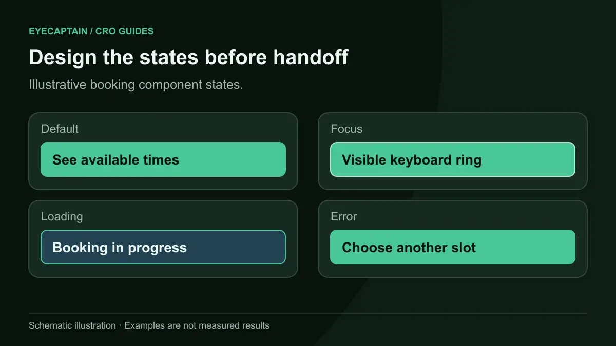
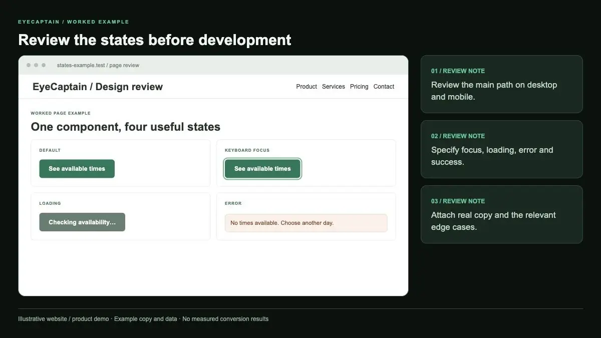
Error, loading, and empty states are the ones most often missing, and they are the ones that decide whether a visitor finishes a form or a checkout. Developers will build something for every state anyway. If it is not designed, it will be improvised.
- Form errors: inline messages next to the field, in plain language, that say how to fix the problem. Our post on form microcopy and error messages covers the wording.
- Loading: what the button looks like after it is pressed, so people do not tap it twice.
- Disabled: whether a disabled button explains why it is disabled.
- Focus: a visible focus ring for keyboard users.
- Empty and edge content: an empty cart, zero search results, a very long product name, and a sold out size.
What should you check in the mobile frame?
Check that a dedicated phone frame exists and that the first screen still shows the headline, the key value point, and the primary CTA. A desktop design squeezed to phone width usually pushes the CTA far below the first screen.