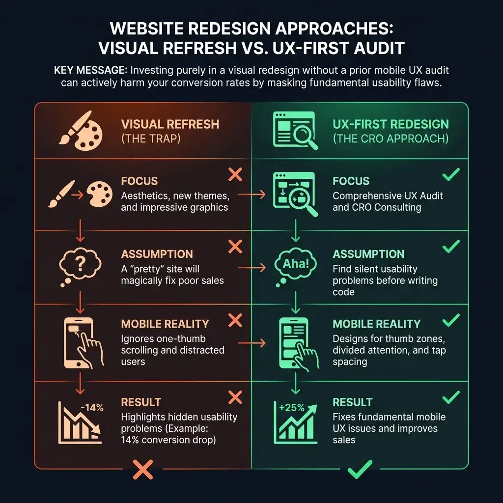

Thinking about a website redesign? Before you make a significant investment in a new look, it's crucial to perform a comprehensive UX audit using a detailed UX checklist. Many brands discover that a polished visual refresh fails to improve sales because it ignores fundamental mobile UX issues that frustrate customers. This was the case for one e-commerce owner who saw their mobile conversion rate drop by 14% after a costly redesign, a story that highlights the need for a user-centric approach over purely aesthetic changes.
Does this situation sound familiar? You're not alone.
Most business owners believe a visual refresh is the solution for poor sales, assuming a new theme will magically fix what drives shoppers away. The truth is, impressive graphics often just highlight hidden usability problems. Real conversion rate optimization (CRO) starts with a proper user experience audit. This is the foundation of effective CRO, and it's where expert CRO consulting begins: finding the silent problems that are frustrating your mobile customers before you write a single line of code.


Start Your Website Redesign with a Mobile UX Audit
People browsing on their smartphones behave differently than those on a desktop. They often operate in short bursts of attention, using one thumb to scroll while being distracted by notifications. Their attention is divided, and your site's mobile UX must account for this reality.
Consider the implications: their attention is divided.
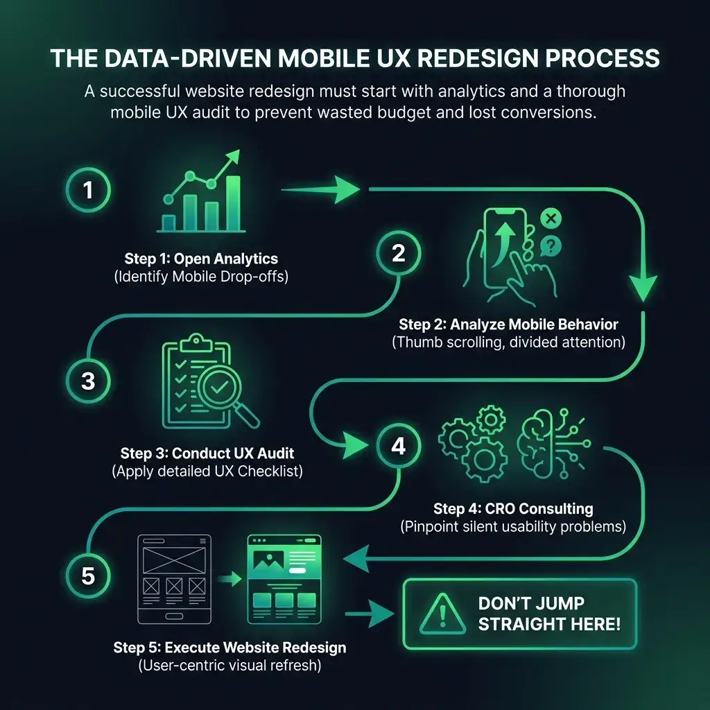
Data from the Baymard Institute shows that over half of leading retail websites fail to meet basic mobile design standards. When buttons are too close together, people mis-tap, get frustrated, and leave - often for good. So, where do you start your UX audit? Open your analytics and look specifically at your mobile traffic. Check the mobile bounce rate - the percentage of visitors who land on a page and leave without clicking anything. If your mobile bounce rate is significantly higher than your desktop rate, your site's navigation is a likely cause.
Common Mobile Navigation Issues for Your UX Checklist
Go ahead and view your online store on your phone. As you scroll, how much of your screen is taken up by the navigation bar? A proper UX checklist for your website redesign should scrutinize these common friction points:
- Sticky Header Intrusion: Headers that "stick" to the top of the screen can consume a third of the usable space, pushing product photos and pricing out of immediate view.
- Tap Target Size: Ensure your buttons and other tappable elements are at least 48x48 pixels in size. This standard helps prevent users from accidentally hitting the wrong link.
- Nested Menu Clutter: If a customer has to tap through three sub-menus to find a product like "running shoes," you've likely lost them. Hiding options behind multiple taps dramatically increases cognitive load and frustration.
Optimizing Mobile Product Pages: A Core Part of Your UX Audit
Your product pages have one primary goal: to turn a curious browser into a committed buyer. Yet, many redesigns focus on large lifestyle photos that push critical product details and the price completely off-screen on mobile devices. When someone arrives on your product page, they need immediate answers about sizes, colors, and shipping. Hiding these details inside collapsible tabs or accordions creates unnecessary friction.