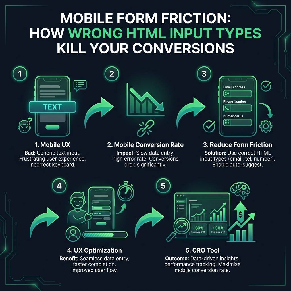

Are you losing potential customers on your mobile website? A poor mobile UX, especially during checkout, can severely damage your mobile conversion rate. Often, the issue is not your product or pricing, but simple form friction - a critical, yet easily fixable, problem that results in lost revenue every day. This guide will show you how to identify and resolve these issues for immediate results.
The Impact of Poor Mobile Form UX on Conversion Rates
Imagine a customer is ready to buy. They tap the "Phone Number" field on your checkout form, but instead of a number pad, they see the full text keyboard. This small moment of friction is a major problem. To enter their number, they must stop, find the key to switch keyboards, and navigate a small screen - likely while distracted on public transport or in a queue.
Many users will not complete this extra step. They will abandon their cart and close the browser tab. This is not a theoretical problem; it is a well-documented issue that directly reduces sales. This small flaw in your mobile user experience creates a significant barrier to purchase.
The Baymard Institute found that 23% of mobile users abandon forms because of frustrating input issues. It is a significant conversion barrier that is often overlooked.
The psychology is simple: every extra tap and unnecessary action creates doubt and frustration. The user thinks, "Why is this so difficult? Is this purchase worth the effort?" A few of these moments can turn a 30-second task into a frustrating ordeal. Improving this process is a fundamental part of UX optimization, as frustrated users do not convert.
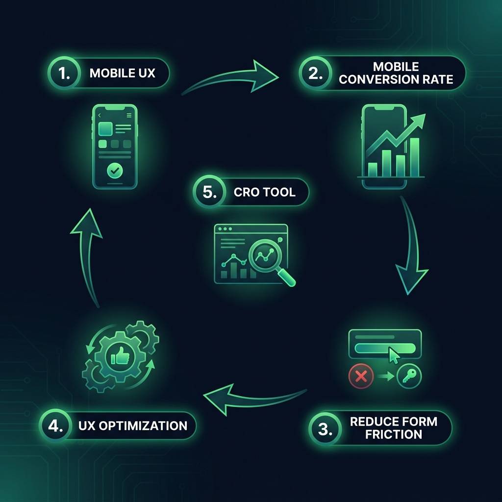

Practical UX Optimization: How to Reduce Form Friction on Mobile
The solution to this problem is straightforward. You can reduce form friction and improve your mobile checkout experience using basic HTML5 attributes. This type of technical adjustment is a cornerstone of effective conversion rate optimization (CRO).
The key is to use the correct input type for each form field. For a phone number, you should always use <input type="tel"> instead of a generic text input. This simple change ensures the user's device automatically displays a numeric keypad. This removes the need to search for keys, switch keyboards, and eliminates friction.
This same logic applies to other fields for a seamless user experience:
- Email: Use type="email" to display a keyboard with the "@" and "." symbols readily accessible.
- Numbers: For quantities or postal codes, type="number" provides a simple number pad.
- Dates: Use type="date" to activate the device's native calendar interface. This eliminates confusion over regional date formats (e.g., MM/DD/YYYY vs DD-MM-YYYY).
A surprising number of major websites fail to implement these basics. An audit of 200 e-commerce sites revealed that 68% were using the wrong input type for phone numbers, unknowingly damaging their mobile conversion rate.