
Infographic για digital marketing - οπτικοποίηση εννοιών copywriting for conversions, microcopy, reduce form friction
    eyecaptain.io

    Microcopy for Forms: How 'Insignificant' Words in Labels & Error Messages Save Your Conversions

    Your forms lose 67% of users before submission. Learn how microcopy in labels and error messages can recover those conversions instantly.

    EyeCaptain

    Dimitris

    26 August 2026

    3 min read
    1 views
    copywriting for conversionsmicrocopyreduce form frictionUX writinglead generation

    Did you know that a significant number of potential customers abandon online forms just before completion? This common challenge in lead generation is often not due to a lack of interest in your offer. Instead, it is frequently caused by friction from small, overlooked words in your user interface.

    The problem isn't always a long form or a weak value proposition. It's the small, seemingly insignificant text on your field labels, buttons, and error messages. This is the world of microcopy and UX writing. Mastering it is the key to turning hesitant visitors into confident customers by creating a smoother, more intuitive path to conversion.

    In fact, one major study of online checkout processes found that confusing microcopy caused more users to leave than concerns about payment security. Consider the impact of that finding: the words you place next to an email field can be more critical to gaining a customer than your security credentials.

    What is Microcopy? The UX Writing That Drives Conversions

    Microcopy refers to all the small pieces of instructional text within a user interface, especially on forms. This includes field labels, placeholder text, helper sentences, error messages, and button text. It is the functional copy that is often written quickly and then forgotten.

    But your users are not forgetting it. They are reading it carefully.

    Every field on your form prompts a series of small questions in the user's mind: What information should I enter here? Is this field required? What format is needed? Is it safe to provide this information? What happens when I click this button? When your microcopy fails to answer these questions instantly, it creates friction and uncertainty. One confusing label causes hesitation. A second creates doubt. A third may cause the user to leave entirely. This is why effective UX writing is essential to reduce form friction.

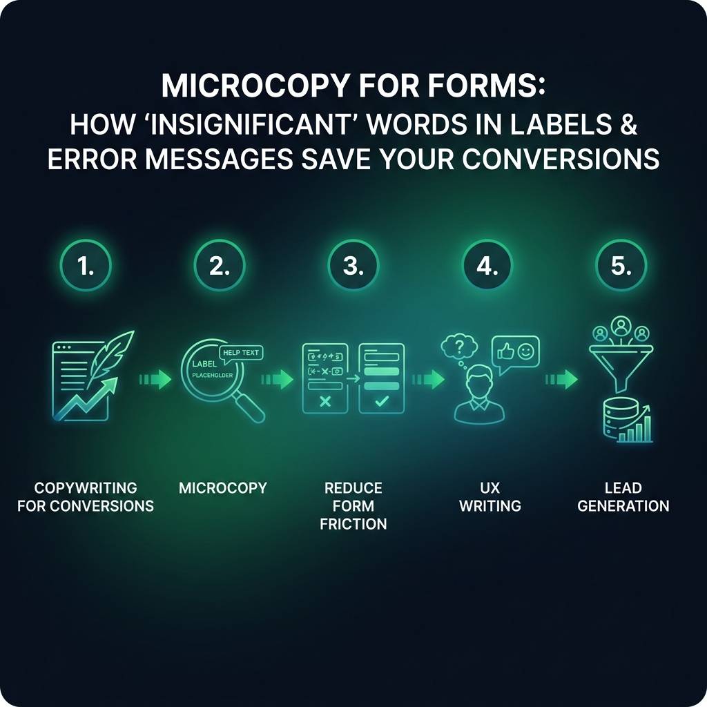
    Microcopy for Forms: How 'Insignificant' Words in Labels & Error Messages Save Your Conversions infographic showing copywriting for conversions, microcopy, reduce form friction for digital marketing
    EyeCaptain
    eyecaptain.io
    Researchers at the Nielsen Norman Group, a global leader in user experience, found that users can spend up to 42% of their time on forms just reading the microcopy, not filling in the fields. They are looking for reassurance and a clear path forward. Your role is to provide that clarity.

    Imagine a user encounters a field labeled "Phone." Their mind instantly considers potential issues: Is this required? Will I receive unwanted sales calls? Can I use my mobile number? Do I need to include my country code? If your copy doesn't address these concerns, they might abandon the form. However, changing the label to "Mobile number (for order updates only)" preemptively answers these questions, turning potential objections into confidence. This simple tactic can significantly reduce abandonment for that single field.

    How to Write Field Labels That Reduce Form Friction

    Generic labels like "Name" or "Email" can harm conversion rates because they force the user to pause and think. This hesitation is the very definition of form friction. Your copywriting for conversions must add context to eliminate this doubt.

    For example, compare the label "Email" with "Work email (for your invoice)." The second version is superior because it accomplishes three things at once: it specifies which email to use, explains why you need it, and sets a clear expectation. In one large-scale test, adding this purpose-driven context to form fields resulted in a 31% increase in completions. Your labels should eliminate questions, not create them.

    A Simple Checklist for Friction-Free Labels

    For every form field, ask if your microcopy clearly answers the following:

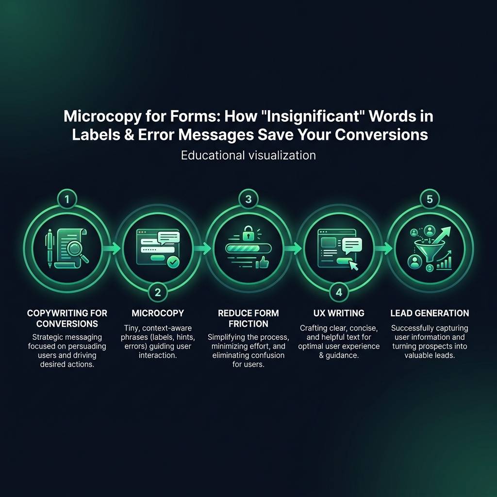
    Microcopy for Forms: How 'Insignificant' Words in Labels & Error Messages Save Your Conversions infographic showing copywriting for conversions, microcopy, reduce form friction for digital marketing
    EyeCaptain
    eyecaptain.io
    • Why do you need this information?
    • What will you do with it?
    • What format is required (e.g., date, phone number with country code)?
    • What will happen next?

    For a phone number field, testing "Mobile number (for 2FA security code)" against a simple "Phone" can improve conversions because it instantly removes the fear of unsolicited calls. Similarly, changing "Address" to "Shipping address" clarifies intent and consistently outperforms the generic label. This is not about adding more words; it is about providing absolute clarity to improve your lead generation.
    EyeCaptainEyeCaptain
    97%
    Conversions Booster

    Your visitors leave without converting

    Most websites lose 97% of their traffic without a single conversion. Our AI scans 200+ CRO elements to find exactly where visitors drop off.

    Hero CTA missing

    Transform Error Messages from Conversion Blockers to Saviors

    The moment an error message appears, you have only a few seconds to help the user correct their course before frustration leads them to abandon the form.

    Most default error messages are robotic and unhelpful, such as "Invalid email format" or "This field is required." They communicate failure without offering a solution.

    Now, contrast that with a message that says, "Please enter a valid email address, including the '@' symbol," or "Your password must be at least 8 characters long." The difference is profound. One message blames the user; the other guides them. This is a fundamental principle of good UX writing. Directive error messages - those that explain exactly how to fix the problem - have been shown to recover significantly more form submissions than generic ones.

    The timing of the message is also critical. The best practice is to validate input in real-time, immediately after a user moves away from a field. If the input is correct, display a positive indicator like a green checkmark. If it is incorrect, then display your helpful, corrective message in a supportive tone.

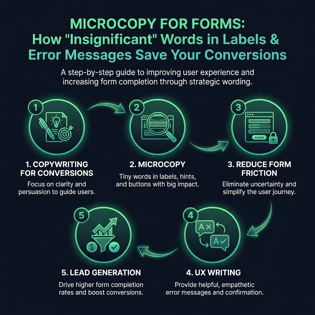
    Microcopy for Forms: How 'Insignificant' Words in Labels & Error Messages Save Your Conversions infographic showing copywriting for conversions, microcopy, reduce form friction for digital marketing
    EyeCaptain
    eyecaptain.io

    Button Copywriting for Conversions: The Final Step to Success

    For the sake of your conversion rates, please stop using the word "Submit" on your call-to-action buttons.

    The word "Submit" is vague and focuses on what the user is giving up, not what they are receiving in return. Your button is the final, crucial piece of your form's microcopy. It should reinforce the value of the action and drive your lead generation efforts.

    People do not want to "submit." They want to get the valuable item or service you promised. Your button text should reflect that outcome. Here are examples of button copy that consistently outperform "Submit" in tests:

    • Get Your Free Quote
    • Download the Guide
    • Start My Free Trial

    The pattern is clear: make the text outcome-focused, use active language, and be specific about the value exchange. In nearly 90% of A/B tests, buttons that specify what the user receives outperform those with generic verbs. These small words are the core of effective copywriting for conversions and can mean the difference between gaining a new customer and losing one to a competitor.

    Enjoyed this article?

    Join 1,500+ professionals getting weekly CRO & UX tips

    🎁 Bonus: Weekly CRO insights + exclusive resources

    No spam. Unsubscribe anytime.

    🚀 Boost Your Conversion Rate with EyeCaptain

    EyeCaptain is an AI-powered CRO & UX analysis tool that automatically scans your pages, identifies UX issues, and gives you actionable optimization suggestions to increase conversions. Try it for free, no card, no commitment.

    Free CRO Audit

    Did you find this helpful?

    Share it with someone who might find it useful.

    Be the first to learn CRO secrets

    Actionable tips, case studies & early access to new AI tools. Weekly in your inbox.

    1,200+ marketers trust us

    Cookie Settings

    We use cookies to improve your experience.