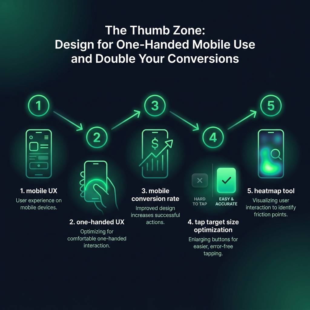

A Global Guide to One-Handed UX: Boost Your Mobile Conversion Rate
Is your mobile website truly designed for how people use their smartphones? For a significant 68% of your users, the answer is likely no. Key buttons and calls-to-action are often placed in screen locations they cannot comfortably reach with one hand, creating a frustrating mobile UX that can cause lost sales. This guide will explore how focusing on one-handed UX can dramatically improve your mobile conversion rate by making your site more intuitive and natural to use for a worldwide audience.
Why One-Handed Mobile UX is Crucial for Global Conversions
Influential research by Steven Hoober revealed a critical insight into mobile usage: nearly half of all users operate their phones with one hand, using their thumb to navigate. However, many mobile sites place their most important elements - like menus, search bars, and "Add to Cart" buttons - at the very top of the screen. This area, known as the "stretch zone," is difficult for the thumb to reach and creates unnecessary friction in the user journey.
This is not just an inconvenience; it is a significant obstacle to completing a purchase. The Baymard Institute found that a poor mobile user experience and difficult navigation are major reasons for cart abandonment globally. When a user has to constantly shift their grip or use two hands on a site that should be simple, they are more likely to abandon the process. Consider your own phone usage: your thumb naturally sweeps across the bottom of the screen in an arc. Excellent mobile UX works with this natural human movement, rather than against it.
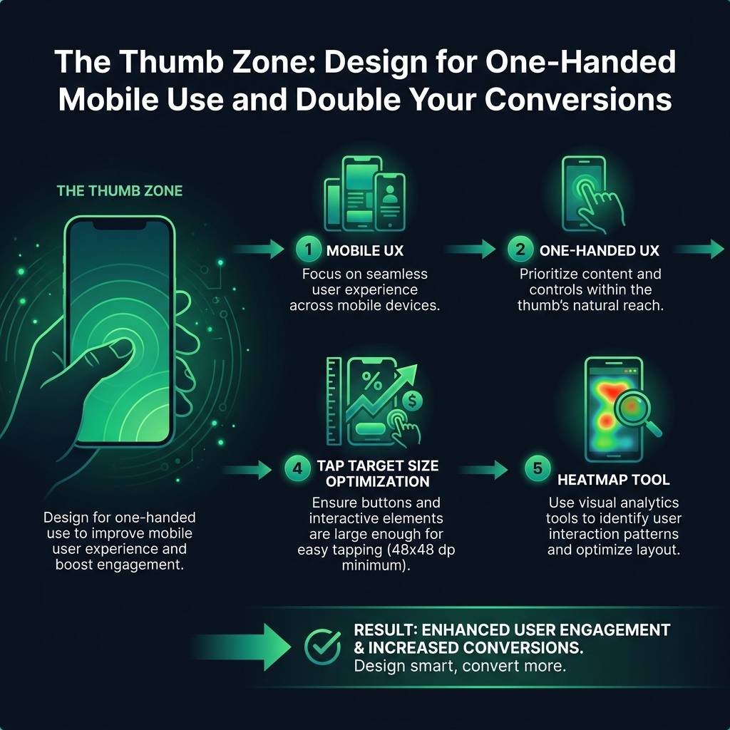

One e-commerce company saw its mobile conversion rate increase by 34% in just two weeks with a single change: they moved their primary checkout button from the top-right corner to the bottom-center of the screen, making it easily accessible for the thumb.
Designing for the Thumb: The Three Ergonomic Zones of a Mobile Screen
To optimize for one-handed use, it is essential to understand the three ergonomic zones of a mobile screen. Designing with these areas in mind ensures your most important actions are always within easy reach for users everywhere.
- The Natural Zone: This is the optimal area at the bottom of the screen, easily accessible to the thumb without any strain. This is the ideal location for your most critical calls-to-action, such as "Add to Cart," "Proceed to Checkout," or "Submit Form."
- The Stretch Zone: This is the middle and upper portion of the screen. Users can reach this area, but it requires a conscious effort to stretch their thumb or adjust their grip. Reserve this zone for secondary actions like account settings, wish lists, or less-frequently used navigation links.
- The Hard-to-Reach Zone: Located in the top corner opposite the user's thumb (e.g., the top-left for a right-handed user), this area is the most difficult to access. Users will naturally avoid interacting with elements here. Placing essential functions in this zone is a common mistake that severely hinders usability.
Remember that these zones are mirrored for left-handed users, so a truly effective global design often centralizes key controls at the bottom of the screen. Successful international apps like Instagram and Spotify master this by placing their main navigation and controls in a persistent bottom bar - a core principle of good one-handed UX.
Beyond Placement: Optimizing Tap Target Size
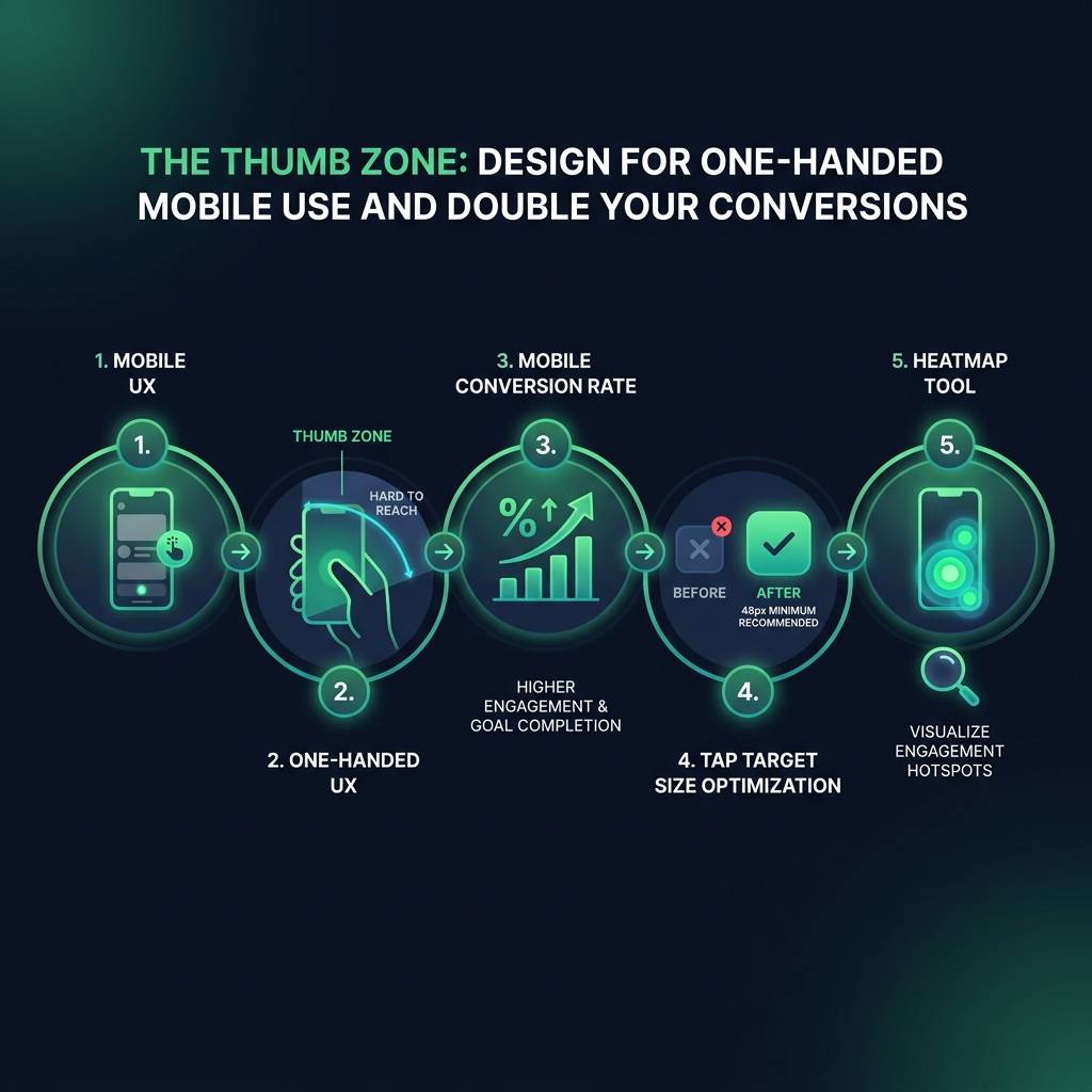
Positioning is only part of the equation; the size of your buttons is equally important. Effective tap target size optimization is critical for reducing errors and user frustration across all devices.