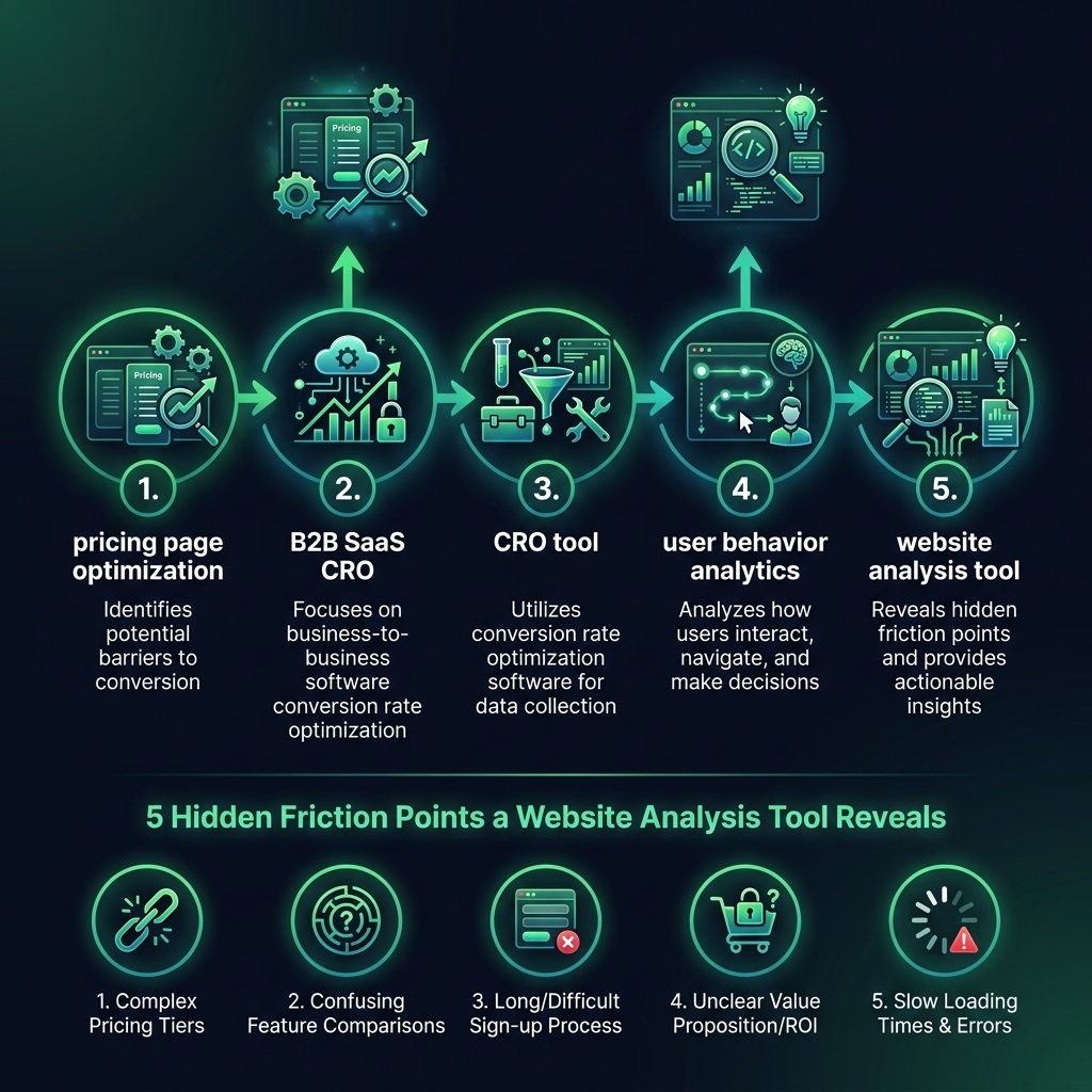

Is your B2B SaaS pricing page attracting visitors but failing to convert them into customers? This is a common challenge. Effective pricing page optimization is crucial because this is the final step where interested prospects decide to buy or leave. If your conversion rates are low, the issue is often not your price. It is more likely a clarity and user experience problem that a powerful user behavior analytics platform can help you solve by revealing exactly why visitors abandon the page.
Let's analyze your pricing page performance. By understanding where potential customers encounter friction, you can implement targeted changes to improve conversions and retain high-intent buyers.
Why Visitors Abandon Your Pricing Page: It's Not Just the Price
Most founders immediately assume their price is too high, but the situation is rarely that simple. While price is a factor, it is often not the main reason for page abandonment.
According to the Baymard Institute, direct price objections only cause about 23% of users to leave a SaaS pricing page. The other 77% leave due to confusion, friction, or cognitive overload. These are the invisible conversion blockers that negatively impact your revenue.
A comprehensive website analysis tool, one equipped with session replays and heatmaps, brings these issues to light. To leverage these insights, you need to know what to look for. Here is what is really happening when a potential customer views your pricing plans.
They are not reading every word; they are scanning. Their eyes move quickly between plan names, prices, and features, trying to find a mental shortcut to the best option. If they cannot understand the value proposition in seconds, they leave. On a user behavior analytics dashboard, this appears as chaotic mouse movement, frantic scrolling, and zero clicks on your call-to-action (CTA) buttons.
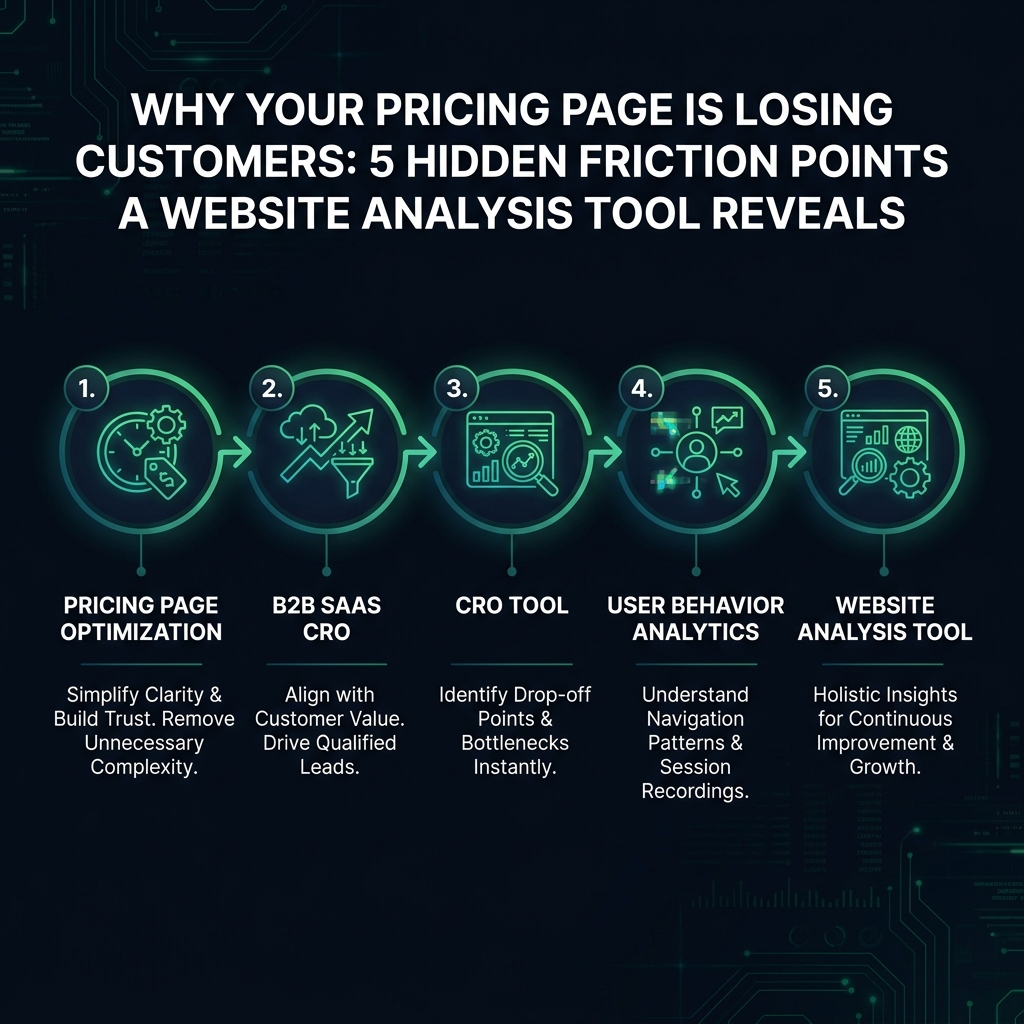

Comparison Paralysis: When Too Many Options Hinder Decision-Making
Imagine you have multiple tiers, each with a long list of features and subtle variations. This complexity can force prospects into "comparison paralysis." Unable to quickly determine the right plan for their needs, they decide to "think about it" - a decision that almost always leads to a lost sale.
Eye-tracking studies from the Nielsen Norman Group confirm this behavior. When users cannot easily differentiate between options in under 10 seconds, the abandonment rate can increase dramatically. The issue is not that your features are confusing, but that the mental effort required to compare them is too high at this critical decision-making stage.
Commitment Anxiety: The Hidden Fear Behind Your Call-to-Action
Your "Start Free Trial" button may seem harmless, but for a user, it can trigger a wave of questions: Do I need a credit card? Will I receive endless sales calls? How difficult is it to cancel? A dedicated CRO tool can reveal this hesitation by tracking behaviors like "rage clicks" or "hesitation hovering" over the CTA, where users click repeatedly or hover their mouse without clicking before retreating from the page.
Using a Website Analysis Tool to Uncover User Confusion
Session recordings are a cornerstone of B2B SaaS CRO because they show that users do not read a pricing page in a linear fashion. They jump between elements, scanning the headline, then the prices, then a feature list, then the FAQ, and back to the call-to-action (CTA). This is not random behavior - it is a search pattern.
Your prospects are looking for specific information that gives them the confidence to buy. When they cannot find it, the analytics tell a clear story: scroll depth and time on page may increase, but clicks on your CTAs remain at zero. They are stuck searching for answers, not actively considering a purchase.
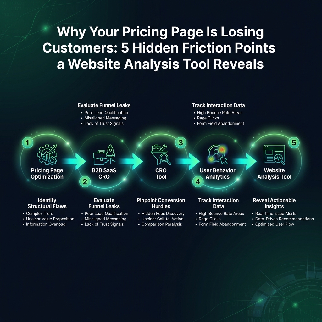
Lack of Context: When Feature Lists Create More Questions
Your plan might list "500 API calls per month." To a new buyer, that number is abstract and meaningless. Is 500 a large amount? Will they use it in one week or six months? User behavior analytics will show this as a mouse pointer hovering over that line item with no subsequent click. The user is stuck trying to translate your feature into their real-world needs.