EyeCaptain
Online Booking Conversion Rate: Fix Drop-Off in Your Flow

Online Booking Conversion Rate: Fix Drop-Off in Your Flow

Raise your online booking conversion rate: simplify service choice, show availability fast, handle deposits fairly, and use reminders to cut no-shows.

Dimitris Andreadakis

7 min read
118 views
online booking conversion ratebooking flow drop offappointment booking page optimizationreduce no-shows with remindersbooking deposit best practices

To raise your online booking conversion rate, cut the steps between "I want this" and "I'm booked": let visitors pick a service in one tap, show real availability right away, ask for details only after they choose a time, explain any deposit before checkout, and confirm instantly. Then use reminders so booked visits actually happen.

Where do people drop off in a booking flow?

People drop off at the points where they have to think, wait, or worry: choosing between confusing services, finding an open slot, filling in a long form, and paying a deposit they did not expect. Each step in the flow is a chance to leave, so the first job is to see which step loses the most people.

Set up your analytics so each step fires its own event: service selected, date selected, time selected, details submitted, payment completed, confirmation viewed. A funnel report on those events shows where the biggest gap sits. Fix that step first.

StepCommon cause of drop-offFirst fix to try
Service choiceToo many options, internal names, no prices or durationsGroup services, show price and duration on each
AvailabilityCalendar opens on a fully booked week, slow loadingJump to the first open slot, show "next available"
Details formAccount creation required, too many fieldsGuest booking with name, email, phone
Deposit or paymentSurprise charge, unclear refund rulesState the deposit and cancellation terms before this step
ConfirmationNo clear "you're booked" message, no emailInstant confirmation page plus email with calendar file

How should you present service choices?

Present services in a short, grouped list where each option shows what it is, how long it takes, and what it costs. Visitors stall when they cannot tell the difference between "Signature Treatment" and "Deluxe Experience", or when they are afraid of booking the wrong thing.

  • Use customer words, not internal names. "Men's haircut, 30 min, $35" beats "Gents Classic".
  • Group by need. Hair, color, treatments. Or new patient, follow up, emergency.
  • Show the most booked services first. Put rare add-ons later in the flow.
  • Offer a "not sure" path. A "Consultation" or "Help me choose" option catches people who would otherwise leave.
  • Allow booking straight from the service page. If a visitor is reading about a massage, the "Book this" button should open the flow with that service already selected, not send them back to step one.

EyeCaptain
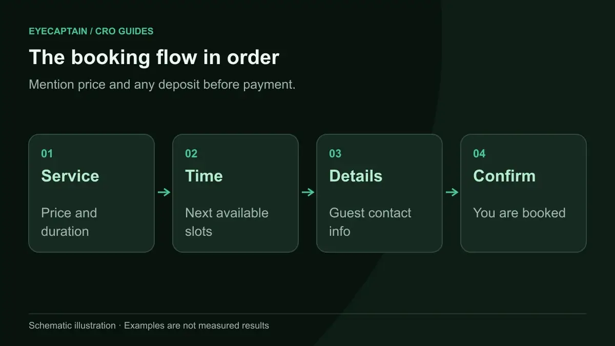
The booking flow in order. Mention price and any deposit before payment.

How should the availability calendar work?

The availability calendar should show bookable times in the first view, without making the visitor hunt through empty days. A calendar that opens on today, when today and tomorrow are full, tells the visitor "nothing available" even when next week is wide open.

Practical rules for the calendar:

  • Open on the first date that has slots, or show a "Next available: Thursday 10:00" button above the calendar.
  • Grey out fully booked days so visitors do not tap them and find nothing.
  • Show time slots as large buttons, grouped into morning, afternoon, and evening. Small dropdowns of times are hard to use on phones.
  • Show the time zone if you serve customers in more than one, especially for video appointments.
  • Load fast. If the calendar fetches availability from a slow third party widget, visitors stare at a spinner. Interaction speed matters here, and our INP optimization guide covers how to measure it.
  • Hold the slot briefly once chosen, so it does not disappear while the visitor types their details.

If you have several staff members, let visitors choose "Any available" as the default. Requiring a staff choice first hides open slots from people who do not care who they see.

What details should you ask for, and when?

Ask for contact details only after the visitor has chosen a service and a time, and ask only for what you need to deliver the appointment. At that point the visitor is invested and has a specific slot to protect, so they are more willing to fill in a form.

For most businesses, name, email, and mobile number are enough. The mobile number is worth asking for because it powers text reminders. Skip forced account creation: offer an optional "save my details for next time" after the booking is confirmed. The same logic applies here as in ecommerce, which our post on guest checkout vs forced registration explains.

If you need intake information, such as medical history or a pet's breed, collect it in a follow up form sent with the confirmation, unless it changes which slot or service they can book.
EyeCaptain
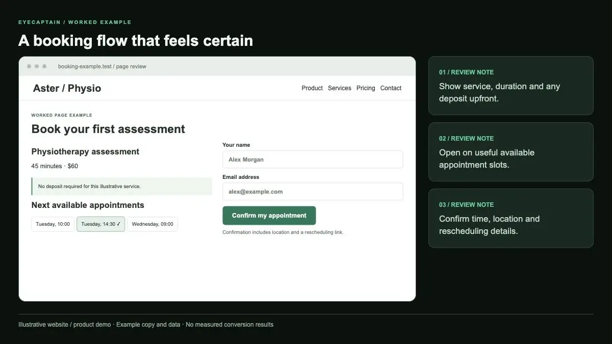
A booking flow that feels certain. Show service, duration and any deposit upfront. Open on useful available appointment…

Should you take a deposit for online bookings?

Take a deposit when no-shows or late cancellations cost you real money, such as long appointments, limited tables, or prepared materials, and skip it for short, low cost visits where a reminder does the job. A deposit adds friction at the booking step, but it also makes the booking feel more committed.

If you take one, handle it fairly:

  1. Mention the deposit on the service list, next to the price, so it is not a surprise at payment.
  2. State the cancellation rule in one sentence before the payment step, for example "Free cancellation up to 24 hours before. After that the deposit is kept."
  3. Keep the amount proportionate to the cost of a missed slot, not the full price unless that is normal in your industry.
  4. Offer fast payment methods, such as saved cards and wallet payments, so the deposit step takes seconds.
  5. Show the amount and the remaining balance on the confirmation page and email.

A card hold, where you save the card and only charge for a no-show, is a softer middle ground some businesses use.

EyeCaptainEyeCaptain
Conversions Booster

Your visitors leave without converting

Most websites lose 97% of their traffic without a single conversion. Our AI scans 200+ CRO elements to find exactly where visitors drop off.

Hero CTA missing

What should the confirmation include?

The confirmation should tell the visitor, instantly and without doubt, that they are booked, and give them everything they need to show up. A vague "Thanks for your request" makes people wonder whether they need to wait for approval, and some book elsewhere.

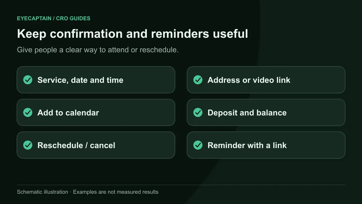
  • A clear "You're booked" heading with service, date, time, staff member, and address or video link.
  • An "Add to calendar" button and a calendar file in the email.
  • Directions, parking, or what to bring.
  • A one tap link to reschedule or cancel. Making cancellation easy sounds risky, but it frees the slot for someone else instead of creating a silent no-show.
EyeCaptain
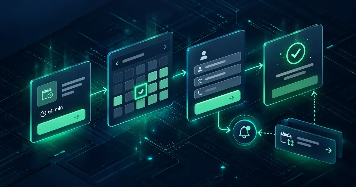
Keep confirmation and reminders useful. Give people a clear way to attend or reschedule.

How do reminders reduce no-shows?

Reminders reduce no-shows by bringing the appointment back to mind and giving people an easy way to reschedule instead of skipping. A common pattern is an email at booking, a reminder a day or two before, and a text message a few hours before.

  • Include the reschedule link in every reminder. A rebooked slot is better than an empty one.
  • Ask for a confirmation reply on the day before reminder for long or high value appointments.
  • Send a waitlist offer when a slot frees up, so cancellations get filled.
  • Follow up after no-shows with a friendly rebooking link rather than silence.

What does a fixed booking flow look like?

Take a hypothetical physiotherapy clinic. Its current flow: a "Book now" button opens a page asking the visitor to choose a practitioner from six photos, then a service from twelve options with internal names, then a calendar opening on today, which is full. After that comes account creation, a card payment for the full fee, and a page saying "Your request has been received".

The fixed flow:

  1. Service first, with four grouped options: "New injury assessment, 45 min", "Follow up treatment, 30 min", "Sports massage, 60 min", and "Not sure, book a call".
  2. Practitioner defaults to "Any available", with names as an optional filter.
  3. The calendar opens on the next open day, with times as large buttons.
  4. Guest details: name, email, mobile. Health questionnaire moves to the confirmation email.
  5. A deposit only for new assessments, mentioned on the service card, with the 24 hour rule stated above the payment field.
  6. A "You're booked" page with calendar buttons, plus email and text reminders that include a reschedule link.

Key takeaways

  • Track each booking step as an event and fix the step with the biggest drop first.
  • Show services with price and duration, and open the calendar on the first available slot.
  • Ask for details after the time is chosen, and never force account creation.
  • State deposits and cancellation rules early, and confirm instantly with a reschedule link.
  • Use reminders with easy rescheduling to turn bookings into attended visits.

For more booking specific fixes, see the booking site CRO overview, or run a free CRO audit on EyeCaptain on your booking page to get ranked changes.

EyeCaptain
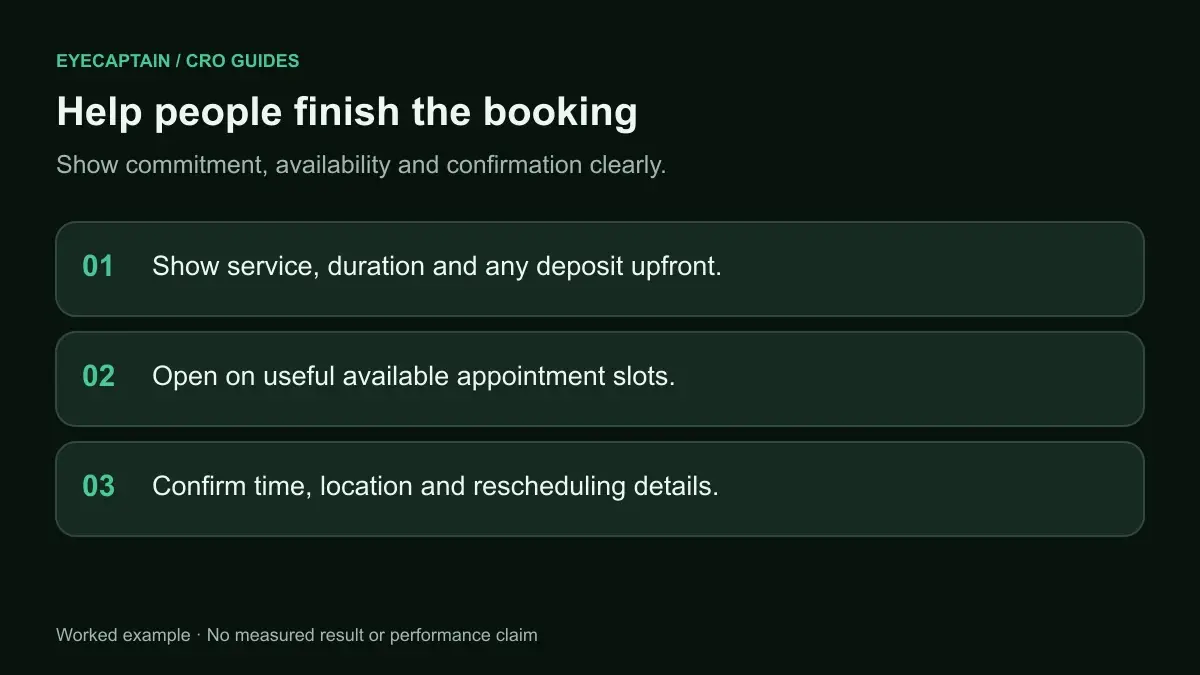
Help people finish the booking. Show commitment, availability and confirmation clearly.

Frequently asked questions

What is a good online booking conversion rate?

It depends heavily on your traffic source, industry, and how you define a conversion, so a single benchmark is misleading. Compare against your own history instead: bookings divided by visitors who reach the booking page, tracked weekly. Then measure each step of the flow so you know whether a change in rate comes from more interest or less friction.

Should I use a third party booking widget or build my own?

A third party widget is usually faster to launch and handles calendars, payments, and reminders. The trade-off is less control over design, speed, and tracking. Check that the widget works well on mobile, loads quickly, lets you track each step in your analytics, and supports guest booking. If it fails those checks, look at other tools before building your own.

Do online booking customers prefer to call instead?

Some do, especially for complex or urgent needs, so keep a visible phone number on the booking page. But many people book outside opening hours and prefer not to call. Offering both lets each visitor choose. Track phone calls from the page too, so you do not mistake a shift to calls for a drop in demand.

How far ahead should customers be able to book online?

Far enough to cover how your customers plan, which is often a few weeks for services and longer for events or travel. Too short a window frustrates people who plan ahead. Too long a window can fill your calendar with bookings that are more likely to be forgotten. Pair longer windows with stronger reminders.

Enjoyed this article?

One short email a week with practical CRO and UX tips

No spam. Unsubscribe anytime.

Find what stops your visitors from converting

EyeCaptain is an AI-powered CRO & UX audit tool that automatically scans your pages, identifies UX issues, and gives you actionable optimization suggestions to increase conversions. Try it for free, no card, no commitment.

Free CRO Audit
Share this article
LinkedIn X

About the author

Founder of EyeCaptain. Writes about conversion rate optimization, UX analysis and the neuromarketing behind pages that actually sell.

More articles by Dimitris Andreadakis