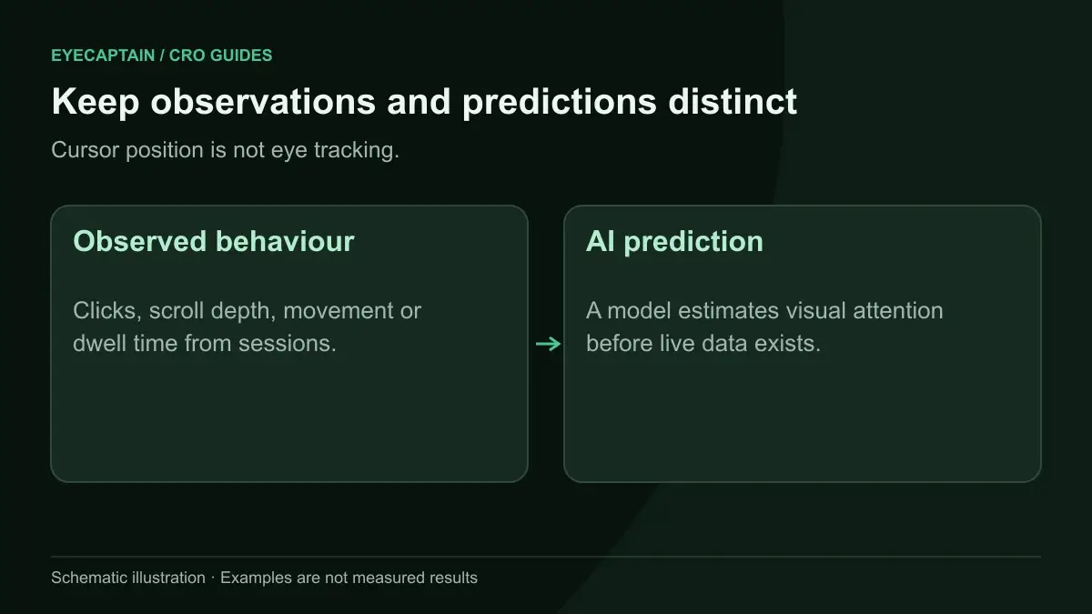


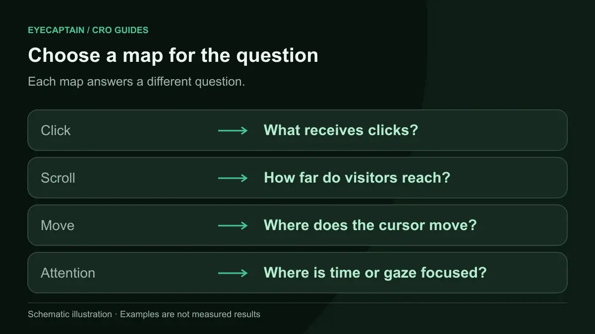
There are five main types of website heatmaps: click maps, scroll maps, move (hover) maps, attention maps, and predictive AI Predictive Attention. Click, scroll, and move maps record what real visitors did. Attention maps show where people spent time. Predictive heatmaps estimate where eyes will land before any traffic arrives. Each answers a different question, so pick by question.
What are the main types of heatmaps for websites?
Website heatmaps fall into two families: behavioral heatmaps built from recorded visitor sessions, and predictive heatmaps generated by a model from a screenshot of the page. Behavioral maps tell you what happened. Predictive maps tell you what is likely to happen at first glance. Both use warm colors for more activity and cool colors for less, but the data underneath is very different.
If you want a full walkthrough of reading these maps once you have them, the heatmap analysis guide covers the process. This article is about choosing the right type in the first place.
What does a click map tell you, and what does it miss?
A click map tells you which elements visitors try to interact with and which they ignore. It is the most direct signal of intent on a page, because a click is a decision.
Use it to answer questions like these:
- Is the primary call to action getting the clicks, or is a secondary link stealing them?
- Are people clicking things that are not links, such as product images, icons, or bold text?
- Which navigation items get used, and which could be removed?
What a click map misses: it says nothing about elements people saw but did not click, and nothing about why. A low click count on a button could mean the button is invisible, the offer is weak, or visitors already got what they needed. Click maps also need volume. With a few dozen sessions, the pattern is noise. Repeated clicks on a dead element are a separate frustration signal worth filtering for.
What does a scroll map tell you, and what does it miss?
A scroll map tells you what share of visitors reached each depth of the page. It shows where attention drops off, which is often a sharp line rather than a gentle fade.
Scroll maps are good for deciding where to place content. If most mobile visitors never reach your shipping and returns block, that block is doing no work. Move it up or summarize it near the price. A sudden drop usually points to a false bottom: a full-width banner, a big gap of white space, or a section that looks like a footer.
What a scroll map misses: reaching a section is not the same as reading it. Fast scrollers pass content without processing it. Scroll maps also blur together very different visits, such as a buyer who scrolled to check reviews and a bouncer who flicked down and left. Our article on scroll map analysis and above the fold optimization goes deeper on reading the drop-off line.

What does a move map tell you, and what does it miss?
A move map, also called a hover map, tells you where desktop visitors moved and rested the mouse cursor.
Move maps help with long comparison tables, pricing grids, and forms, where you want to see which rows or fields get attention before a click happens.
What a move map misses: the link between cursor and eyes is loose. Many people park the mouse and read elsewhere. Move maps also do not exist on touch devices, so on a mobile heavy site they describe a minority of visitors. Treat them as supporting evidence, never as proof of what people looked at.
What does an attention map tell you, and what does it miss?
An attention map tells you which parts of the page stayed in the visible viewport the longest, combining scroll position with time on page. It answers the question "where did people actually stop?"
This is useful on long pages such as articles, landing pages, and SaaS feature pages. If the hottest band is a testimonial block halfway down, that content is resonating.
What an attention map misses: time in view is not the same as interest. A visitor may leave a tab open and walk away, or stop because a section is confusing. Attention maps also depend on traffic volume, like every other behavioral map.
What is a predictive (AI) heatmap, and when is it useful?
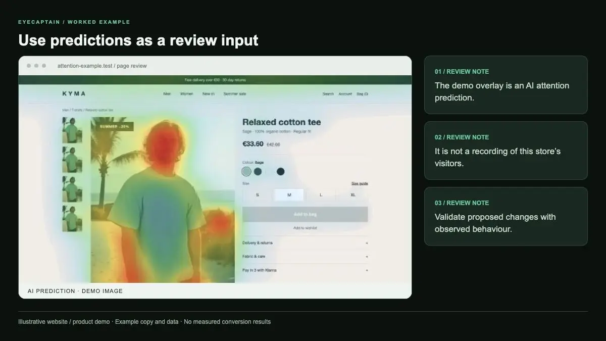
A predictive heatmap is generated by a model that estimates where people will look in the first few seconds on a page, using visual features like contrast, faces, text size, color, and position. It needs no traffic and no tracking script, only the page itself.
That makes it the right tool in situations where behavioral maps cannot help:
- Before launch, when a new landing page or redesign has zero visitors.
- On low traffic pages, where it would take weeks to collect enough clicks.
- When you need a fast check of visual hierarchy, such as whether the headline and primary CTA win the first glance.
- When comparing two design variants before you spend traffic on an A/B test.
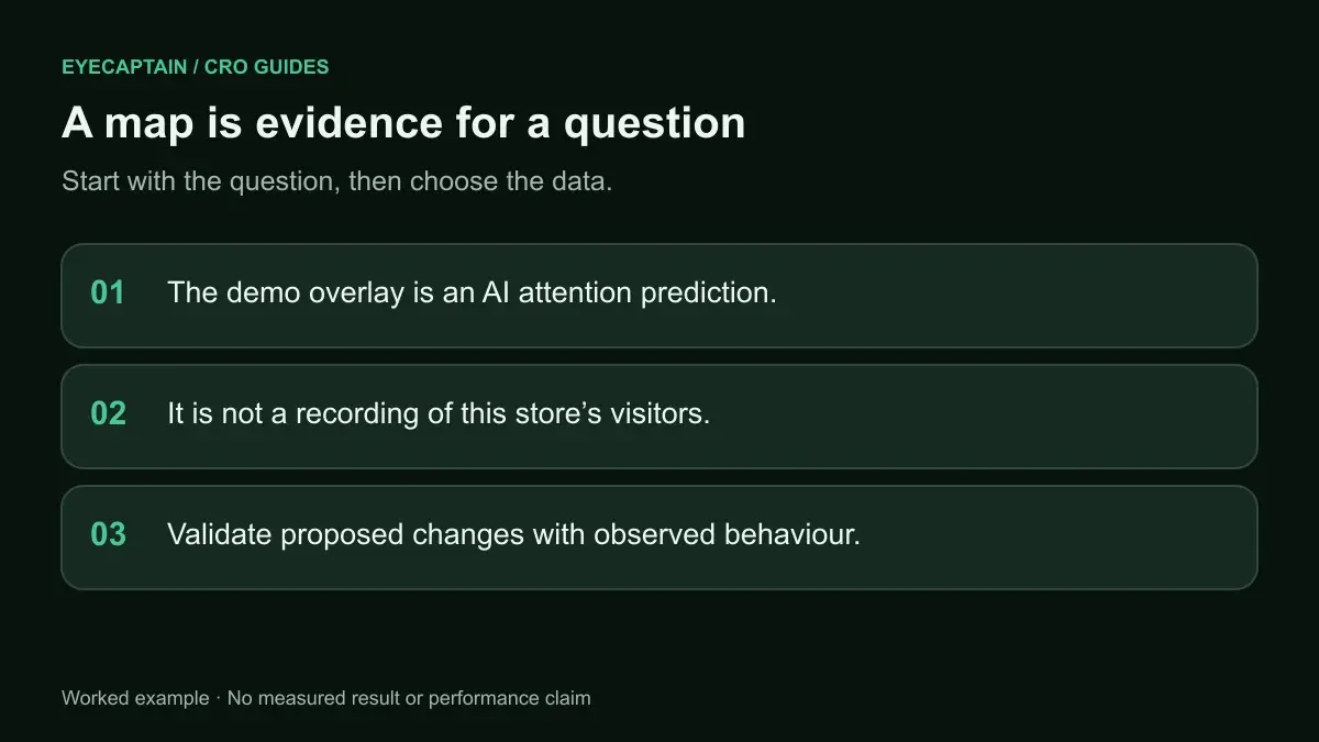
What a predictive heatmap misses: it models first impressions, not intent or behavior over time. It cannot tell you that visitors clicked a fake button, scrolled past your reviews, or abandoned a form. It is a forecast of visual salience. You can read more about how these models work in our post on AI attention heatmaps, and see an example of the output on the AI Predictive Attention feature page.