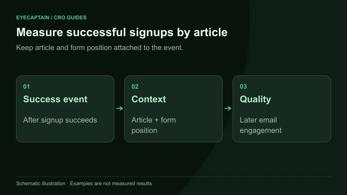


To increase newsletter signups on a content site, place a form inside the article where readers are most engaged, add one at the end of every post, and use a polite slide-in rather than an instant pop-up. Promise something specific, ask only for an email, and track signup rate per article so you can fix the pages that underperform.
Why do most blog signup forms underperform?
Most blog signup forms underperform because they sit where readers are not looking and ask for an email without a reason to give it. A sidebar box that says "Subscribe to our newsletter" is easy to ignore on desktop and often disappears entirely on mobile, where the sidebar drops below the footer.
The other common problem is timing. A full screen pop-up that appears before the reader has read a single paragraph interrupts them before they know whether your writing is worth subscribing to. The fix is to match the ask to the moment: ask when the reader has just received value, and ask in the space they are already reading.
Where should you place a newsletter signup form?
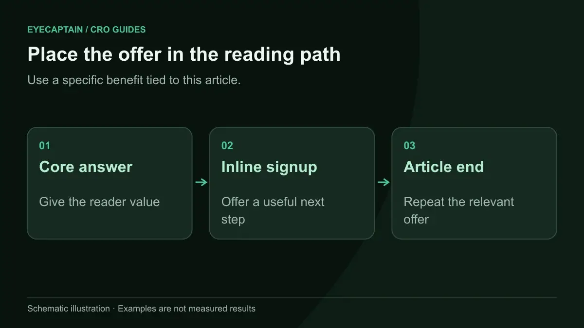
Place the main signup form inline in the article body and at the end of the article, then add one gentle, delayed prompt such as a slide-in. Those positions sit in the reader's path instead of beside it. Here is how the common placements compare:
| Placement | Strength | Weakness | Use it when |
|---|---|---|---|
| Inline, mid-article | Seen by engaged readers in the content flow | Can feel intrusive if styled like an ad | Posts long enough that readers scroll past the first screen |
| End of article | Reaches readers who finished, the most engaged group | Missed by readers who leave early | Always, on every post |
| Slide-in | Noticeable without blocking the text | Annoying if it appears instantly or returns after dismissal | Triggered by scroll depth or time, shown once per visitor |
| Exit intent pop-up | Catches desktop readers about to leave | Does not work reliably on mobile | As a secondary desktop prompt |
| Sidebar | Always visible on desktop | Ignored by many readers, hidden on mobile | As a backup, never the only form |
| Header bar or homepage hero | Visible to new visitors | Competes with navigation | For sites where the newsletter is the main product |
For the inline form, a good spot is right after the section that delivers the core answer, often a third to halfway down the post. A scroll map tells you how far most readers actually get, so you can place the form before the big drop, not after it.
On mobile, check that slide-ins and pop-ups do not cover the text. Google's guidance on intrusive interstitials warns against pop-ups that block the main content on mobile when a visitor arrives from search, so a small slide-in or inline form is the safer choice.

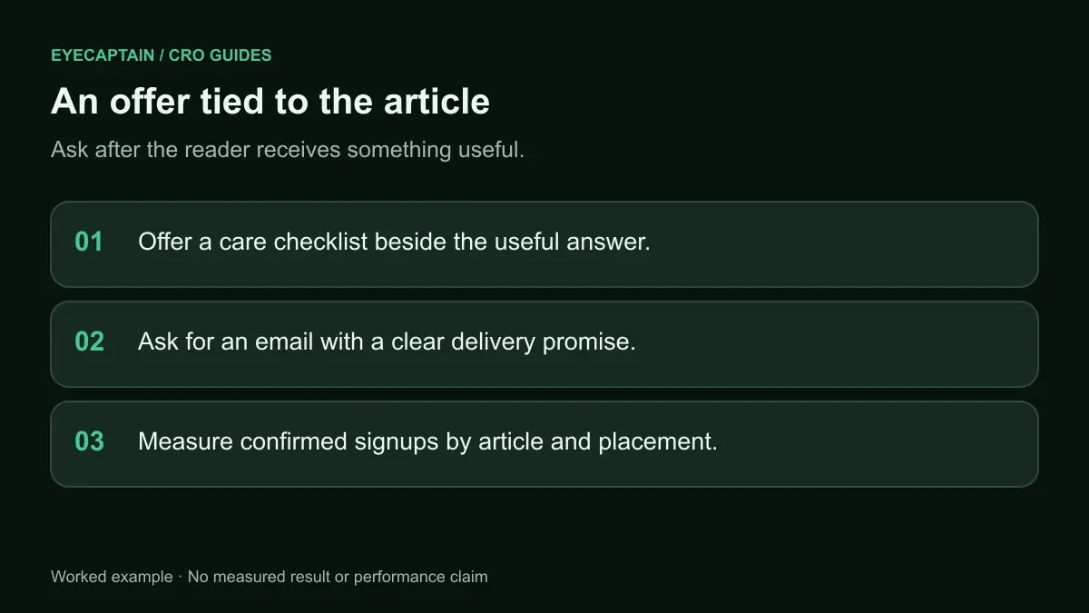
What offer gets more people to subscribe?
The offer that works best is a specific promise about what arrives in the inbox, matched to the article the reader is on. "Subscribe to our newsletter" describes an action, not a benefit. Readers need to know what they get, how often, and why it is worth the space in their inbox.
Ways to make the offer concrete:
- Describe the content and frequency. "One practical gardening task every Friday, in under 3 minutes of reading."
- Match the topic of the article. On a post about sourdough, offer "Get the weekly bake plan" rather than a generic site newsletter.
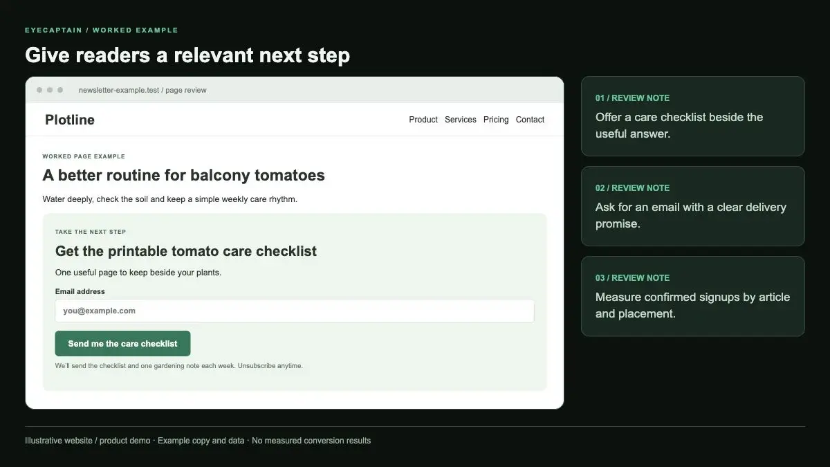
- Use a content upgrade on top posts. A checklist, template, or printable version of the article, delivered by email. It works because the reader already wants exactly that.
- Show a sample. A link to the latest issue lets a cautious reader judge quality first.
- Add honest proof. A subscriber count, if it is real and impressive, or a short line from a reader who agreed to be quoted.
How should the signup form be designed?
The signup form should ask for an email address only, use a button that names the benefit, and say clearly what happens next. Every extra field, such as first name, adds effort for little gain on a newsletter.
- One field: email, with the correct email keyboard on mobile.
- A specific button label: "Send me the Friday tips" instead of "Submit" or "Subscribe".
- A short reassurance line: "One email a week. Unsubscribe anytime." This answers the main worry, getting spammed.
- A visual style that fits the article but is distinct enough to notice. If it looks like a banner ad, readers skip it by habit.
- A clear success state: replace the form with "Check your inbox to confirm" so readers know to look for the confirmation email if you use double opt-in.
Mind privacy rules where your readers live. Under GDPR, consent for marketing email has to be freely given and specific, so do not pre-tick boxes or bundle newsletter consent into something else.
How do you measure signup rate per article?
Measure signup rate per article by dividing the signups that happened on each article by the unique readers of that article, over the same period. Sitewide signup totals hide the real story: a handful of posts usually drive most subscribers, and some high traffic posts barely convert.