
Infographic για digital marketing - οπτικοποίηση εννοιών ecommerce CRO, increase conversion rate, A/B testing
    eyecaptain.io

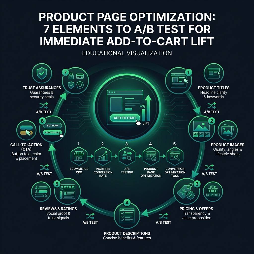
    Product Page Optimization: 7 Elements to A/B Test for Immediate Add-to-Cart Lift

    Your product pages get views but no adds to cart? Test these 7 elements and watch your conversion rate climb by 30-50% in weeks.

    EyeCaptain

    Dimitris

    21 June 2026

    5 min read
    225 views
    ecommerce CROincrease conversion rateA/B testingproduct page optimizationconversion optimization tool

    Struggling to turn website traffic into sales? You're not alone. Mastering ecommerce CRO (Conversion Rate Optimization) is the key to transforming your online store's performance. This guide provides actionable strategies for product page optimization to help you increase your conversion rate and stop losing customers just before they decide to buy. We'll explore the simple, testable changes that can dramatically boost your revenue without needing a complete website redesign.

    It's a common scenario: visitors land on your product page, scroll around, admire your images, and then leave without making a purchase. The difference between a high-performing page and one with low sales often comes down to a few simple adjustments. Industry benchmarks for add-to-cart rates often fall between 8-12%; if your rate is below this range, it's time to focus on conversion optimization.

    Product Page Optimization: Start with Your Images

    Your main product image is the first critical factor that determines whether a shopper stays or leaves. Research from the Baymard Institute found that 56% of shoppers have abandoned a purchase because the product photos were not sufficient. The goal isn't just to have more images, but the right images in the right order.

    The First A/B Test: Lifestyle vs. Isolated Shots

    Where should you begin your A/B testing? Test a lifestyle photo against a clean, isolated product shot for your primary image. You might be surprised by the results. An isolated image on a simple white background often works best for functional items where technical details are important, like electronics or tools. However, for aspirational products like fashion, home decor, or outdoor gear, a lifestyle shot showing the product in use typically performs better.

    Use your preferred conversion optimization tool to run this test for at least a week, ensuring you have a significant sample size (for example, 1,000+ visitors per version). Monitor not just the add-to-cart rate, but also the average time spent on the page. A longer visit without a purchase could indicate that your price, not your images, is the issue.
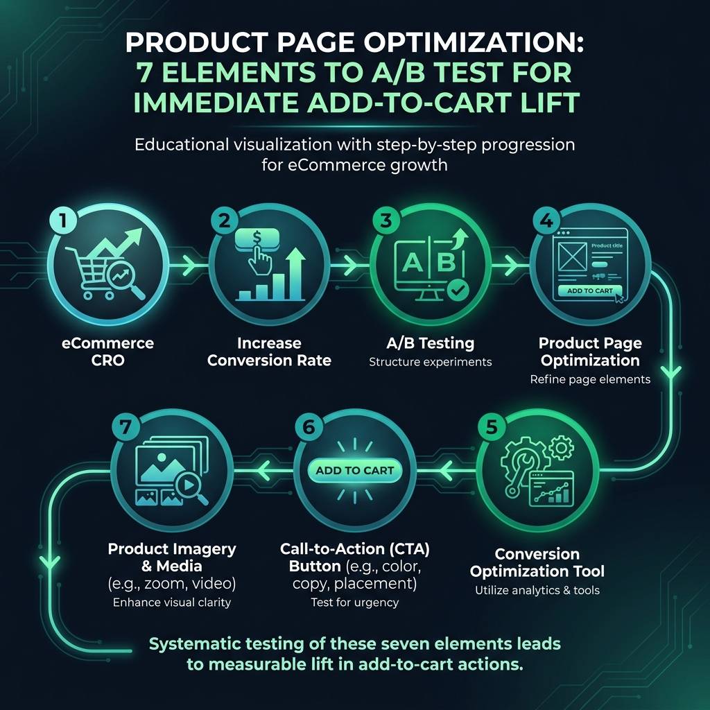

    Product Page Optimization: 7 Elements to A/B Test for Immediate Add-to-Cart Lift infographic showing ecommerce CRO, increase conversion rate, A/B testing for digital marketing
    EyeCaptain
    eyecaptain.io

    Finding the Optimal Number and Angle for Images

    Next, test the number of images you display. Research from the Nielsen Norman Group suggests the ideal range is between five and seven photos. Any fewer, and you risk not providing enough information; any more, and you can cause decision fatigue. Test five versus seven images on your top-selling products to see which number helps to increase the conversion rate.

    Here is an expert tip: instead of focusing only on image quality, test the image angle. For physical goods, a shot from a 45-degree angle that shows depth can outperform a flat, straight-on shot by 18-25%. A photo from your smartphone, taken from the right angle, can easily be more effective than a professional but uninspired flat shot.

    Crafting Product Descriptions to Increase Conversion Rate

    Your product description has one primary function: to answer the unasked questions that prevent someone from buying. Most descriptions fail because they list features when buyers are focused on outcomes. For example, a mattress company might say, "Our foam has advanced cooling gel technology." A better, benefit-driven approach is: "Enjoy cooler, more comfortable nights without waking up overheated."

    Try this exercise: rewrite your current description, leading with the benefit. Instead of starting with "Made from 100% organic cotton," try "This t-shirt is designed to last. It's built to endure 3x longer than regular shirts without fading or losing its shape."

    While your descriptions don't need to be lengthy, Baymard's research shows that 20% of users abandon a purchase because they can't find specific information. The problem isn't length; it's structure. This brings us to another crucial A/B test: short, narrative paragraphs versus scannable bullet points. Luxury items may benefit from a story, while functional products need facts presented clearly and quickly. Test both formats to see how your audience responds.
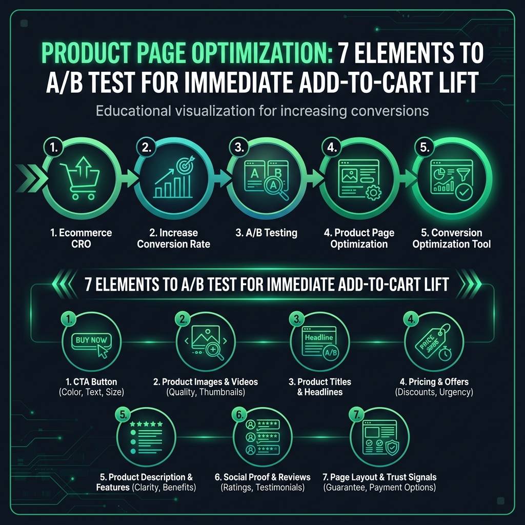
    Product Page Optimization: 7 Elements to A/B Test for Immediate Add-to-Cart Lift infographic showing ecommerce CRO, increase conversion rate, A/B testing for digital marketing
    EyeCaptain
    eyecaptain.io

    For a potential 15-20% lift in conversions, try integrating your best customer reviews directly into your product description instead of hiding them in a separate tab. This social proof is incredibly effective, especially for higher-priced items.

    EyeCaptainEyeCaptain
    97%
    Conversions Booster

    Your visitors leave without converting

    Most websites lose 97% of their traffic without a single conversion. Our AI scans 200+ CRO elements to find exactly where visitors drop off.

    Hero CTA missing

    Ecommerce CRO for Your Add-to-Cart Section

    If you are still testing button colors like green versus orange, it's time to move on. That is a relic of outdated conversion optimization advice. Today, the text on the button and its placement are far more important.

    The copy on your button matters immensely. Consider testing these variations:

    • Add to Cart: The universal standard, a safe and effective option for most stores.
    • Add to Bag: Tends to perform better for fashion and beauty brands, aligning with a boutique shopping experience.
    • Buy Now: Can be effective for low-cost impulse buys but may feel too committal and deter customers making a considered purchase.

    Also, examine the button's size, especially on mobile devices. Buttons that occupy 70-80% of the screen's width often receive 23% more taps than full-width buttons, which can be mistaken for banner ads. For products with long pages, a "sticky" add-to-cart button that remains visible as the user scrolls can be a powerful CRO strategy, boosting conversions by 15-30%. Avoid using it on short pages where it can become an annoyance.

    Optimizing Price Display to Boost Perceived Value

    How you display your price - regardless of the currency - can completely alter its perception. A product priced at $89 might seem expensive, but "$2.96 per day" feels manageable. Breaking down the cost per use is a powerful tactic for any product used daily or over a long period.

    Be cautious with reference pricing (e.g., "Was $120, Now $89"). This only works if the original price is believable. If it seems artificial, you will erode trust. Sometimes, simply showing the current price with a "Bestseller" badge is more effective.

    Product Page Optimization: 7 Elements to A/B Test for Immediate Add-to-Cart Lift infographic showing ecommerce CRO, increase conversion rate, A/B testing for digital marketing
    EyeCaptain
    eyecaptain.io

    Finally, don't hide your "buy now, pay later" options. Displaying choices like "4 interest-free payments of $22.25" directly on the product page can increase add-to-cart rates significantly for higher-priced items by reducing initial price hesitation.

    Using Trust Signals to Secure the Conversion

    A few small signals can make a huge difference in whether a customer feels safe buying from you. If you offer free shipping, display it prominently. However, be strategic. For example, if your policy is free shipping on orders over a certain value, highlighting this on a product that falls just short of that threshold can discourage the sale.

    A clear, generous return policy visible near the add-to-cart button provides the confidence shoppers need, especially for apparel and home goods. As for security badges, they can lend credibility to a new store but may seem unnecessary or even reduce trust on an established brand's site, having little impact on your conversion rate.

    The biggest mistake in ecommerce CRO is testing everything at once. Pick one element, test it until you reach at least 95% statistical confidence, and then implement the winning version. If you're wondering where to start, follow this order:

    • Product Images
    • Product Descriptions
    • Add-to-Cart Button & Price Display
    • Trust Signals

    Remember, every test - even one that doesn't produce the expected result - teaches you something valuable about your customers. Now, it's time to start testing!

    Enjoyed this article?

    Join 1,500+ professionals getting weekly CRO & UX tips

    🎁 Bonus: Weekly CRO insights + exclusive resources

    No spam. Unsubscribe anytime.

    🚀 Boost Your Conversion Rate with EyeCaptain

    EyeCaptain is an AI-powered CRO & UX analysis tool that automatically scans your pages, identifies UX issues, and gives you actionable optimization suggestions to increase conversions. Try it for free, no card, no commitment.

    Free CRO Audit

    Did you find this helpful?

    Share it with someone who might find it useful.

    Be the first to learn CRO secrets

    Actionable tips, case studies & early access to new AI tools. Weekly in your inbox.

    1,200+ marketers trust us

    Cookie Settings

    We use cookies to improve your experience.