Infographic για digital marketing - οπτικοποίηση εννοιών how to do a ux audit, user experience micro-conversions, reduce UX friction conversions
    eyecaptain.io

    UX Audit Mastery: Fix Website Friction in 2026

    Master the professional UX Audit in 2026. Identify and fix user experience leaks to recapture lost sales and improve overall website satisfaction.

    EyeCaptain

    Dimitris

    13 March 2026

    4 min read
    161 views
    professional UX audit 2026 guideidentify website friction UXUX optimization for conversions 2026

    Learning how to do a UX audit is the first step toward improving a website that is losing customers and revenue. If your users hesitate, get confused, or navigate away, you are losing potential sales. This guide will walk you through essential UX optimization techniques to identify issues, reduce user effort, and ultimately improve your conversion rates by focusing on what your users truly need.

    How to Do a UX Audit to Uncover Conversion Blockers

    A great user experience (UX) is more than just visual design; it is about understanding user psychology. When a website is difficult to navigate, it directly impacts your business results. The goal of a UX audit is to identify these exact moments of user frustration.

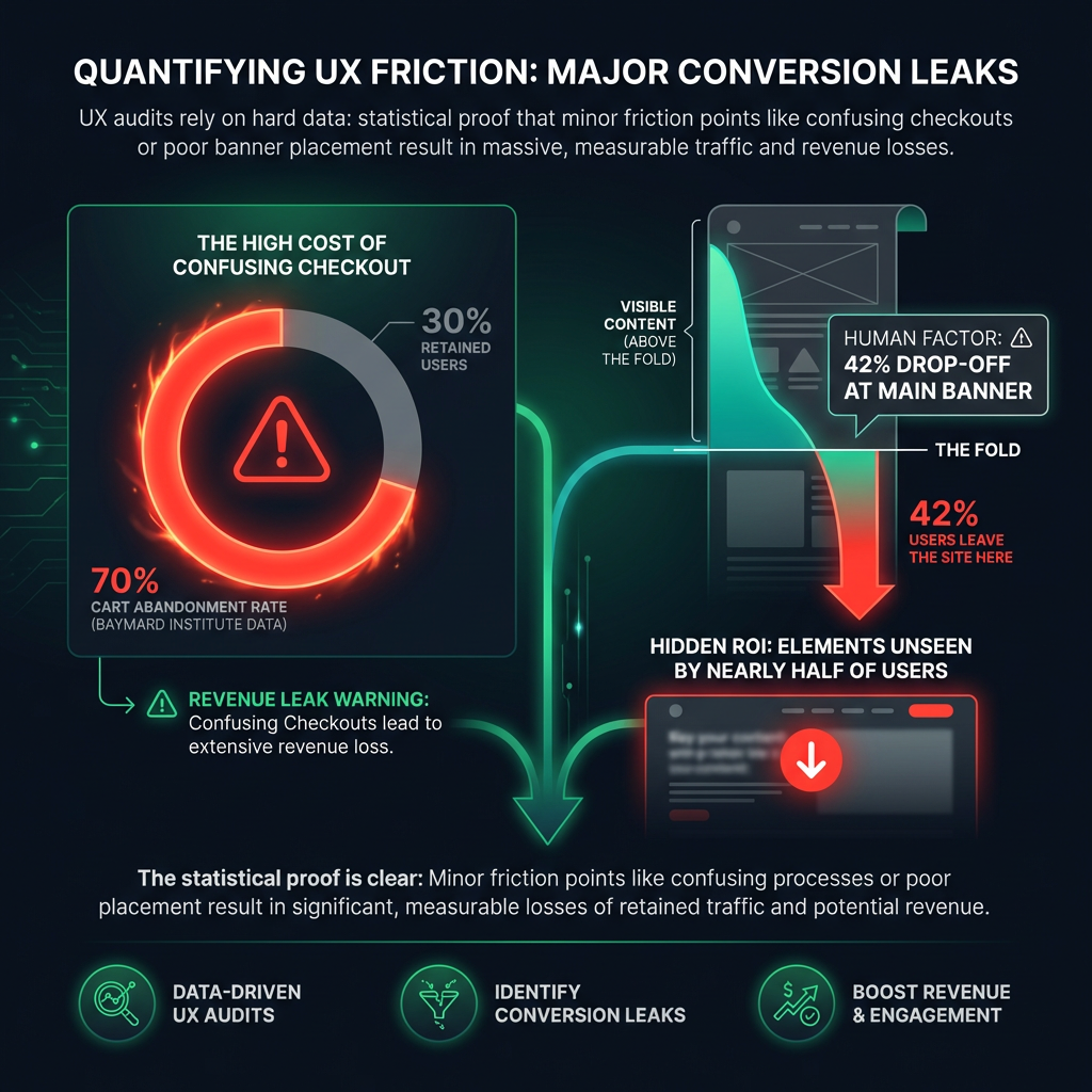
    Research from the Baymard Institute shows that nearly 70% of online shopping carts are abandoned. A complicated or confusing checkout process is a primary reason. These are not just statistics; they represent lost sales and customers.

    See Your Website Through Your Users' Eyes

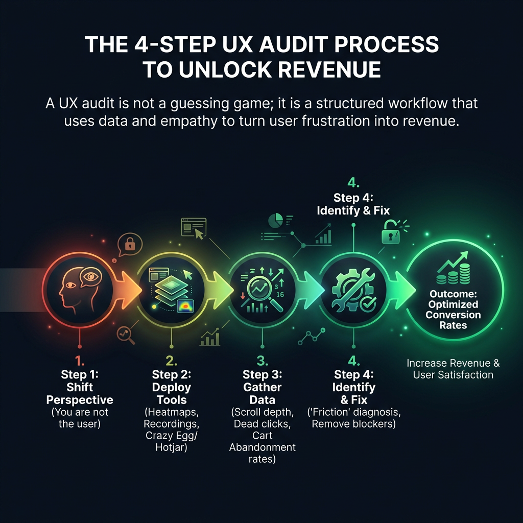
    A successful UX audit begins with a fundamental principle: you are not your user. Your primary objective is to build a smooth, intuitive path that anticipates your user's needs. To achieve this, you must analyze their behavior to understand their journey and challenges.

    Συγκριτικό γράφημα πληροφοριών που αντιπαραβάλλει τις υποθέσεις σχεδιασμού ιστοσελίδας με τα πραγματικά δεδομένα από έναν έλεγχο UX (UX Audit). Η αριστερή στήλη δείχνει την προσδοκώμενη συμπεριφορά του χρήστη, ενώ η δεξιά στήλη αποκαλύπτει τα προβλήματα πλοήγησης, τα αποτελέσματα από χάρτες θερμότητας (heatmaps) και τα υψηλά ποσοστά εγκατάλειψης καλαθιού που εντοπίζονται μέσω εργαλείων usability testing. Στοχεύει στη βελτιστοποίηση του user experience και τη μείωση της τριβής.
    EyeCaptain
    eyecaptain.io

    Leverage Usability Testing Tools

    To begin, you need data. Modern usability testing tools provide invaluable insights into user behavior. For example, tools like Hotjar or Crazy Egg offer features like heatmaps, which show you exactly where people are clicking, how far they scroll, and which elements they ignore. In one analysis of a SaaS platform, we discovered that 42% of visitors never scrolled past the main banner, meaning all the critical calls-to-action below it were never seen.

    Reduce UX Friction to Boost Conversions

    Online success is often determined by small, seemingly minor details. Every moment of confusion a user feels - what we call "friction" - accumulates, leading to high bounce rates and abandoned journeys. Studies have shown that a page load delay of just one second can decrease conversions by up to 20%. The key is to reduce UX friction for better conversions by making every interaction as effortless as possible.

    Go beyond aggregated data and watch individual user session recordings. This is one of the most powerful UX optimization techniques. Look for the specific places where users get lost in your navigation, hesitate during checkout, or struggle to use your site on a mobile device. The goal is not perfection; it is the continuous process of eliminating friction, one small improvement at a time.

    Πληροφοριακό γράφημα που παρουσιάζει τη διαδικασία ελέγχου UX (UX Audit) σε τέσσερα βήματα. Το διάγραμμα απεικονίζει τη ροή εργασίας από την αλλαγή προοπτικής και τη χρήση εργαλείων usability testing (όπως heatmaps), μέχρι την ανάλυση δεδομένων συμπεριφοράς και τον εντοπισμό σημείων τριβής (friction). Στόχος είναι η βελτιστοποίηση της εμπειρίας χρήστη και η αύξηση των μετατροπών (conversions) σε ιστοσελίδες.
    EyeCaptain
    eyecaptain.io

    Focus on User Experience Micro-Conversions

    Not every valuable action is a final purchase. Optimizing for user experience micro-conversions - smaller steps a user takes on their journey - is critical. These actions indicate engagement and move users closer to your main business goal. A UX audit should identify friction points that prevent these actions, such as:

    EyeCaptainEyeCaptain
    97%
    Conversions Booster

    Your visitors leave without converting

    Most websites lose 97% of their traffic without a single conversion. Our AI scans 200+ CRO elements to find exactly where visitors drop off.

    Hero CTA missing

    • Signing up for a newsletter
    • Adding an item to a cart or wishlist
    • Downloading a report or case study
    • Watching a product video

    By making these small steps easier, you build momentum toward the final conversion.

    Proven UX Optimization Techniques That Work

    Ultimately, clear and intuitive design is more impactful than visually complex elements. Your focus should be on reducing the cognitive load - or mental effort - required to use your site. Here are a few proven methods:

    • Create a clear, predictable site structure: Users should always know where they are and how to find what they need easily.
    • Embrace minimalist design: A clean, uncluttered layout guides the user's attention toward the most important elements.
    • Use helpful microcopy: Small, contextual pieces of text can answer questions before they are asked, clarifying form fields or button functions.
    Στατιστικό infographic που παρουσιάζει δεδομένα από ελέγχους UX (UX Audit). Ένα κυκλικό διάγραμμα δείχνει ότι το 70% των καλαθιών αγορών εγκαταλείπονται λόγω κακής εμπειρίας χρήστη. Ένα δεύτερο γράφημα τύπου heatmap αποκαλύπτει ότι το 42% των επισκεπτών δεν κάνουν scroll κάτω από το κεντρικό banner, χάνοντας σημαντικά calls-to-action. Η εικόνα τονίζει την ανάγκη για βελτιστοποίηση UX και χρήση εργαλείων usability testing.
    EyeCaptain
    eyecaptain.io

    This approach delivers results. Amazon's "1-Click" purchase button is a prime example of reducing the mental energy needed to complete a transaction. We saw a German automotive platform increase its lead generation by 33% simply by simplifying its contact forms - they did not add new features; they removed unnecessary fields. Every field you require a user to complete is a barrier that consumes their limited attention.

    True UX optimization is often about subtraction, not addition. While many are tempted to add more features, the experts focus on simplification. If you are still treating your website like a static digital brochure, you are not just losing sales; you are losing customers you will never have the chance to serve.

    Enjoyed this article?

    Join 1,500+ professionals getting weekly CRO & UX tips

    🎁 Bonus: Weekly CRO insights + exclusive resources

    No spam. Unsubscribe anytime.

    🚀 Boost Your Conversion Rate with EyeCaptain

    EyeCaptain is an AI-powered CRO & UX analysis tool that automatically scans your pages, identifies UX issues, and gives you actionable optimization suggestions to increase conversions. Try it for free, no card, no commitment.

    Free CRO Audit

    Did you find this helpful?

    Share it with someone who might find it useful.

    Be the first to learn CRO secrets

    Actionable tips, case studies & early access to new AI tools. Weekly in your inbox.

    1,200+ marketers trust us

    Cookie Settings

    We use cookies to improve your experience.