Infographic για digital marketing - οπτικοποίηση εννοιών UX audit, website audit checklist, UX checklist
    eyecaptain.io

    The Complete UX Audit Checklist: 25+ Critical Points to Check Before Using Any Website Analysis Tool

    Planning a website audit? This UX checklist reveals 25+ critical points pros check first—before they even open an analysis tool. Get it right from day one.

    EyeCaptain

    Dimitris

    19 June 2026

    5 min read
    142 views
    UX auditwebsite audit checklistUX checklistwebsite analysis toolUI/UX analysis

    Performing a comprehensive UX audit is crucial for understanding why your website isn't achieving its conversion goals. However, simply running a generic website analysis tool won't provide a complete understanding. A true user experience audit goes deeper than technical issues to uncover why real people visit your site and leave without taking action. Before you begin your analysis, it's essential to create a plan that focuses on the human element of your website's performance.

    Most audits are ineffective because they begin with automated tools that check metrics like page speed, mobile responsiveness, and accessibility. While these technical aspects are important, focusing on them alone often leads to fixes that don't improve business results. The key is to shift your focus from what an automated tool measures to what a human user experiences. This is the core of a successful UI/UX analysis.

    Why a UX Audit Goes Beyond a Standard Website Analysis

    Consider this: a standard website audit is often focused on search engines. It identifies technical issues like broken links, slow load times, and missing alt tags. A UX audit, in contrast, is for people. It is a detailed investigation into the feelings and experiences that drive user behavior.

    The Baymard Institute analyzed nearly 750 e-commerce sites and found that almost 70% of all shopping carts are abandoned. The primary reason isn't a technical bug; it's a confusing, frustrating, or clunky user experience.

    This difference can translate into millions in lost revenue. Before you even run a website analysis tool, you must map out your user's journey - not the ideal path you designed, but the often complex, real-world path they actually take.

    Start with your analytics data. Find your top five landing pages and examine the exit rate for each. If a page has an exit rate over 60%, it's a clear indicator of a UX problem, no matter what an automated tool reports. Next, clearly identify your critical conversion paths. For an e-commerce site, this might be Homepage → Category Page → Product Page → Cart → Checkout. For a SaaS company, it could be Landing Page → Features → Pricing → Sign Up. Document these user flows to understand every potential point of friction.

    The Complete UX Audit Checklist: 25+ Critical Points to Check Before Using Any Website Analysis Tool infographic showing UX audit, website audit checklist, UX checklist for digital marketing
    EyeCaptain
    eyecaptain.io

    A common mistake is to treat every page as equally important. For example, a blog post with a 90% bounce rate might be acceptable, but a product page with the same rate means your business is losing significant revenue. Context is essential in a proper UI/UX analysis.

    Finally, set specific, measurable conversion goals. Instead of a vague goal like "increase sales," aim for something precise, such as "reduce cart abandonment from 78% to 65% in the next quarter." Instead of "improve engagement," target an "increase in average time on product pages from 42 seconds to 90 seconds." Vague goals lead to vague audits, while specific goals help uncover the exact problems that are costing you revenue.

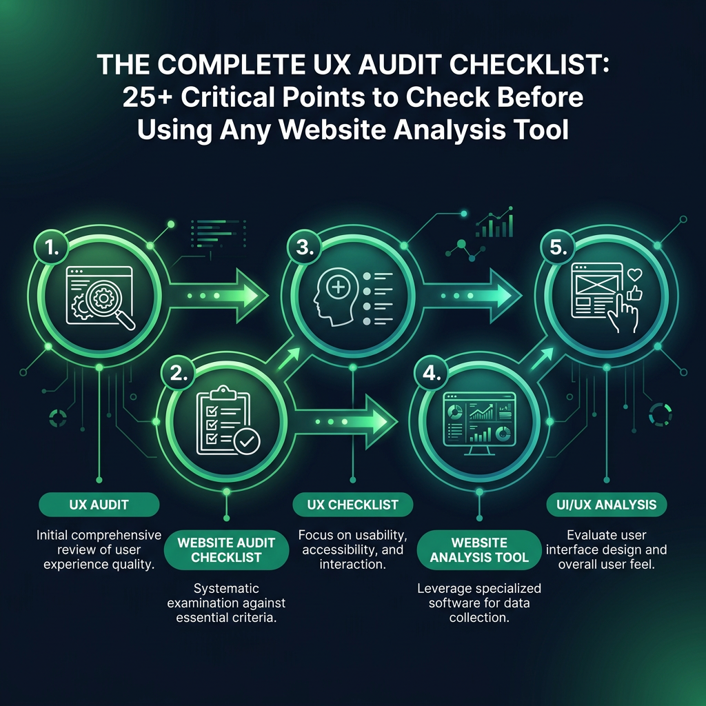
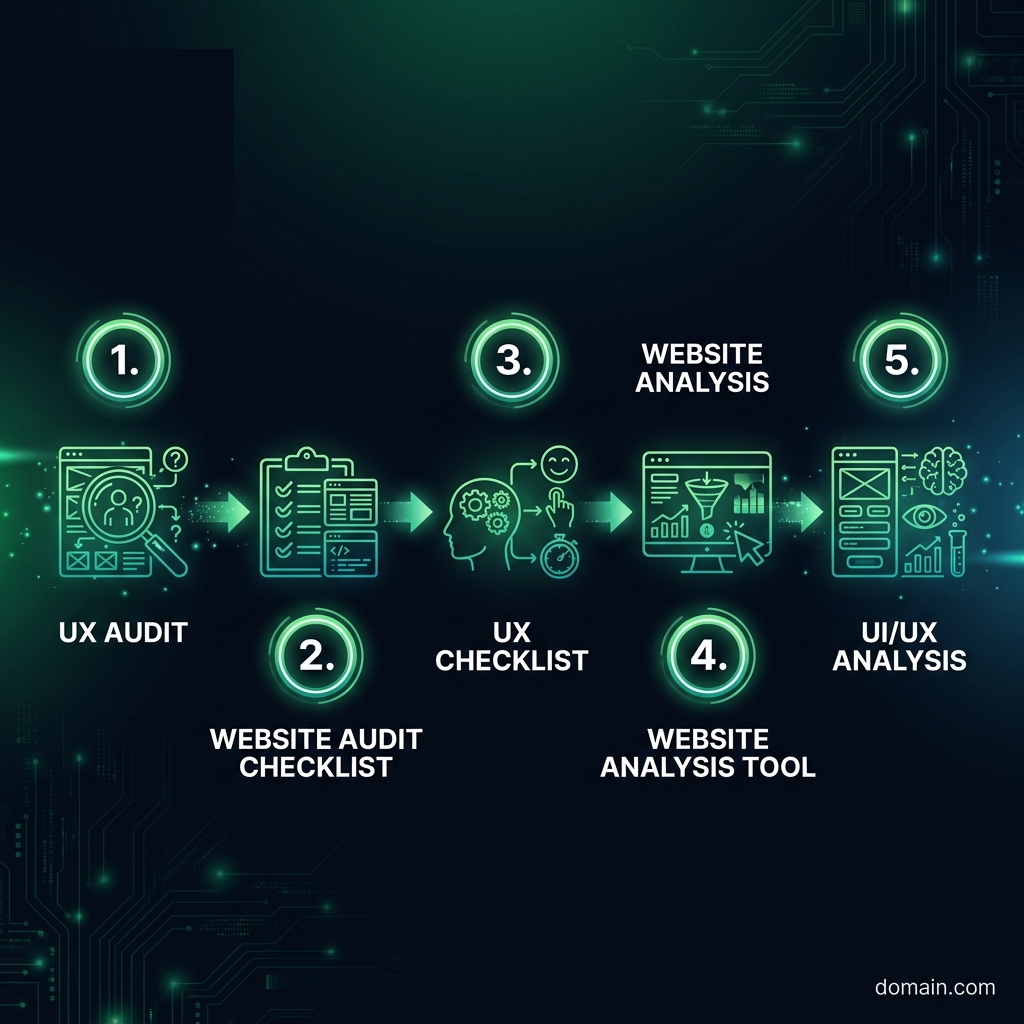
    Your In-Depth UX Audit Checklist: A Step-by-Step Framework

    A professional UX audit begins not with tools, but with questions. This UX checklist provides a framework for evaluating what truly matters to your users.

    Navigation and Information Architecture

    Can users find what they need quickly? Research from the Nielsen Norman Group suggests you have only a few seconds to show a user that your site has what they are looking for. Your navigation is the first test. If your main menu has more than seven items, you risk causing cognitive overload, as people can generally only process about seven items at once. Also, test your site's search functionality. Can you easily find your top three products or services? If not, your search function is failing your most motivated users.

    Clarity, Hierarchy, and Scannability

    People typically scan websites rather than reading them word-for-word. Your UI/UX analysis must confirm that the most important elements on the page capture attention instantly. A simple method is the "squint test": view your homepage and squint until the text becomes blurry. What elements stand out? If your main call-to-action (CTA) button is not one of these prominent visual anchors, you have a significant hierarchy problem. Additionally, check your color contrast. Low contrast between text and its background makes reading difficult and can negatively impact conversion rates.

    Forms, Friction, and Conversion

    The Complete UX Audit Checklist: 25+ Critical Points to Check Before Using Any Website Analysis Tool infographic showing UX audit, website audit checklist, UX checklist for digital marketing
    EyeCaptain
    eyecaptain.io

    Forms are a common point where potential sales and leads are lost. Research from the Baymard Institute suggests the average e-commerce site could increase conversions by over 35% simply by designing a better checkout experience. Review your signup or checkout forms and count the number of fields. Every field you can eliminate reduces friction and can improve your conversion rate. Also, test the form's error handling by trying to submit it with incorrect information. Does it provide clear, helpful error messages, or a generic one like "Invalid input"? Vague error messages are absolute conversion killers.

    EyeCaptainEyeCaptain
    88%
    Conversions Booster

    UX bugs are silently killing your revenue

    88% of users never come back after a bad experience. Our AI detects CTA hierarchy issues, mobile gaps, and cognitive overload patterns.

    CTA hierarchy broken

    Mobile Usability and Responsiveness

    The question is not just "Is my site responsive?" but rather, "Is my site genuinely usable on a mobile device?" Take out your smartphone and attempt to complete a key task - such as purchasing a product or signing up - using only one thumb. If the process feels awkward or frustrating for you, it is likely a significant problem for your users. Pay close attention to the size of buttons and links. For instance, Apple's Human Interface Guidelines recommend a minimum tap target size of 44x44 points to prevent accidental taps and user frustration.

    Perceived Performance and Load Speed

    A user's perception of speed is often more important than the actual load time measured in seconds. A site that takes two seconds to load but shows a blank screen feels slower than a site that takes three seconds but displays content progressively. During your UX audit, examine what loads in the initial viewport (the "above the fold" area). Does meaningful content appear almost instantly? According to Google's research, a delay of just one second can significantly increase bounce rates.

    Building Trust: Social Proof and Security

    Automated website analysis tools cannot measure user trust, yet it is a fundamental requirement for conversion. Scan your key pages for trust signals, such as security badges (e.g., SSL certificates), customer reviews, and detailed testimonials. Specificity is key for social proof. For example, "Trusted by 50,000+ businesses worldwide" is significantly more powerful than a vague statement like "Trusted by thousands."

    The Complete UX Audit Checklist: 25+ Critical Points to Check Before Using Any Website Analysis Tool infographic showing UX audit, website audit checklist, UX checklist for digital marketing
    EyeCaptain
    eyecaptain.io

    Content Clarity and Value Proposition

    Can a new visitor understand what your business offers within five seconds of landing on your homepage? A simple way to test this is included in this website audit checklist: show your homepage to someone for five seconds, then hide the screen. Ask them to explain what your company does. If they are unable to, your core value proposition is not clear enough.

    Documenting Your UI/UX Analysis: A Practical Guide

    After completing your manual review, organize your findings before using an automated tool, which can sometimes distract from user-centric issues. Create a simple spreadsheet with four columns:

    1. Page URL: The specific page where the issue exists.
    2. Issue: A clear, concise description of what you observed.
    3. Severity: How critical the issue is (e.g., Critical, High, Medium, Low).
    4. Hypothesis: An explanation of why this issue impacts the user experience and business goals.

    The final column, "Hypothesis," is the most critical. For example, "Button is too small" is not a useful finding. In contrast, "The main CTA button is too small on mobile devices, which likely causes users to make errors and abandon the checkout process" is an actionable insight.

    Prioritize your list based on the severity of the issue's impact on the user journey, not on how easy it is to implement a fix. For instance, a confusing value proposition is a much more significant problem than a button that uses an incorrect brand color.

    Only after you have completed this human-centered analysis should you use a website analysis tool. At this stage, you are not searching for random errors; you are using the tool to validate your hypotheses and gather quantitative data. The tool provides the data, but your analysis provides the insight - and it is insight that drives meaningful results.

    Enjoyed this article?

    Join 1,500+ professionals getting weekly CRO & UX tips

    🎁 Bonus: Weekly CRO insights + exclusive resources

    No spam. Unsubscribe anytime.

    🚀 Boost Your Conversion Rate with EyeCaptain

    EyeCaptain is an AI-powered CRO & UX analysis tool that automatically scans your pages, identifies UX issues, and gives you actionable optimization suggestions to increase conversions. Try it for free, no card, no commitment.

    Free CRO Audit

    Did you find this helpful?

    Share it with someone who might find it useful.

    Be the first to learn CRO secrets

    Actionable tips, case studies & early access to new AI tools. Weekly in your inbox.

    1,200+ marketers trust us

    Cookie Settings

    We use cookies to improve your experience.