Mobile Form Friction: The Ultimate Guide to Crushing Conversion Barriers
Struggling with mobile form dropoffs? Learn how top brands reduce friction and turn more taps into completed checkouts.
Dimitris
08 June 2026
4 min read
455 views
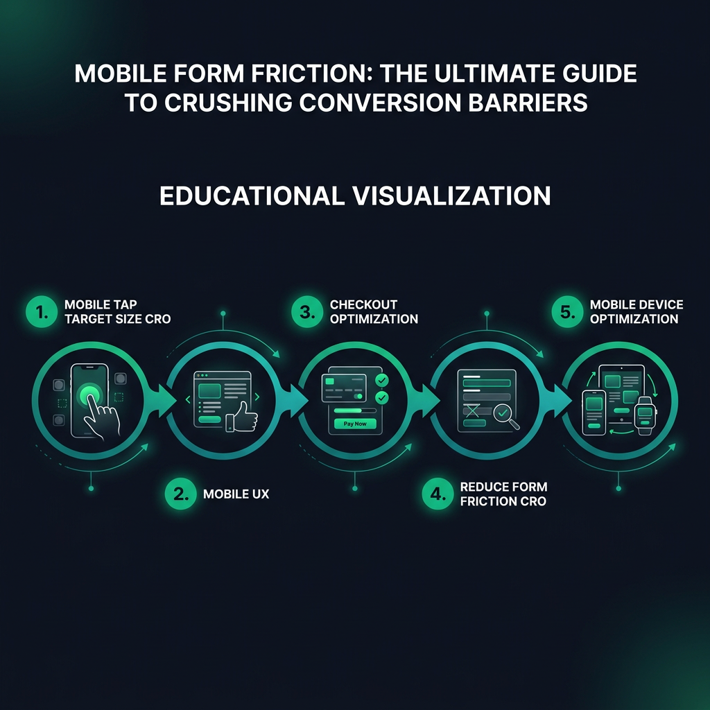
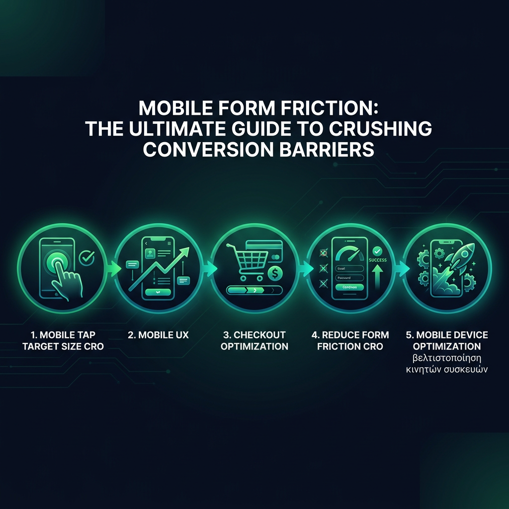
mobile tap target size CROmobile UXcheckout optimizationreduce form friction CRO
Your mobile forms are bleeding conversions. Every unnecessary tap, every tiny input field, every moment of user frustration is costing you money.
HEADING: Why Mobile Form Design Kills Your Conversion Rates
Baymard Institute's research reveals a brutal truth. 69% of users abandon forms on mobile because of poor design. Not complicated products. Not pricing. Pure user experience friction.
Your typical mobile checkout looks like a minefield. Tiny touch targets. Keyboards that cover half the screen. Form fields that feel like they were designed by someone who's never used a smartphone.
HERE'S WHAT'S ACTUALLY HAPPENING: When a user struggles to input information, their brain registers cognitive load. That tiny moment of frustration? It's enough to make them bounce.
HEADING: How to Design Mobile Forms That Convert
Subheading: Tap Target Size - The Silent Conversion Killer
eyecaptain.io
Google's UX guidelines recommend minimum tap targets of 48x48 pixels. But here's the real insight. It's not just about size. It's about spacing, context, and reducing mental effort.
Immagine trying to tap a button while riding a bus. Your finger isn't a precision laser. Mobile design must account for human imperfection.
Real-world example. Booking.com increased mobile conversions by 30% simply by increasing tap target sizes and adding more padding between form elements. Not by changing the actual functionality. Just by making interaction easier.
Subheading: Input Types - Your Secret Conversion Weapon
HTML5 input types aren't just technical details. They're conversion optimization tools. Use 'tel' for phone numbers. 'email' for email fields. 'number' for numeric inputs.
Why? Mobile browsers instantly optimize keyboards. A numeric keyboard for phone numbers. An email keyboard with '@' prominently displayed. These tiny optimizations reduce friction.
eyecaptain.io
The Nielsen Norman Group found that contextual keyboards can reduce form completion time by up to 40%. Forty. Percent. That's not a small improvement.
HEADING: Auto-fill: The Conversion Accelerator
Modern browsers remember. They want to help users. Enable autocomplete attributes. Let browsers do the heavy lifting.
Code like `autocomplete="name"` or `autocomplete="email"` isn't just convenient. It's a conversion strategy. Users appreciate speed. They reward frictionless experiences with completed purchases.
A study by Chrome showed that enabling autocomplete can increase form completion rates by 25%. Imagine gaining a quarter more conversions without changing your actual product.
The brutal truth? Your mobile form is either a conversion machine or a user repellent. There's no middle ground. And now you know exactly how to make it work.
EyeCaptain
97%
Conversions Booster
Your visitors leave without converting
Most websites lose 97% of their traffic without a single conversion. Our AI scans 200+ CRO elements to find exactly where visitors drop off.
EyeCaptain is an AI-powered CRO & UX analysis tool that automatically scans your pages, identifies UX issues, and gives you actionable optimization suggestions to increase conversions. Try it for free, no card, no commitment.


 EyeCaptain