
Infographic για digital marketing - οπτικοποίηση εννοιών heatmap analysis guide, top heatmap tools for cro, user behavior analytics
    eyecaptain.io

    Heatmap Analysis: Decoding User Behavior 2026

    Decode user behavior using surgical heatmap analysis. Learn how visitors interact with your site to improve UX and boost conversions in 2026.

    EyeCaptain

    Dimitris

    19 March 2026

    3 min read
    316 views
    heatmap user behavior analysis 2026UX optimization with heatmapswebsite interaction tracking tools

    Do you ever feel like you're just guessing what your users want? This comprehensive heatmap analysis guide is your solution. By leveraging heatmaps for user behavior analytics, you can move beyond guesswork and start making data-driven decisions to improve your website's performance and overall user experience (UX).

    Understanding User Behavior with Heatmap Analysis

    Every single click, scroll, and mouse movement on your website tells a story. This is a fundamental principle for professional UX researchers. Your users are constantly communicating with you through their on-page actions, not just through feedback forms or surveys. A proper heatmap analysis lets you see these unspoken signals - the crucial behavioral data that traditional analytics reports often miss.

    Decoding Clicks, Scrolls, and User Journeys

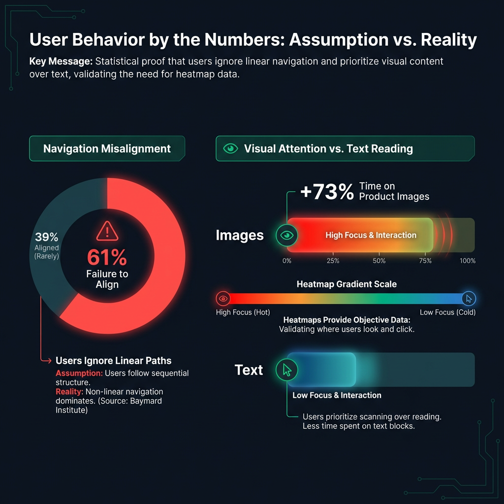
    Do you believe your website's navigation is straightforward? You might be surprised. Research from the Baymard Institute revealed that 61% of websites fail to align with how people actually navigate. Designers often assume a linear user journey, but real human behavior is often complex and unpredictable.

    We saw this on an e-commerce site we analyzed. The heatmap data was revealing. It showed that users spent 73% more time looking at product images than reading the carefully written descriptions. That single visual told us everything: for their customers, pictures were far more important than words.

    A Practical Heatmap Analysis Guide: Reading the Data

    Heatmaps create a visual representation of user attention, showing which parts of your page capture the most focus. Are you seeing bright red spots? This indicates where user interaction is most concentrated - a clear sign of high engagement. In contrast, the cool blue and green areas represent sections with low engagement, the parts of your page people are ignoring. Landmark studies from the Nielsen Norman Group confirm what we see every day: users make split-second judgments based on what they see first.
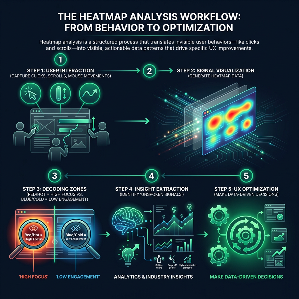

    Ενημερωτικό γράφημα (infographic) διαδικασίας που παρουσιάζει τα 5 βήματα της ανάλυσης χαρτών θερμότητας (heatmap analysis). Η ροή εργασίας δείχνει την καταγραφή ενεργειών του χρήστη, όπως κλικ και κύλιση, την οπτικοποίηση σε θερμικές ζώνες (κόκκινο για υψηλή αλληλεπίδραση, μπλε για χαμηλή), την ερμηνεία των δεδομένων συμπεριφοράς και την τελική βελτιστοποίηση της εμπειρίας χρήστη (UX optimization).
    EyeCaptain
    eyecaptain.io

    Beyond Hotspots: Advanced UX Optimization Techniques

    Looking at a heatmap isn't just about finding the most popular spots. True mastery comes from decoding the complex patterns hidden within the visual data. This is where UX optimization techniques become crucial.

    Expert analysts use this data to perform detailed investigations:

    • They track mouse movements to find moments of hesitation or confusion, often called cognitive friction.
    • They analyze scroll depth to see exactly where people lose interest and abandon your content.
    • They examine click maps to spot navigation problems, broken links, or non-clickable elements that users mistake for buttons.

    Consider Amazon's product pages. Every element on that page is intentional. They have meticulously engineered the layout so that product images, the price, and the prominent "Add to Cart" button all sit in what are guaranteed to be high-intensity zones on a heatmap.

    EyeCaptainEyeCaptain
    97%
    Conversions Booster

    Your visitors leave without converting

    Most websites lose 97% of their traffic without a single conversion. Our AI scans 200+ CRO elements to find exactly where visitors drop off.

    Hero CTA missing

    Top Heatmap Tools for CRO (Conversion Rate Optimization)

    Choosing the right platform is a critical step in leveraging user behavior analytics. The top heatmap tools for CRO not only provide visual data but also integrate with other analytics to give you a complete picture of the user journey. When evaluating options, look for features that support your specific goals, from simple visualization to in-depth analysis.

    Many of the best tools offer a suite of features that go beyond basic heatmaps, including:

    • Session Recordings: Watch anonymized video replays of individual user sessions to see their exact journey.
    • Conversion Funnel Analysis: Identify where users are dropping off in the conversion process.
    • Form Analytics: Discover which form fields cause hesitation or abandonment.
    • A/B Testing Integration: Combine heatmap data with A/B tests to validate your optimization ideas.
    Στατιστικό infographic που απεικονίζει δεδομένα συμπεριφοράς χρηστών. Το γράφημα δείχνει ότι το 61% των ιστοσελίδων αποτυγχάνουν στην πλοήγηση σύμφωνα με το Baymard Institute. Επίσης, περιλαμβάνει συγκριτική ανάλυση που αποδεικνύει ότι οι χρήστες αφιερώνουν 73% περισσότερο χρόνο κοιτάζοντας εικόνες προϊόντων σε σύγκριση με την ανάγνωση κειμένων, τονίζοντας τη σημασία της οπτικής ανάλυσης μέσω heatmaps.
    EyeCaptain
    eyecaptain.io

    Turning Insights into Action with UX Optimization

    To truly master heatmaps, you have to start thinking like a user psychologist. Where do users' eyes naturally go when the page loads? What design choices build momentum and encourage them to keep scrolling? And most importantly, which elements are causing frustration and making them leave?

    A global fashion retailer, for example, learned an important lesson from their data. They discovered that users were consistently ignoring large promotional banners at the top of their site. The heatmap showed a clear pattern of "banner blindness," where users mentally filter out anything that looks like a traditional advertisement. The solution was one of the core UX optimization techniques: they replaced the banners with personalized product recommendations that felt more naturally integrated into the shopping experience.

    The most dangerous assumption you can make is believing you already know your users. Heatmaps provide the visual evidence needed to challenge those assumptions. By mastering heatmap analysis, you uncover the hidden stories in your user behavior analytics, unlocking powerful insights that can transform your conversion rates and overall business success.

    Enjoyed this article?

    Join 1,500+ professionals getting weekly CRO & UX tips

    🎁 Bonus: Weekly CRO insights + exclusive resources

    No spam. Unsubscribe anytime.

    🚀 Boost Your Conversion Rate with EyeCaptain

    EyeCaptain is an AI-powered CRO & UX analysis tool that automatically scans your pages, identifies UX issues, and gives you actionable optimization suggestions to increase conversions. Try it for free, no card, no commitment.

    Free CRO Audit

    Did you find this helpful?

    Share it with someone who might find it useful.

    Be the first to learn CRO secrets

    Actionable tips, case studies & early access to new AI tools. Weekly in your inbox.

    1,200+ marketers trust us

    Cookie Settings

    We use cookies to improve your experience.