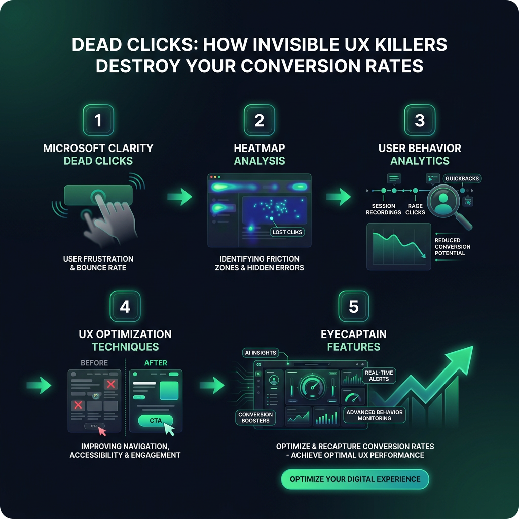
Dead Clicks: How Invisible UX Killers Destroy Your Conversion Rates
Losing sales without knowing why? Discover the hidden user experience traps costing you up to 42% of potential revenue.
Dimitris
02 June 2026
4 min read
177 views
Microsoft Clarity dead clicksheatmap analysisuser behavior analyticsUX optimization techniquesEyeCaptain features
Are dead clicks on your website causing you to lose customers and revenue? By leveraging powerful user behavior analytics, you can uncover these hidden points of friction and significantly improve your site's performance. This guide explores how to identify issues using tools like Microsoft Clarity and implement effective UX optimization techniques to turn user frustration into conversion opportunities.
Understanding Dead Clicks: A Hidden Obstacle to Conversions
A dead click occurs when a visitor clicks on a website element that looks interactive but does nothing. This creates a frustrating user experience and can directly and negatively impact your conversion rates. These non-functional clicks are more than a minor annoyance; they signal a breakdown in your website's design and communication.
Common examples of elements that cause dead clicks include:
Images or icons that look like buttons but are not clickable.
Underlined or colored text that is not a hyperlink.
Static elements that have a hover effect but no click action.
Buttons that are disabled or broken without any visual feedback.
Research from the Baymard Institute reveals that 42% of users become highly frustrated by non-interactive elements that appear clickable. Each dead click is a potential customer lost.
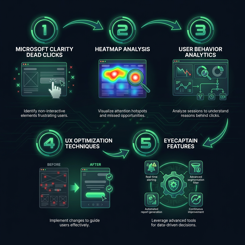
How to Identify Dead Clicks with Heatmap Analysis
To eliminate this hidden source of lost revenue, you need the right tools and a clear strategy. User behavior analytics platforms are essential for this task. Using a tool to analyze Microsoft Clarity dead clicks, for example, provides visual data on where users are clicking without effect.
A comprehensive heatmap analysis is your starting point. Look for these key indicators:
Rage Clicks
When you see a cluster of rapid, repeated clicks on a single, non-responsive spot, you have found a "rage click." This is a clear warning sign of extreme user frustration, indicating that an element is failing to meet their expectations.
eyecaptain.io
Non-Responsive Elements
Heatmaps will show you clicks on images, headlines, or blocks of text that you never intended to be interactive. If users are consistently trying to click on a specific product image or a bolded phrase, they expect it to lead somewhere. This is a missed opportunity for engagement.
Confused Cursor Movements
Session recordings, often paired with heatmaps, can reveal a user's mouse cursor moving quickly and erratically around a section of the page. This behavior suggests confusion, as the user is actively searching for the next step but cannot find a clear, clickable path forward.
EyeCaptain
97%
Conversions Booster
Your visitors leave without converting
Most websites lose 97% of their traffic without a single conversion. Our AI scans 200+ CRO elements to find exactly where visitors drop off.
Beyond Microsoft Clarity: Advanced Analytics with EyeCaptain
While tools like Microsoft Clarity are excellent for initial discovery, platforms like EyeCaptain offer a deeper level of analysis tailored for comprehensive UX optimization. Understanding the advanced EyeCaptain features can help you move from simply identifying problems to proactively solving them.
Key EyeCaptain Features for UX Optimization
AI-Powered Dead Click Detection: EyeCaptain uses machine learning to automatically identify and categorize dead clicks, rage clicks, and other frustration signals, saving you hours of manual analysis.
User Frustration Scoring: Go beyond simple click maps with a proprietary score that quantifies user frustration on each page, helping you prioritize which issues to fix first for the biggest impact.
Automated Element Tagging: The platform can automatically tag website elements (e.g., "main CTA," "product image," "navigation link") to give you contextual insights into what is working and what is not.
Effective UX Optimization Techniques to Fix Dead Clicks
Finding dead clicks is only the first step; fixing them is what drives results. The goal is not just to make everything clickable, but to create an intuitive and predictable user interface. Applying these UX optimization techniques will help build user trust and guide them smoothly toward conversion.
eyecaptain.io
Establish Clear Visual Cues
Consistency is essential. As usability experts at the Nielsen Norman Group have long advised, elements that function differently should look different. Ensure that your interactive elements, like buttons and links, are visually distinct from static content. Use shadows, borders, and conventional design patterns so a user instantly knows what they can and cannot click.
Provide Instant User Feedback
Acknowledge every interaction. When a user hovers over or clicks a functional element, provide immediate visual feedback. This can be a color change, an animation, or a subtle size shift. This feedback confirms that the system has received the user's input and is processing it, which prevents confusion and repeat clicks.
Simplify the User Journey
Simplify the user journey by following a core usability principle: do not force users to think. Every part of your website should have a clear purpose. Remove unnecessary visual clutter and ensure that calls-to-action are prominent and easy to find. The fewer steps and less ambiguity between a user's goal and the final action, the lower the chance they will get frustrated and leave.
Ultimately, the most dangerous dead clicks are not just technical glitches; they are broken promises to your users. Each one represents a real person who decided your website was not worth their time. By focusing on clear design and insightful user behavior analytics, you can fix these issues and build a website that works for your customers, not against them.
EyeCaptain is an AI-powered CRO & UX analysis tool that automatically scans your pages, identifies UX issues, and gives you actionable optimization suggestions to increase conversions. Try it for free, no card, no commitment.