
Discover how color psychology in marketing can transform your digital presence, influencing user emotions and driving business growth. This guide explores the principles of emotional design psychology and neuromarketing for web design, helping you choose a color palette that resonates with your global audience and encourages them to take action. A significant part of why users trust one website or feel compelled to purchase from another comes down to the strategic use of color.
The Science of Color in Global Marketing
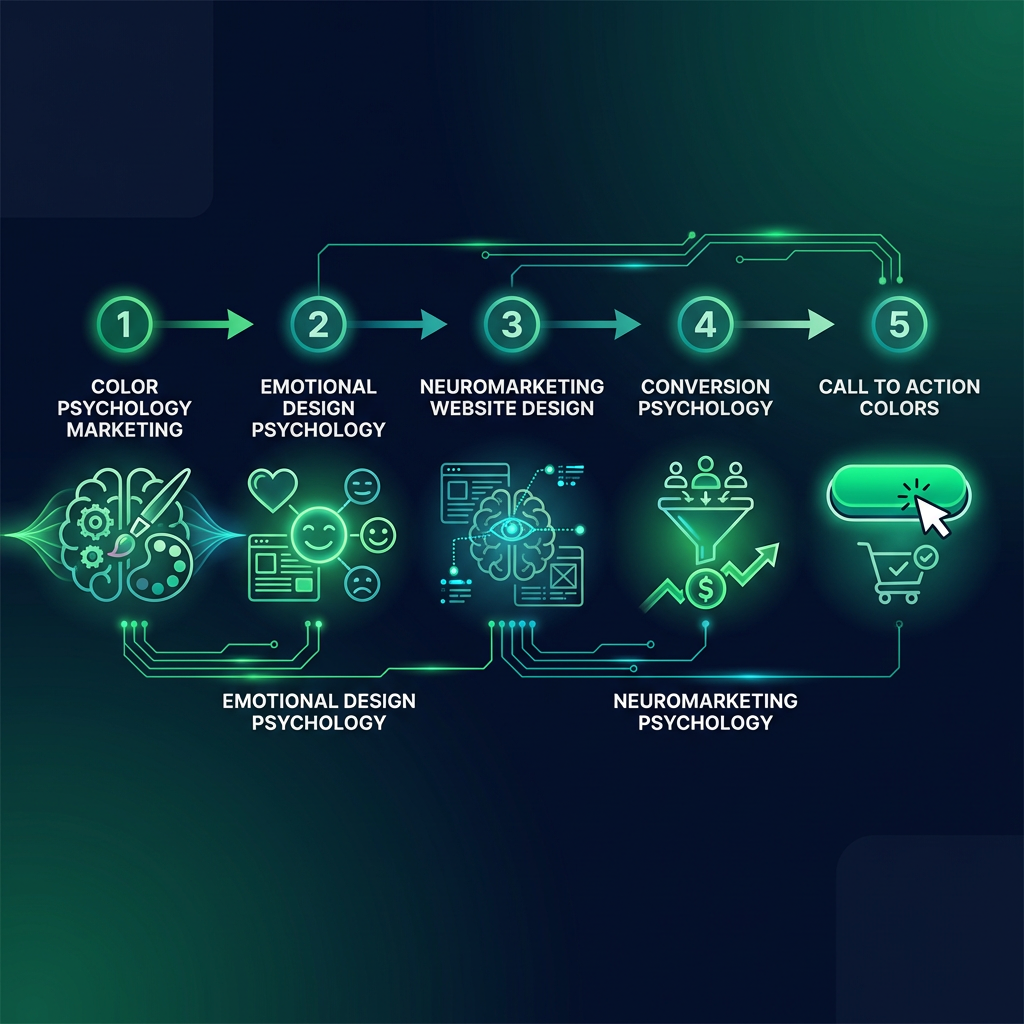
Your website's color scheme is more than an aesthetic choice; it is a powerful communication tool that leverages conversion psychology. Research in neuromarketing shows that before we consciously process text, colors trigger deep-seated emotional responses. This is a foundational aspect of effective neuromarketing for web design.
Studies have shown that optimizing color choices can significantly boost conversion rates. By strategically changing only the colors on a page, businesses can see a measurable impact on their performance metrics.
This occurs because our brains process visual information like color approximately 60,000 times faster than text. Consider the prominent "Add to Cart" buttons on global e-commerce platforms like Amazon. The choice of a high-contrast color like orange is not arbitrary; it is a calculated decision designed to draw attention and encourage immediate action, a perfect example of using specific call-to-action colors.
Decoding Emotional Design: Global Meanings of Website Colors
What messages are your brand colors sending to a worldwide audience? The psychology of emotional design reveals that each hue carries subconscious associations, but these can vary dramatically between cultures. Understanding these nuances is a powerful competitive advantage.
- Blue: In many Western and global business contexts, blue evokes feelings of trust, security, and professionalism. It is a popular choice for financial institutions and technology companies like PayPal and Samsung, as it helps customers feel their money and data are in safe, capable hands.
- Red: In North America and Europe, red is often associated with urgency, passion, and excitement. It can increase the heart rate and is an effective call-to-action color for creating immediacy, such as in "limited time" sales. However, in China and other parts of East Asia, red is the color of luck, prosperity, and celebration.
- Green: Green frequently suggests growth, nature, and positivity. It is a calming, reassuring color often used by health and wellness brands. In finance, it can signify positive returns. This association with "go" or "success" is common but not universal.
- White: While associated with purity, simplicity, and minimalism in many cultures, white is the traditional color of mourning and funerals in many parts of Asia. This stark contrast highlights the critical need for cultural awareness in your design choices.
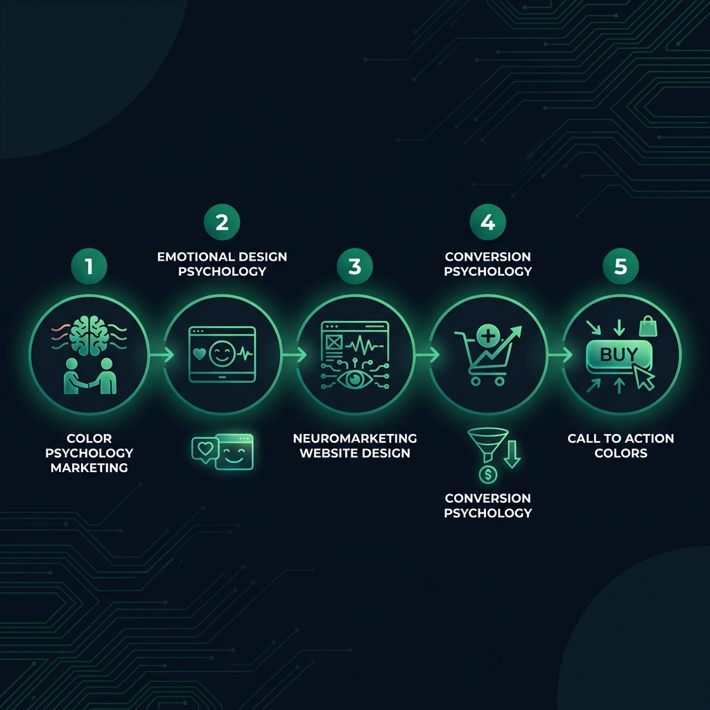
Applying Conversion Psychology to Your Global Color Palette
A common misconception is that a single "best" color for conversions exists. The most important factor in conversion psychology is context. A color's effectiveness depends on its cultural relevance, industry norms, and the expectations of your specific audience.
