How to Build a High-Converting Lead Generation Website
The complete page-by-page guide to structure, write, and optimize every page of your website for maximum lead generation.
What's Inside
The 10 most critical pages of a lead generation website analyzed section-by-section with practical examples and CRO techniques.
Homepage
Hero, value proposition, trust strip, CTAs
Services Page
Outcomes, process, mini case studies
About Us
Story, team, credibility
Contact Page
Forms, multi-channel, trust
Landing Pages
One goal, one action
Blog & Resources
Lead magnets, content upgrades
Case Studies
Proof, measurable results
Pricing Page
Transparency, plan comparison
FAQ Page
Objection handling
Thank You Page
Nurturing, next steps
The Numbers You Need to Know
Before you change anything, look at the data. These statistics explain why your website is losing leads.
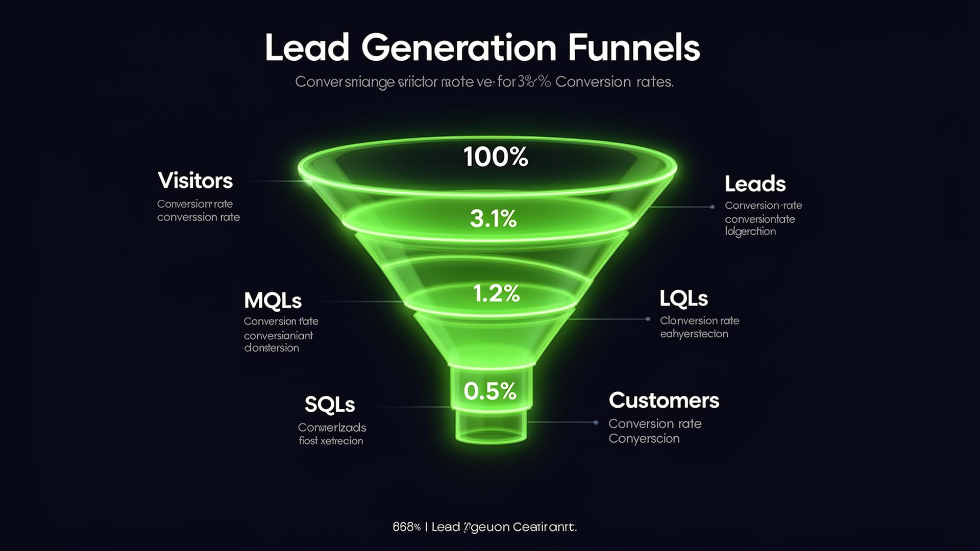
Average conversion rates at each stage of the lead gen funnel
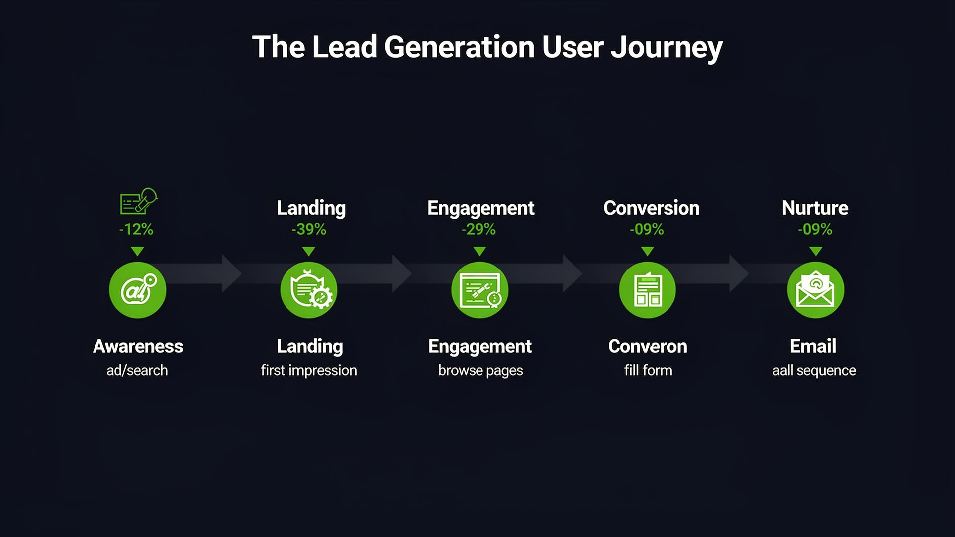
The user journey: from awareness to conversion
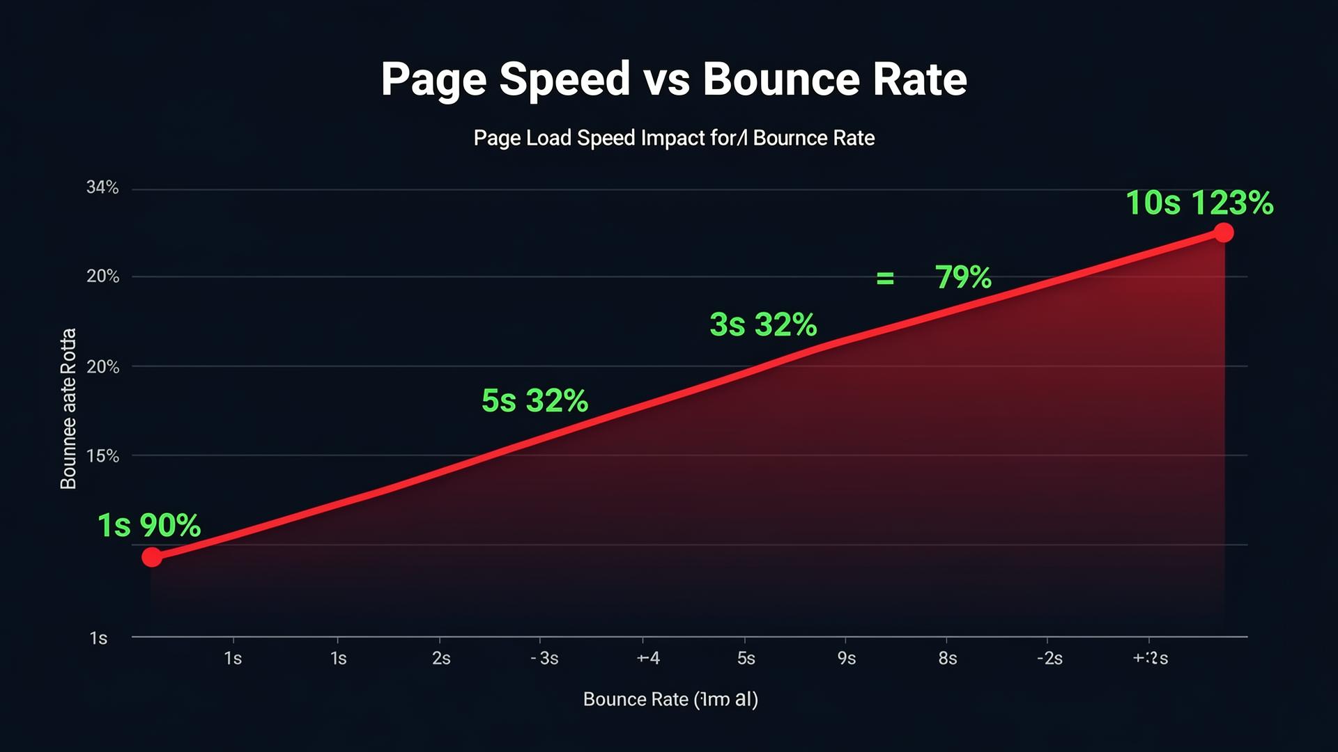
Every second of delay dramatically increases bounce rate
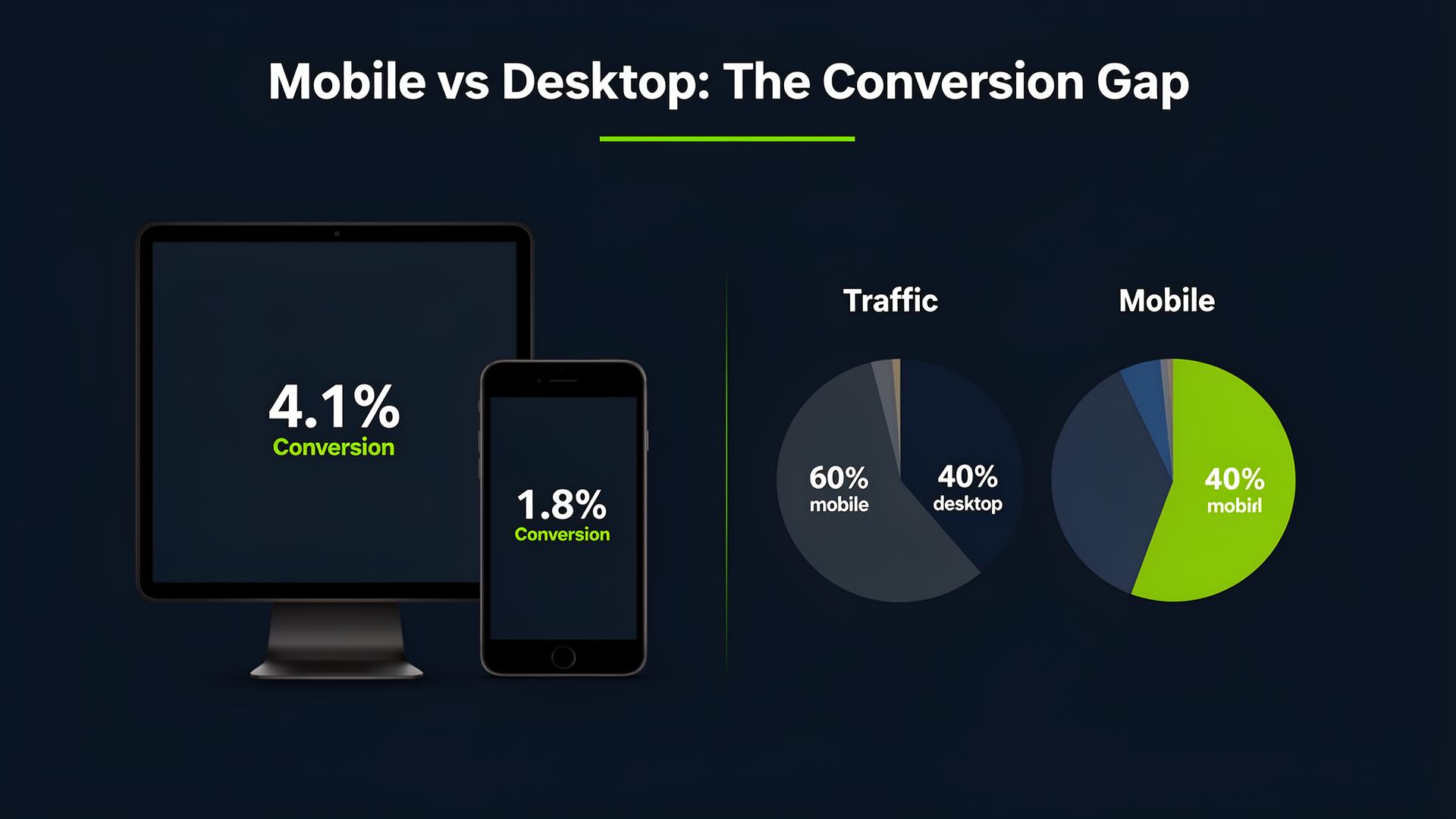
60% of traffic is mobile but converts 2x less
Wrong vs Right. Page by Page
See what a website that loses leads looks like vs one that converts. 14 realistic comparisons.
01. Hero Section
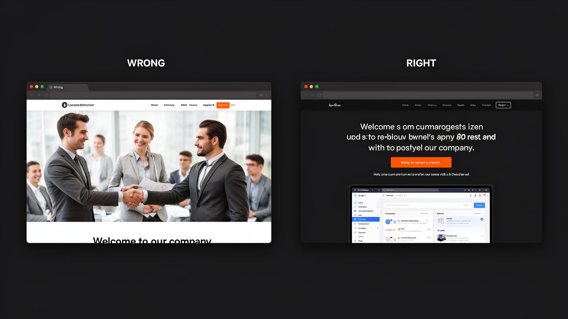
- Generic stock photo
- "Welcome to our company"
- Tiny CTA button
- Specific benefit headline with number
- Product/dashboard hero image
- Prominent CTA with social proof
02. Homepage
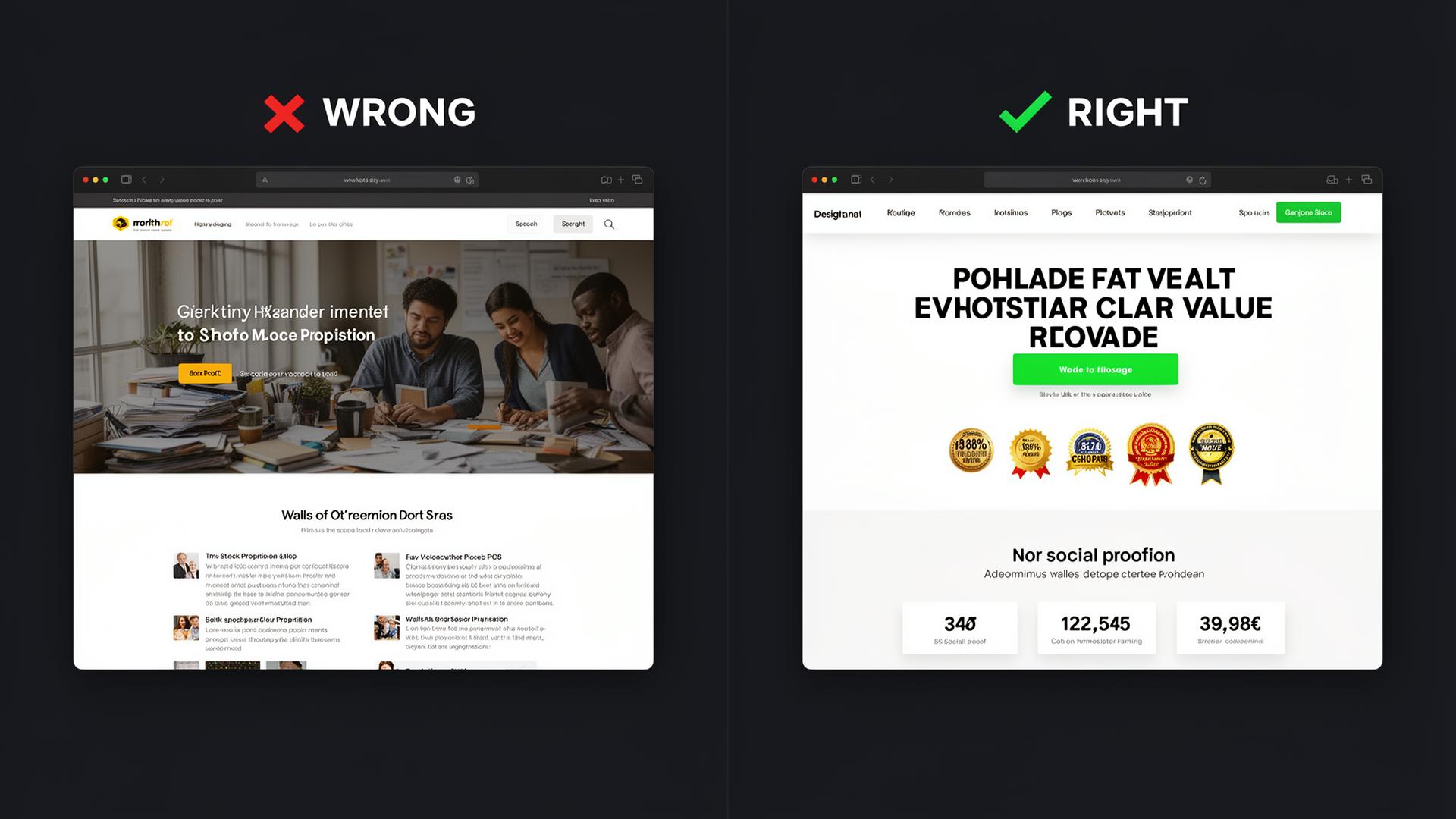
- Unclear value proposition
- Meaningless stock photos
- Multiple confusing CTAs
- Clear headline & value prop
- Trust badges & social proof
- One primary CTA with contrast
03. Navigation
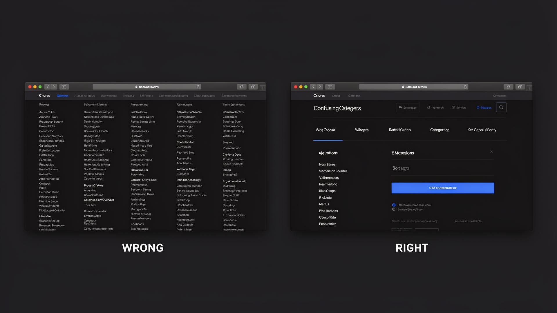
- 30+ links in mega menu
- Deep dropdowns
- Tiny text
- 5-6 main categories
- Clear hierarchy
- CTA button in nav
04. Services Page
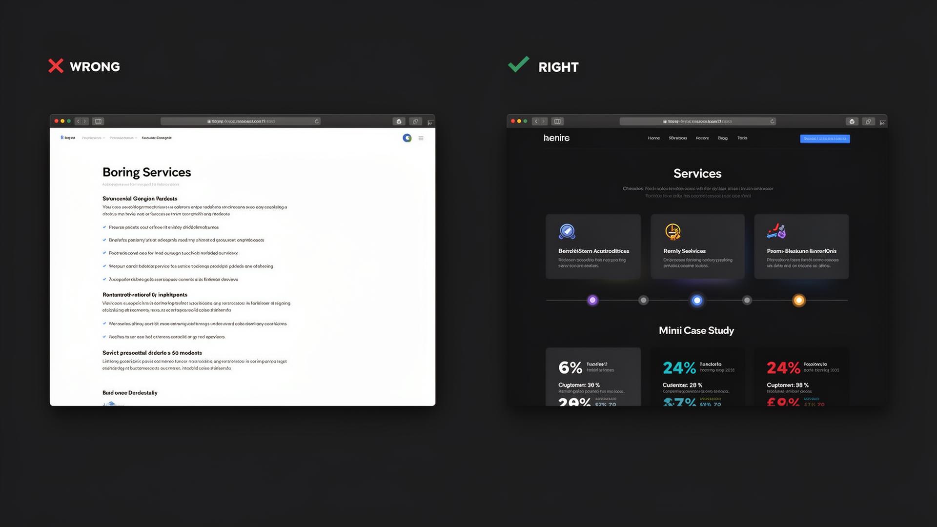
- Service list without benefits
- No visuals or icons
- No proof of results
- Benefit-driven cards with icons
- Step-by-step process timeline
- Mini case studies with metrics
05. About Us

- Text only, no photos
- No story or values
- Corporate bureaucratic tone
- Team photos & founder quote
- Mission, values timeline
- Human, authentic tone
06. Contact Page
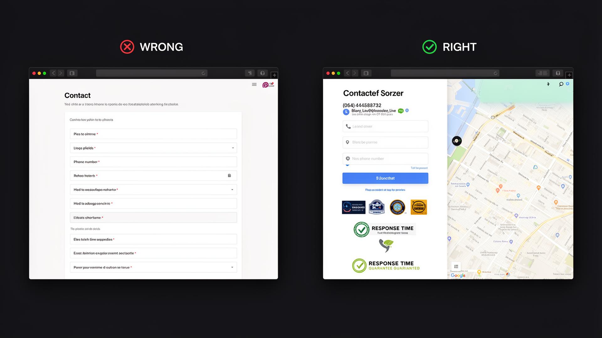
- Form with 10+ fields
- No phone or chat option
- Zero trust signals
- Short 3-4 field form
- Multiple contact channels
- Response time guarantee
07. Landing Pages
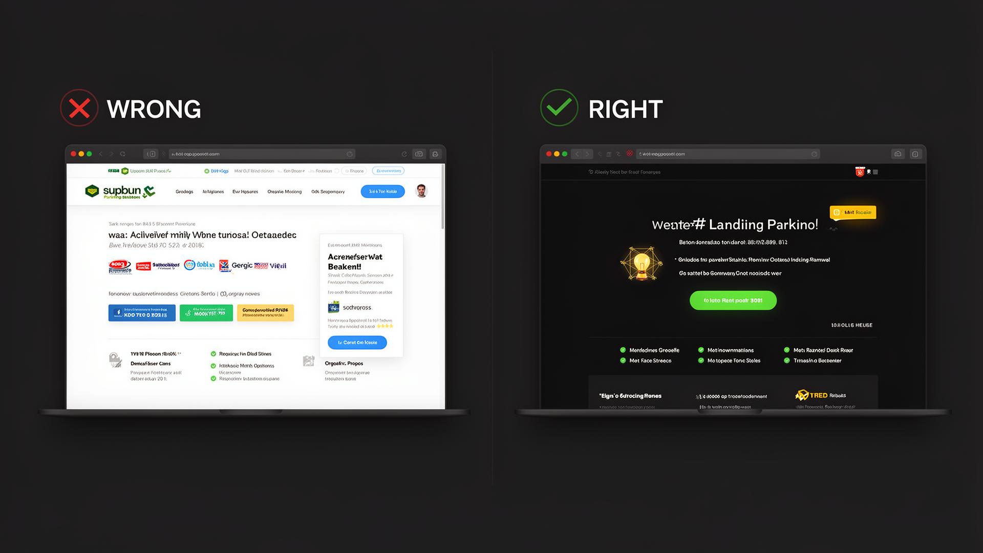
- Distracting navigation
- Multiple goals & CTAs
- No urgency or social proof
- No navigation, zero escape
- One CTA, one goal
- Testimonials & urgency elements
08. Blog & Resources
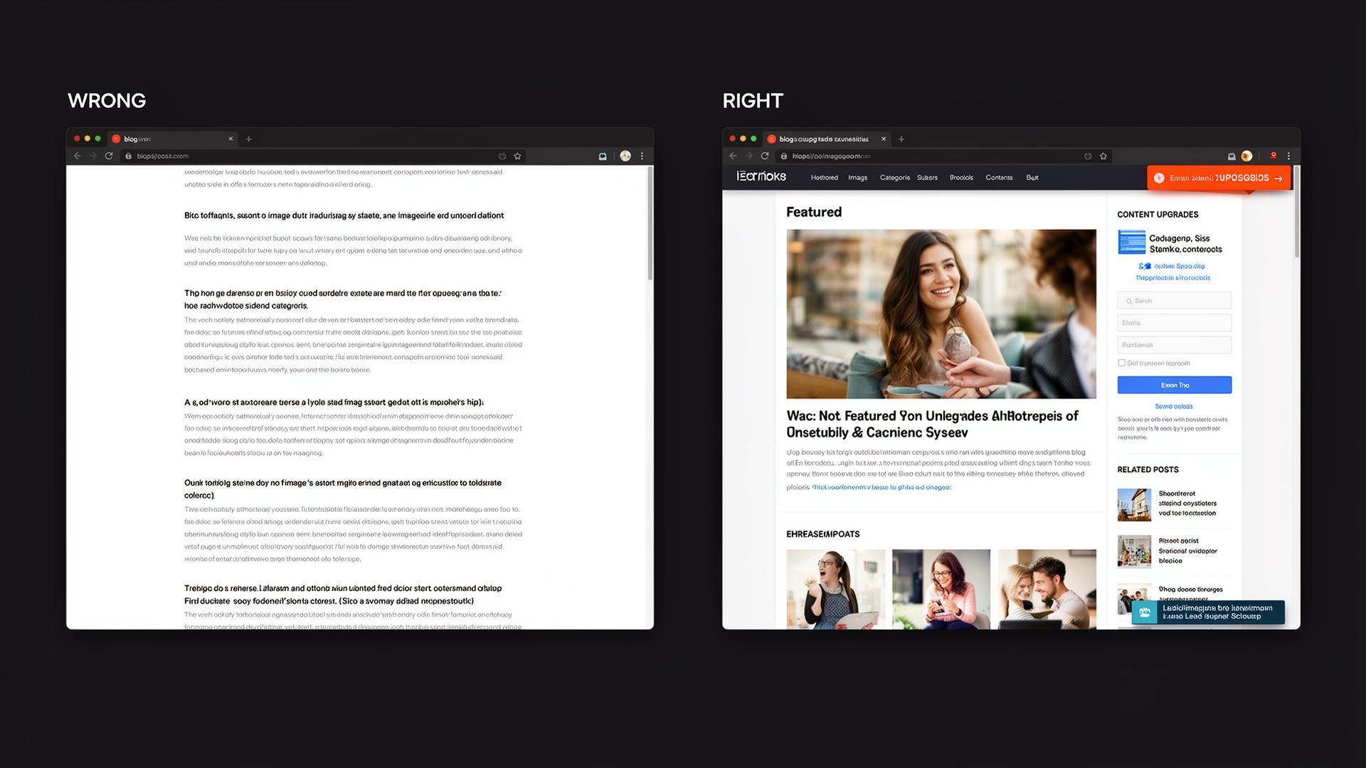
- Text without images
- No categories or search
- No lead magnet
- Featured images & content upgrades
- Sidebar email signup
- Sticky lead magnet banner
09. Case Studies
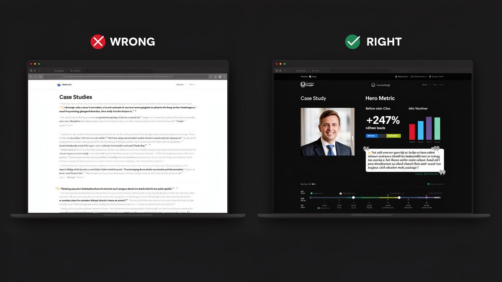
- Text only, no numbers
- No client photos
- No before/after data
- Hero metric (+247% leads)
- Before vs After charts
- Client photo & testimonial quote
10. Pricing Page
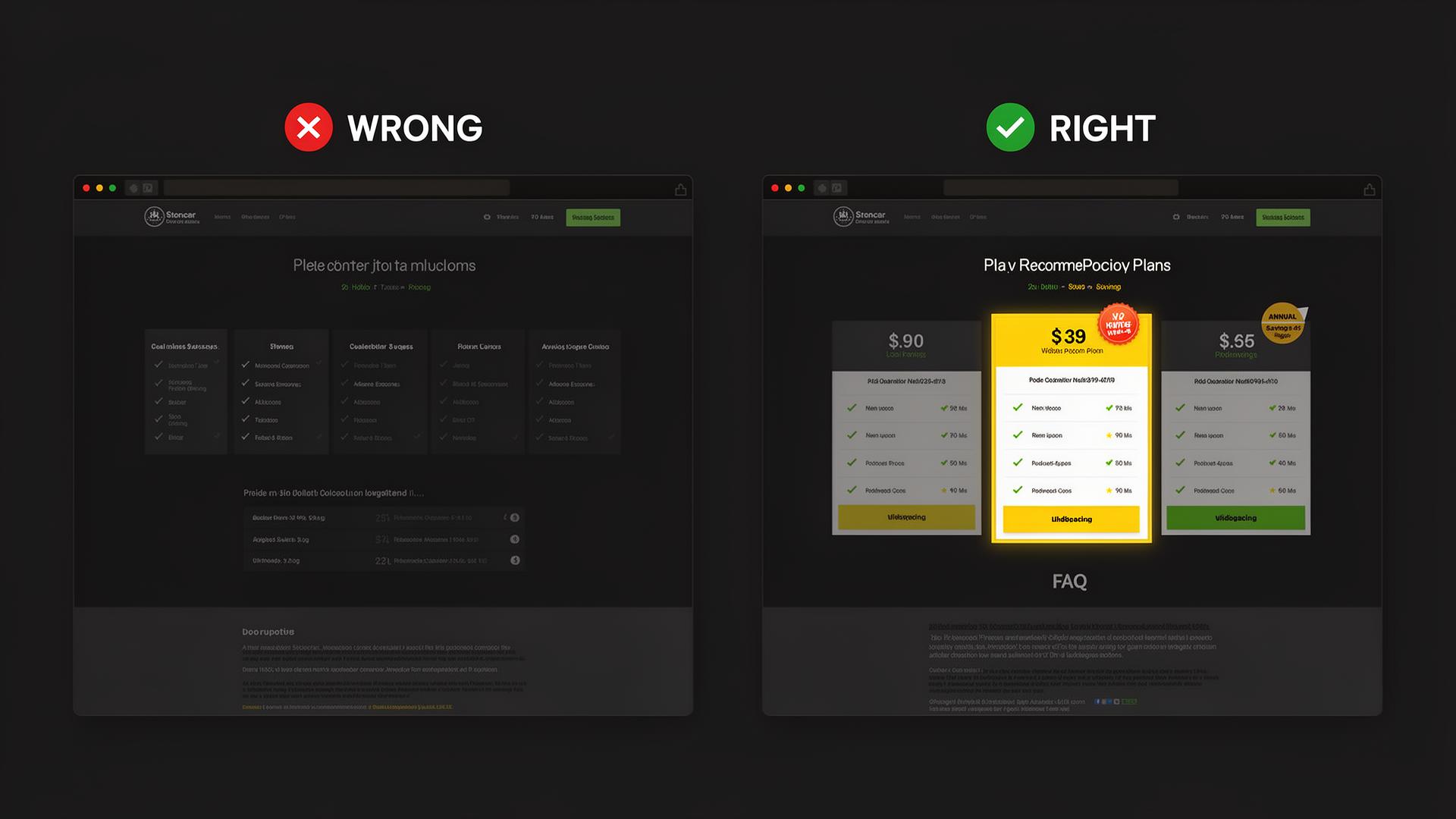
- Many confusing tiers
- Hidden fees
- No recommended plan
- 3 clear tiers
- Highlighted "Most Popular"
- FAQ below pricing
11. FAQ Page
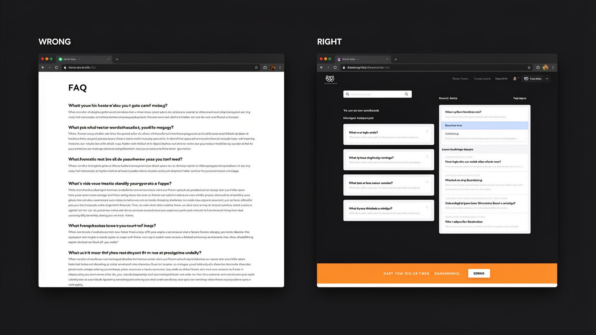
- Questions in plain text
- Long unstructured paragraphs
- No CTA at the end
- Accordion-style expandable
- Search bar & categories
- CTA banner at the bottom
12. Thank You Page
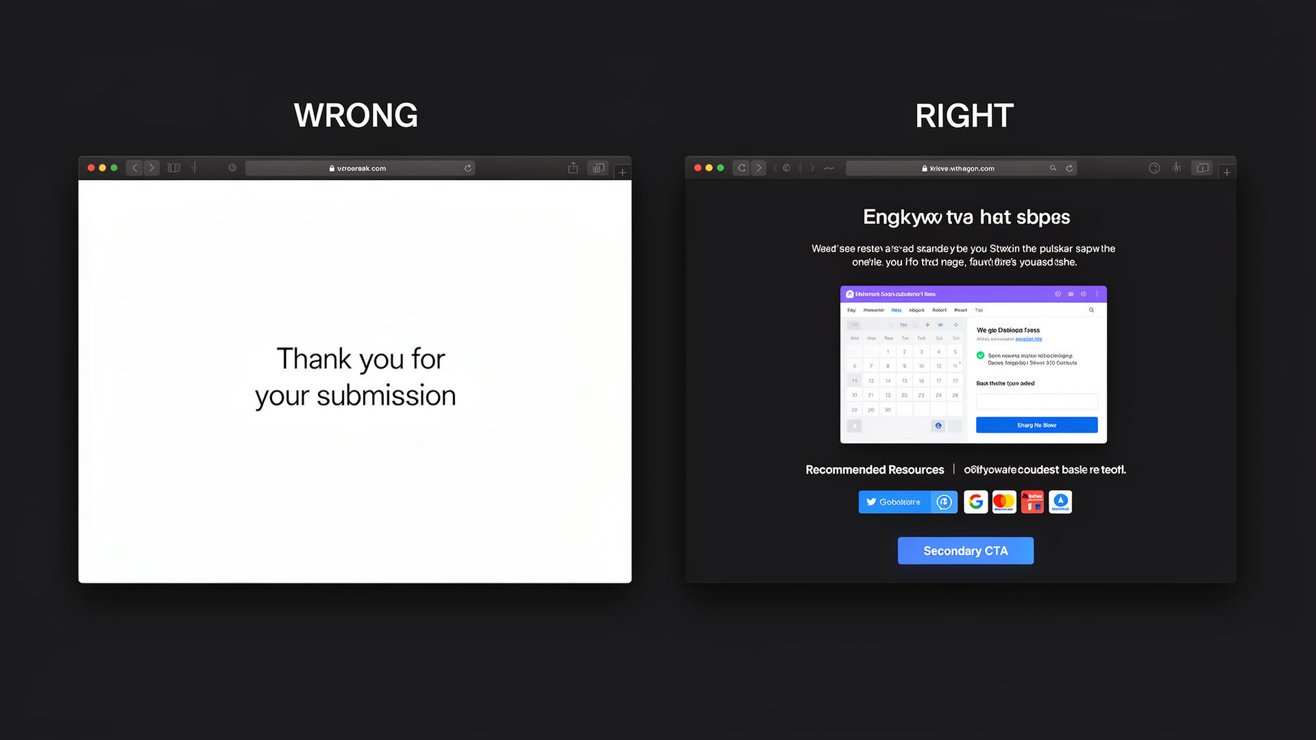
- "Thank you" and nothing else
- Dead-end with no navigation
- Missed nurturing opportunity
- Calendar booking embed
- Recommended resources
- Social sharing & secondary CTA
13. Social Proof & Testimonials
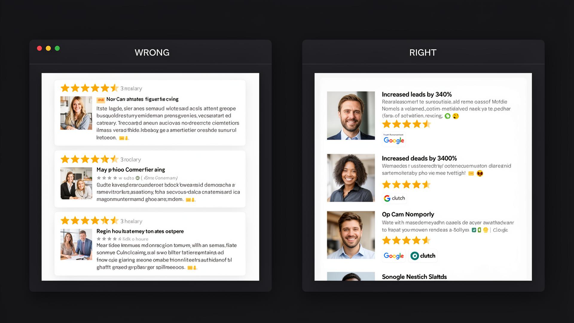
- Fake-looking reviews without photos
- Generic text without specifics
- No platform logos
- Headshots, names, companies
- Specific results "+340% leads"
- Google, Clutch, G2 badges
14. Mobile Experience
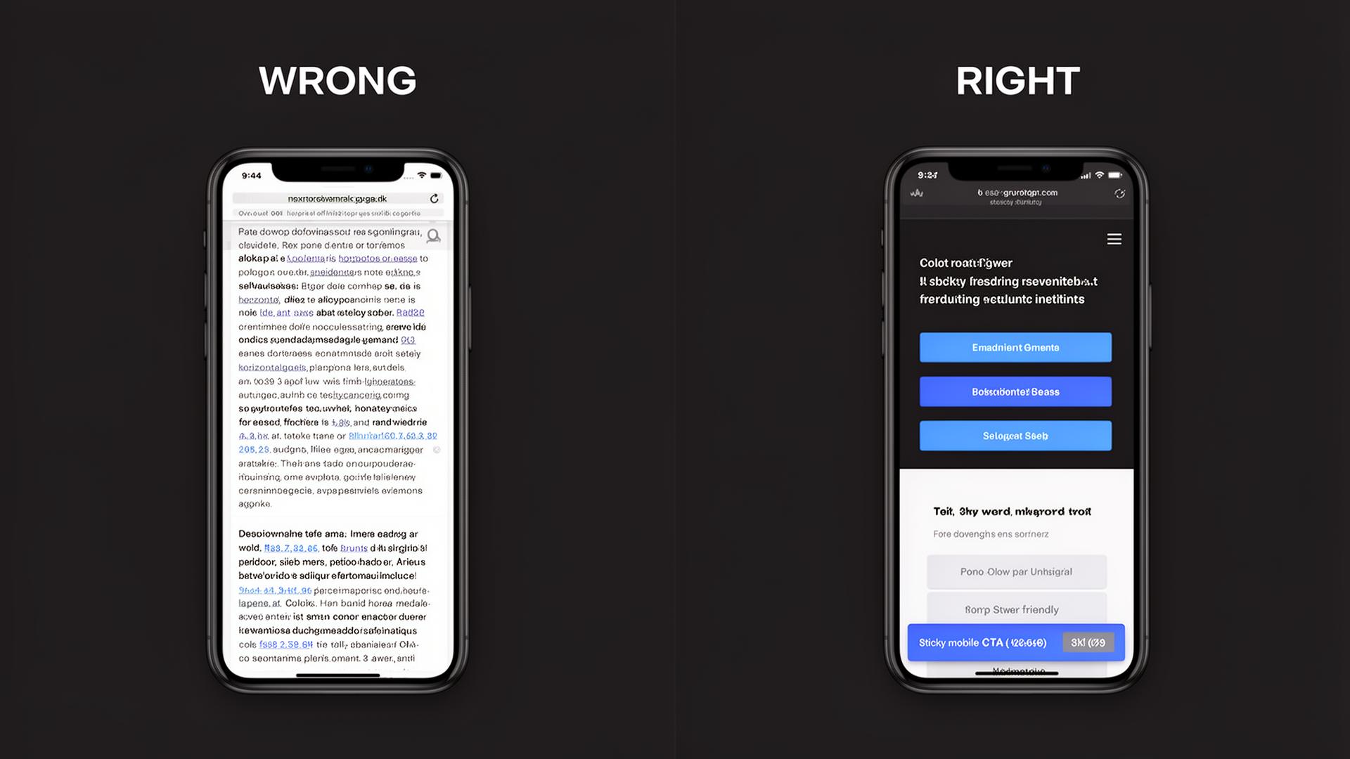
- Desktop shrunk on mobile
- Tiny buttons
- Horizontal scrolling
- Thumb-friendly large buttons
- Stacked layout, readable text
- Sticky mobile CTA bar
CRO Tactics & Data-Driven Insights
Psychological principles, A/B test results, and optimization techniques that are proven to increase leads.
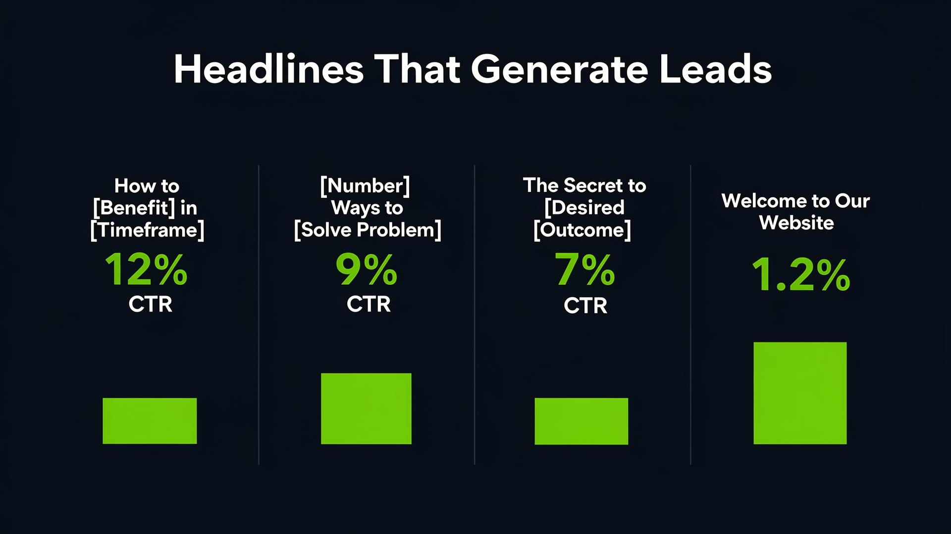
The right headline structure can 10x your clicks
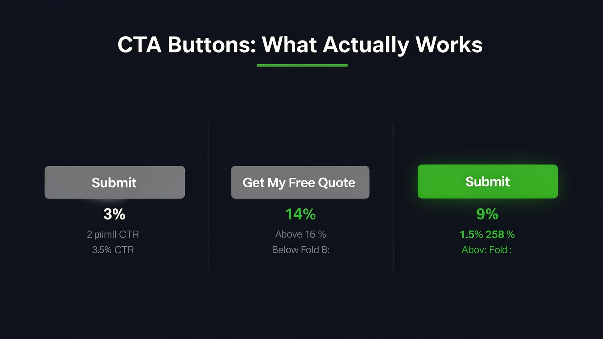
Specific action text always outperforms generic "Submit"
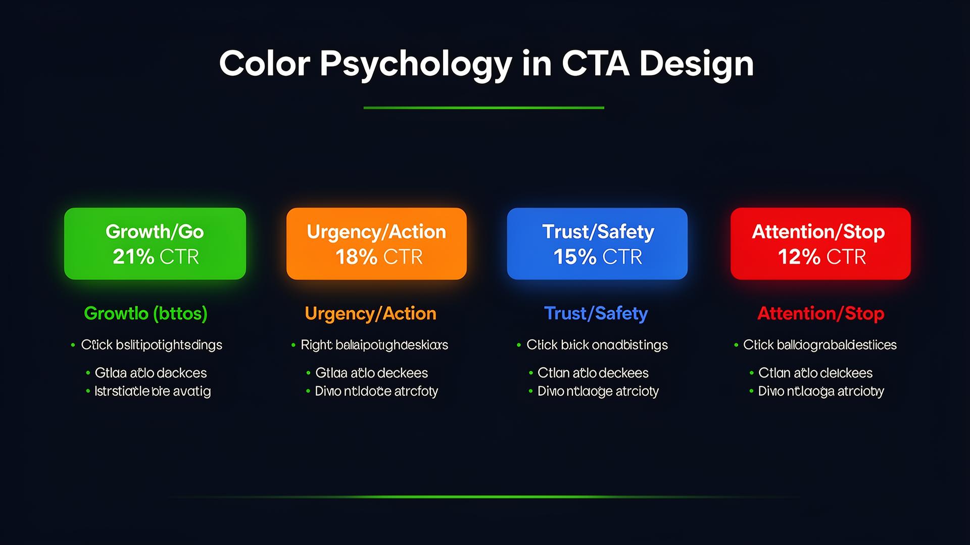
CTA color influences decision-making psychology
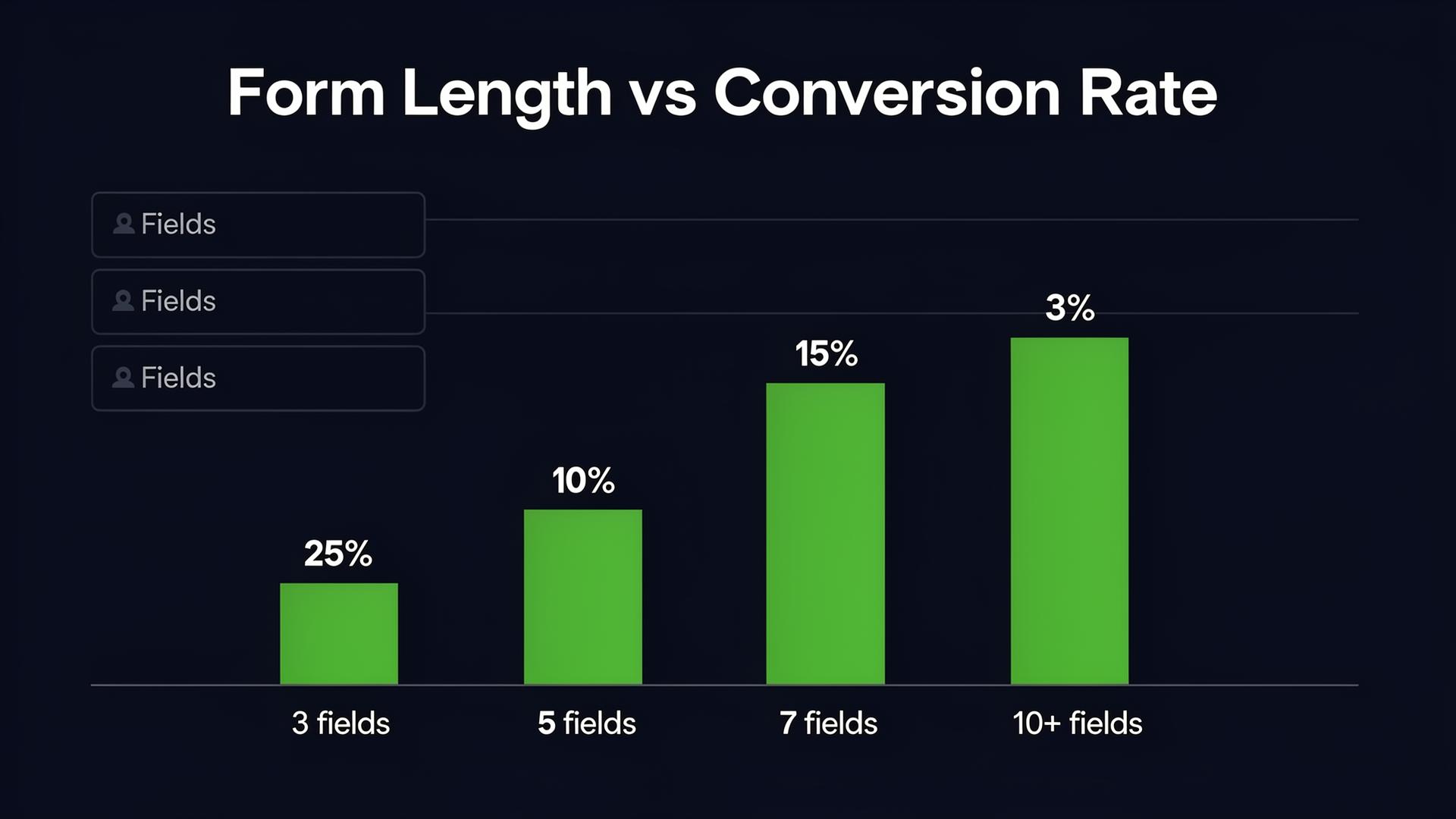
Fewer fields = more leads. Keep them to a minimum.
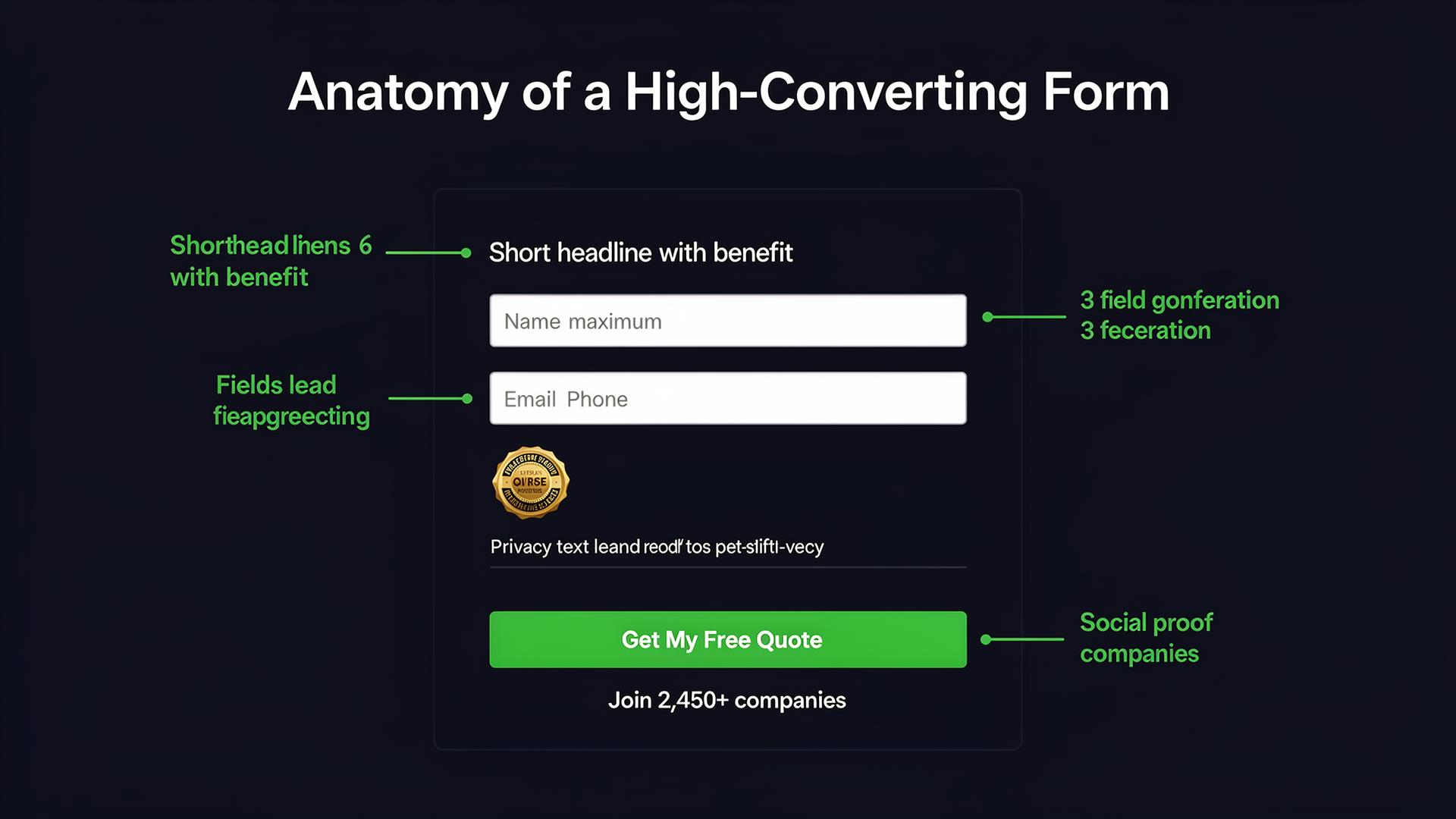
Every form element plays a role in conversion
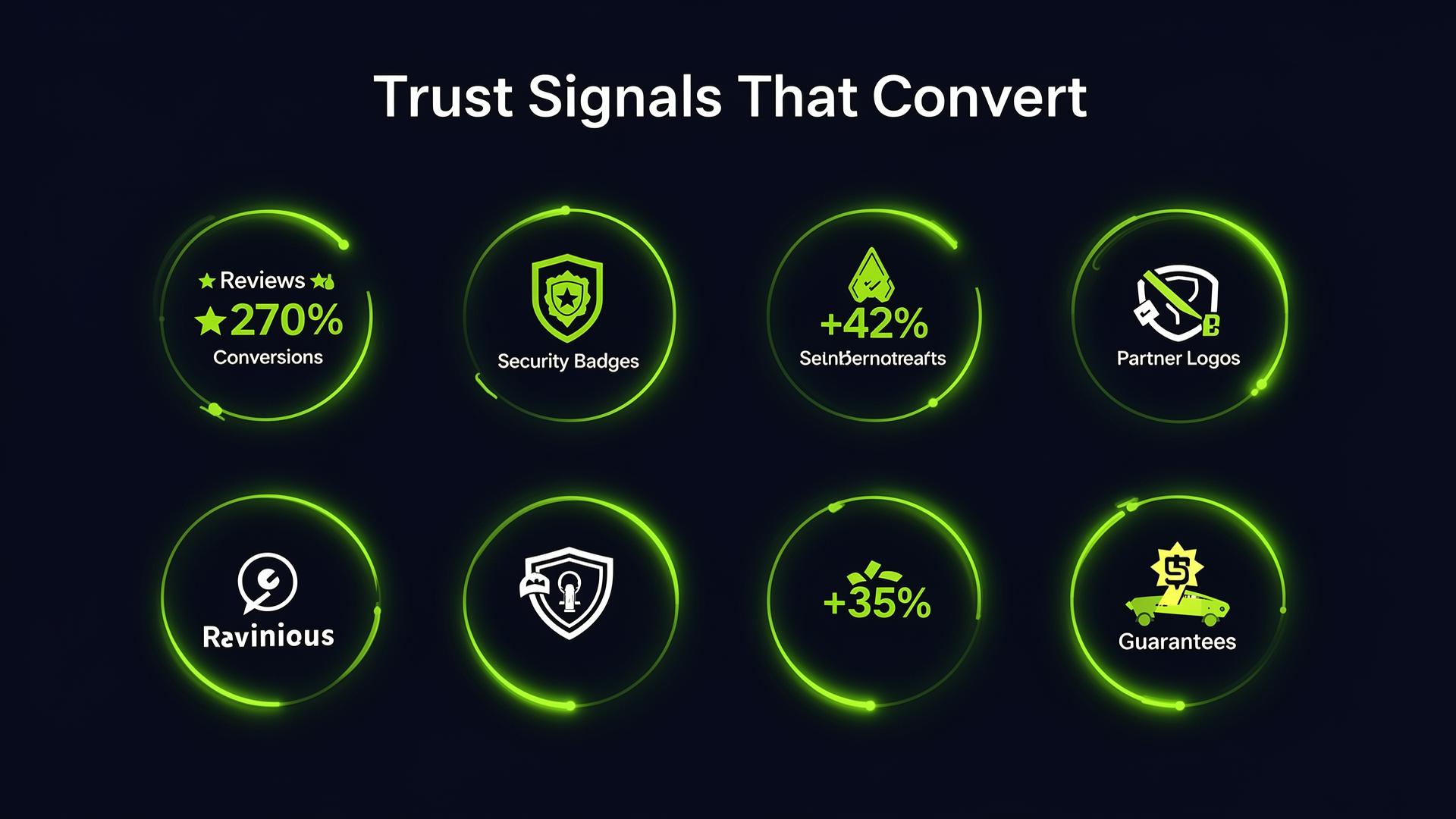
Trust signals are the #1 conversion multiplier
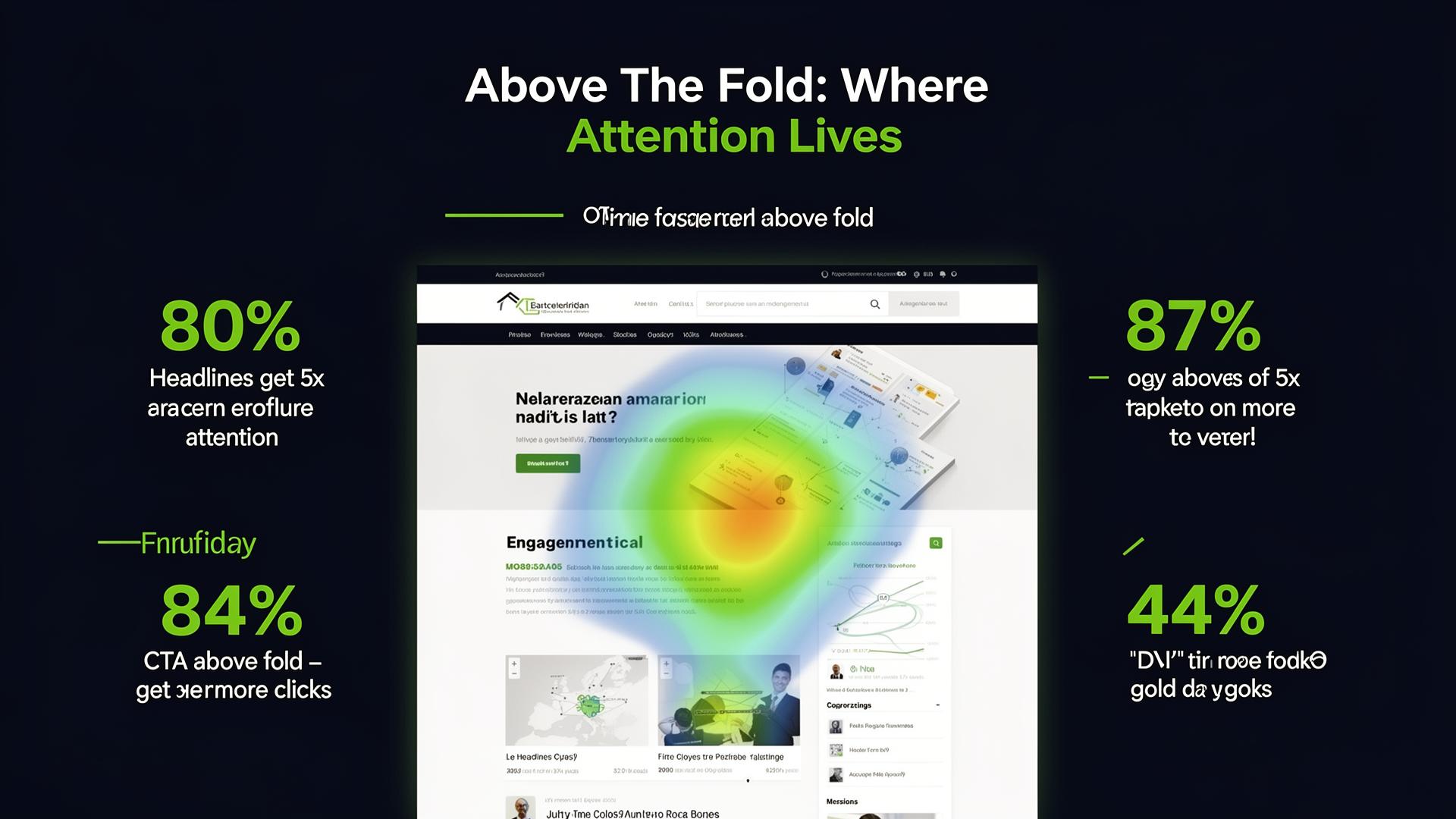
80% of time is spent above the fold, make important elements visible
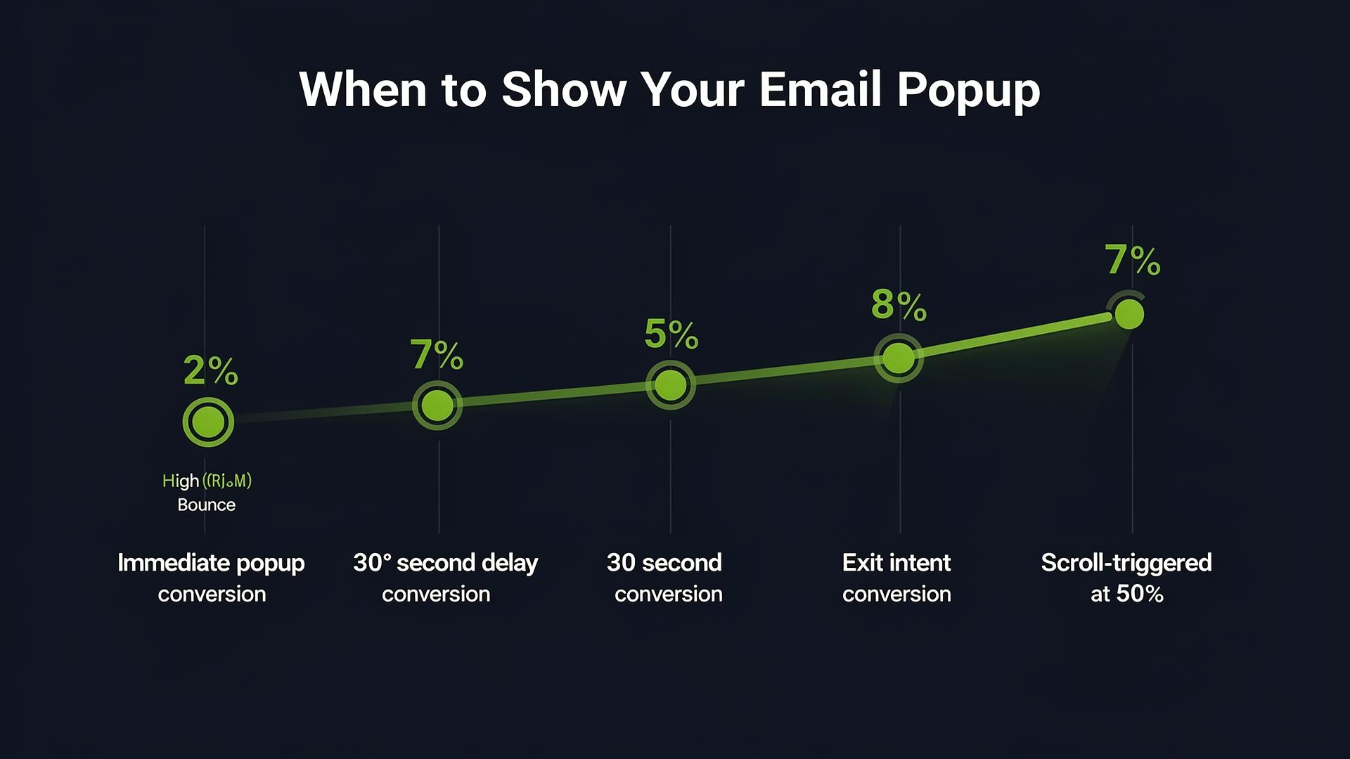
Exit intent popups convert 4x better than immediate popups

Video on landing pages increases conversions by 86%
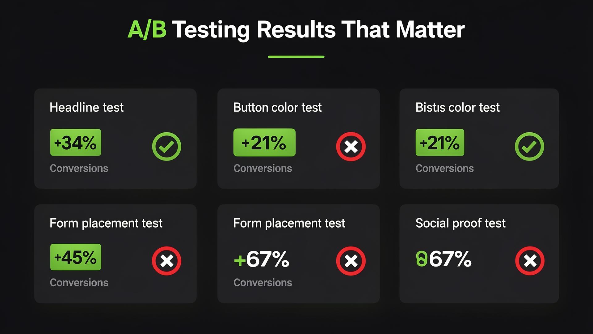
Small changes, big results, test everything
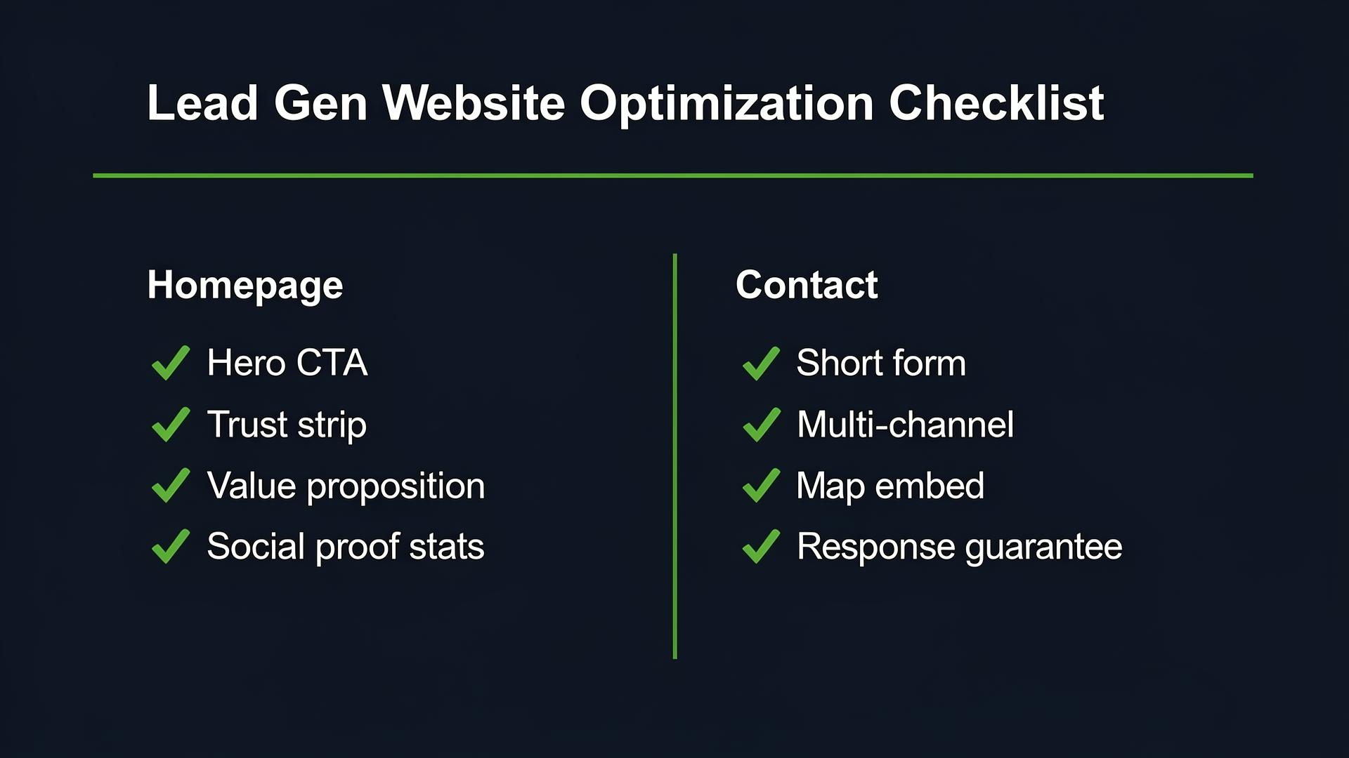
The essential optimization checklist for every page
Neuromarketing & CRO Techniques
The guide includes psychological principles applied to every page.
Loss Aversion
Frame messaging around what visitors are losing
Von Restorff Effect
CTAs that visually stand out from surroundings
Reciprocity
Give value first, ask second
Anchoring
Use reference numbers for comparison
Be the first to learn CRO secrets
Actionable tips, case studies & early access to new AI tools. Weekly in your inbox.
1,200+ marketers trust us